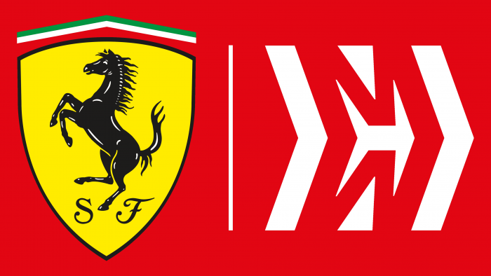
If you don’t look closely, you might think that the Ferrari Scuderia logo is entirely borrowed from the corporate style of the parent company. But this is only partly true, since for this series of cars, the marking has almost always been different from the emblem of the famous colleague. And now it is not identical since it contains a small sign at the bottom of the horse – elegant letters “S” and “F,” which encrypt its full name.
Ferrari (Scuderia): Brand overview
| Founded: | 1929 |
| Founder: | Enzo Ferrari |
| Headquarters: | Maranello, Province of Modena, Italy |
| Website: | ferrari.com |
Meaning and History
There is a beautiful legend about the creation of the Ferrari logo, told by the team’s founder, Enzo Ferrari. On the evening of June 17, 1923, the day of his first victory at Circuito di Savio, the emblem was gifted to Count Enrico Baracca – the father of the famous ace of World War I, in whose squadron Enzo’s brother Dino served. After this, the racer met Countess Paolina, the pilot’s mother, who suggested to Enzo: “Ferrari, depict on your car a rearing horse, the same as on the side of my son’s plane. His emblem will bring you luck.”
However, some believe that the black horse is not Baracca’s personal sign. In fact, it is the sign of the entire 912 squadron, and the pilot’s parents could not transfer the sign to Ferrari. Others claim that the horse is the coat of arms of Stuttgart, which Baracca cut out of the canvas covering the fuselage of a German plane he shot down. He hung the souvenir on his ship, and it was a special item that pilots of both warring sides usually received. Enzo did not use the horse emblem until 1932.
At the dawn of racing, cars of each country were assigned their own color. Green for the English, blue for the French, red for the Italians. But later, red became associated only with Ferrari.
The term “Scuderia” dates back to the Middle Ages. In Italian, it was used to denote a place where racehorses, now replaced by racing cars, were kept.
The image of a rearing horse on the yellow shield of the Ferrari logo was first applied to the side panels of the car in 1952 by Scuderia’s sports manager, Nello Ugolini. Before that year, the Ferrari sign was only placed on the hood.
Yellow was chosen for the background of the Ferrari logo because it is the color of Modena, where Ferrari was born.
What is Ferrari (Scuderia)?
Scuderia Ferrari is the most successful racing team in Formula 1. The same name is also given to the division that manufactures sports cars. They are based in the northern Italian town of Maranello, where they moved in 1943 from Modena.
1950 – 1964
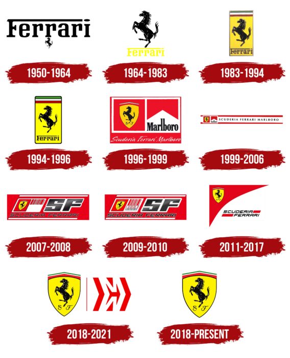
The original version of the logo consisted of the elongated name of the company and team, under which was a miniature sign of a walking horse. It was used to decorate Scuderia Ferrari trucks. Additionally, the letter “r” visually conveyed the contours of the horse. The upper part of the capital “F” was expanded to the full length of the word, and a horizontal oval replaced the dot over the “i.”
1964 – 1983
In 1965, designers changed the proportions of the inscription and drawing, making the prancing horse the main element of the emblem. They painted the name in yellow and placed it below, turning it into a podium for the powerful animal.
1983 – 1994
In 1983, Ferrari (Scuderia) introduced a yellow rectangular logo with a black horse in the middle. Below was the brand name, in which the upper line of the letter “F” was elongated and almost reached the dot over the “i.” Above were three stripes: green, white, and red. Their colors correspond to the Italian tricolor.
1994 – 1996
In 1994, the logo received official status and a refreshed entourage. It was then that three company stripes in the colors of the Italian flag appeared at the top. Subsequently, they were used in various modifications. The designers moved the prancing horse together with the name into a yellow vertical rectangle. To prevent the letters from merging with the background, they repainted the inscription in black. A thin, dark frame ran around the entire perimeter of the geometric figure. The corners of the rectangle were rounded.
1996 – 1999
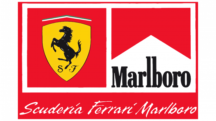
In 1997, the racing team Scuderia’s sponsor became Phillip Morris, the manufacturer of Marlboro cigarettes, so their name was mentioned in the logo. For this, the designers radically revised their style and fine-tuned some details, harmoniously placing the tobacco product advertisement. A large red rectangle was divided into three parts. The top two were equal-sized squares formed by a white frame. On the left was a prancing horse in a yellow shield with the team’s name and the handwritten letters “S” and “F” underneath. On the right was the word “Marlboro,” written in tall, thin serifs. The third part was located at the bottom and additionally repeated all the inscriptions. There, flying cursive handwriting read: “Scuderia Ferrari Marlboro.”
1999 – 2006
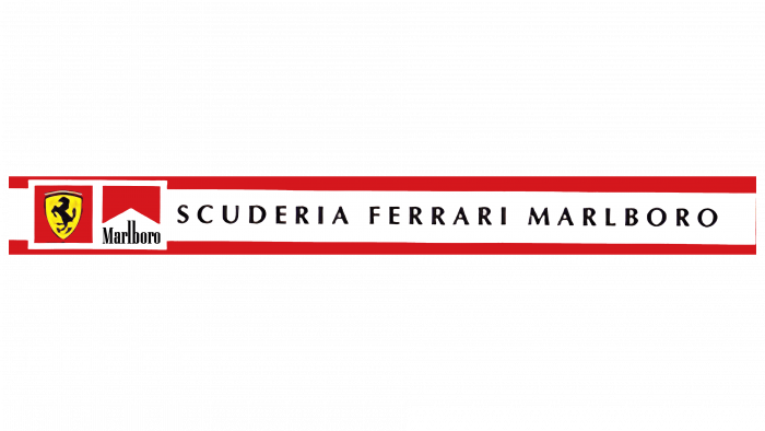
The company’s management decided to update the team’s logo, as a result of which all the elements were regrouped. The top rectangles were shifted to the right, and on the left appeared an expanded inscription, “Scuderia Ferrari Marlboro,” executed in uppercase print letters with a large interval. The overall appearance of the logo became more elongated. To emphasize this, the designers added two wide red stripes at the top and bottom along the entire length.
2007 – 2008
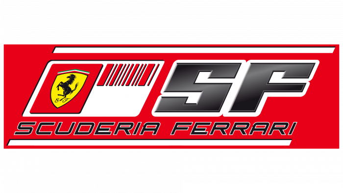
Due to the ban on tobacco advertising, the car company was forced to change its team logo. On the yellow shield remained the black horse, and the word “Marlboro” was replaced by developers with a barcode corresponding to the product. Additionally, the logo featured a large abbreviation “SF” in a strict geometric shape, the slanted inscription “Scuderia Ferrari” in blue, and two boundary lines on a red background.
2009 – 2010
The developers fine-tuned the barcode, adding short stripes to it to encrypt and avoid scandal, which still happened due to hidden tobacco advertising. At the same time, they replaced the red color with a more saturated shade – scarlet. Thanks to this, the black SF stood out even more due to the gradient and highlights.
2011 – 2017
The auto giant updated the racing team’s emblem, as it was constantly under pressure to ban tobacco advertising. As a result, instead of a barcode, a configuration identical to the design of Marlboro cigarettes appeared, as Phillip Morris continued to be their sponsor. The developers raised a yellow triangular shield with a branded horse in the upper left corner. The name was left in the lower right corner, complemented by wide red stripes.
2018 – 2021
Although the Marlboro cigarette advertisement disappeared from the emblem, the Mission Winnow sign appeared on it, again encrypted by Phillip Morris, their manufacturer. Since there was no direct tobacco advertising, the racers accepted the new symbol, which was openly placed on the emblem. Now, on the left is the classic symbolism of the car brand, and on the right is a complex configuration of arrows. Moreover, they emerge from negative space: red elements – from white, and white – from red. Such a design brings a touch of mystery and dynamics to the logo.
2018 – today
During this period, the professional racing team returned to its former logo – a shield with a striding horse and the designations “S” and “F” to the left and right of it. The black name was also preserved outside the central element. The stripe, consisting of the colors of the Italian national flag, was given a triangular shape.
Ferrari (Scuderia): Interesting Facts
Ferrari and its racing team, Scuderia Ferrari, are famous for car making and Formula 1 racing. Enzo Ferrari started the company, and it’s known for being good at racing and making cool cars.
- How It Started: Enzo Ferrari created Scuderia Ferrari in 1929 to help drivers race, and Ferrari began making its cars in 1947 to pay for racing.
- Famous Red Color: Ferraris are often red, “Rosso Corsa,” which means “Racing Red” in Italian. This color is a big deal in Italy’s racing history.
- The Horse Logo: The logo with a horse comes from Count Francesco Baracca, a war hero pilot. Enzo Ferrari started using it in 1923 because it was supposed to bring good luck.
- First Big Win: Ferrari won its first big Formula 1 race in 1951 at the British Grand Prix.
- Top Racing Team: Scuderia Ferrari is the most successful Formula 1 team ever, with the most wins and championships.
- Special Test Track: Near their headquarters, they have a test track called Fiorano, where they can test new car ideas.
- Enzo Ferrari Car: The Ferrari Enzo, named after the founder, came out in 2002. It’s a super fancy car with only 399 made, plus one more for charity. It uses technology from Formula 1 racing.
- Big Rivalries: Ferrari has had some big rivalries, like with McLaren and Mercedes, which made car racing even more exciting.
- Cool Car Tech: Many of the smart ideas from Ferrari’s racing cars end up in their regular cars, making them fast and fun to drive.
- Exclusive Club: Owning a special Ferrari car is by invitation only, making it exclusive. Ferrari car owners can go to special events and buy limited edition models.
Ferrari is all about fast cars, racing wins, and making some of the most awesome cars in the world.
Font and Colors
Ferrari used a non-standard font for its emblem. Later, it received the same name. There are also handwritten elements – for the letters “S” and “F”. The color palette is stable: it has always consisted of yellow, black, red, white, and green. The latter periodically disappeared from the logo but returned after some time.
Ferrari (Scuderia) color codes
| Irish Green | Hex color: | #009a4e |
|---|---|---|
| RGB: | 0 154 78 | |
| CMYK: | 100 0 49 40 | |
| Pantone: | PMS 3405 C |
| Pigment Red | Hex color: | #ed1c24 |
|---|---|---|
| RGB: | 227 212 173 | |
| CMYK: | 0 4 20 7 | |
| Pantone: | PMS Bright Red C |
| Black | Hex color: | #000000 |
|---|---|---|
| RGB: | 0 0 0 | |
| CMYK: | 0 0 0 100 | |
| Pantone: | PMS Process Black C |
| Canary Yellow | Hex color: | #fff200 |
|---|---|---|
| RGB: | 255 242 0 | |
| CMYK: | 0 5 100 0 | |
| Pantone: | PMS 3955 C |
FAQ
What does the Ferrari symbol mean?
The Ferrari emblem has multiple meanings. The horse represents the power of the cars and their unparalleled speed. The black color of the horse symbolizes mourning for the fallen pilot Francesco Baracca, whose plane bore a red stallion. The yellow background is a historical tribute to the Italian city of Modena, where Enzo Ferrari was born.
What do the letters S and J on the Ferrari logo mean?
There is no “J” in the Ferrari (Scuderia) logo – it is replaced by a capital “F.” Meanwhile, “S” and “F” are abbreviations formed from the name of the racing division. The Italian word “Scuderia” is a term used to denote organizations involved in training racehorses.
Who invented the Ferrari logo?
Enzo Ferrari began using the prancing horse as the Ferrari logo. According to one version, the legendary symbol was used to decorate the plane of the military hero Francesco Baracca. Others claim it was a common badge not of Francesco himself but of the entire 912th squadron. There are also rumors that the pilot allegedly took the horse from the coat of arms of Stuttgart (stolen from a German ace) or was inspired by horse breeding, which his family was involved in.
What is the hidden meaning of the Ferrari logo?
The horse on the Ferrari logo represents strength, power, and speed, which are developed by the cars. Specifically referring to the Scuderia Ferrari racing division, this symbol resonates with the meaning of the word “Scuderia” (an organization where racehorses are bred). The yellow background is a tribute to the city of Modena, the birthplace of Enzo Ferrari, and the black color is mourning for the fallen ace Francesco Baracca.
What is the Ferrari emblem like?
The Ferrari (Scuderia) emblem consists of two parts. On the left is a yellow triangular shield, on top of which are two lines: red and green. In the center of the shield is a prancing black horse, and in the lower corner are the letters “S” and “F.” On the right side of the logo is a red and white ornament in the form of an arrow from the Mission Winnow brand. This sign was added at the request of the tobacco company Phillip Morris.
Why did Ferrari choose its logo?
In one interview, Enzo Ferrari admitted that he took this logo from the fuselage of the plane flown by Francesco Baracca. The ace’s parents suggested he use the legendary symbol, promising that the prancing horse would surely bring luck. The founder of the car company met them when he was 23 years old.
Where did the Ferrari symbol come from?
It can be stated unequivocally that the Ferrari symbol was taken from the fuselage of Francesco Baracca’s plane. But where this ace got it from, history remains silent. Perhaps Francesco stole it from a German pilot, and then it became the coat of arms of Stuttgart. Some believe that the same sign adorned the planes of the entire squadron because he was part of a cavalry regiment. Or maybe the horse is a tribute to the Baracca family’s horse breeding business.
