A distinctive feature of the FIAT logo is its massiveness and size. The emblem indicates a rich history, a high position among other manufacturers, and the strength and reliability of cars. The sign convinces buyers that brand cars last long and are not prone to breakdowns.
FIAT: Brand overview
| Founded: | 1899 |
| Founder: | Giovanni Agnelli |
| Headquarters: | Lingotto, Turin, Italy |
| Website: | fiat.com |
Meaning and History
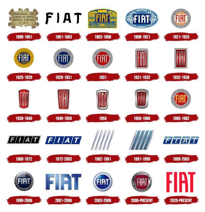
FIAT has 26 logos on the hoods of its cars from the early 20th century to the early 21st when the most recent redesign was carried out. In general, the emblems were very similar to each other and were grouped by year: from 1921 to 1931, the badge was oval; until 1968, it was vertical rectangular; until 2003, it was oblique, and then the round logo alternated with the text … Currently, the emblem contains only an inscription – a red name on a white background.
What is FIAT?
Previously, a whole industrial group FIAT was engaged in manufacturing aviation and land transport. Now, under this name, the Italian automobile company Fiat Automobiles S.p.A. is hiding. It was founded in 1899, and since 2021 it has been owned by Stellantis N.V. Corporation. Now it is the largest car manufacturer in Italy and throughout Europe.
1899 – 1901
The newly minted automaker did not yet have its logo in the year it was founded. But the emblem was created—a golden rectangle with “curved” edges that resembled ancient parchment. The full name “Fabbrica Italiana di Automobili Torino” and its abbreviated Fiat version are flaunted in block letters in the center.
1901 – 1903
The first emblem did not last long. In 1901, chief designer Mario Majoli, driving past the factory in the evening, noticed how futuristic the building looked against the darkening sky. This inspired him to create the first company logo. The blue-enameled plate now bore only an abbreviation for the name, four letters with gaps between them. The shape is rectangular with a slightly elongated upper edge. The font that was used on the first logo became FIAT’s trademark.
1903 – 1908
The artists somewhat simplified the graphics. The letters remained unchanged – slightly elongated, with the characteristic letter “A.” We also retained the color palette, the blue background, and the brightly highlighted letters.
1908 – 1921
In 1908, the emblem became more elegant. The artists placed the traditional abbreviation in the center of a horizontally located blue oval. The logo looks more versatile, and the letters in the center of the oval against a dark blue background look even brighter.
1921 – 1925
In 1921, the Fiat logo was completely changed. Now, it is a perfectly even circle framed by a laurel wreath. The company chose the laurel crown because its cars at this time began to win various racing competitions often. The font color turns red on a white background. With a monochrome palette, he looked confident and powerful.
1925 – 1929
In 1925, minor changes were made: the laurel’s image was simplified, and the wreath became symbolic. The background was dark blue, and the Fiat lettering was made white, which looked very advantageous against such a background.
1929 – 1931
Minor changes were made to the logo until 1931, but they were only concerned with the color scheme. The Fiat emblem remained graceful—a silver frame with leaf ornaments and original lettering.
1931
This time, the logo’s background color was changed, replacing the “blue sky” with the red color of victory.
1931 – 1932
The logo changed dramatically in 1931. The shape of the radiators of Fiat cars has changed. In this regard, the logo was completely changed, deciding to remove unnecessary attributes in a laurel form. The firm “Fiat” font was noticeably “lengthened” in height. The logo became rectangular with rounded corners and resembled a car radiator grill. Only the dark red background color remained unchanged.
1932 – 1938
The emblem has remained the same, but it has become a clear rectangle instead of rounded corners.
1938 – 1949
The logo became shield-like and, in this version, fit much better into the design of the company’s racing cars, becoming an adornment of any radiator grille. The shield emblem with a graphic top looks particularly sleek and elegant. Until 1968, this emblem was installed on cars with only minor changes, retaining the colors and font.
1949 – 1959
Here, we have simplified the outline of the emblem a little, making the lines straight and clearer. The corporate font tapers slightly towards the bottom, repeating the shape of the shield. Dark red, in combination with silver, gives the logo austerity and even a certain aggressiveness.
1959
The shield’s shape has softened with rounded corners. A thick silver frame frames the logo. The letter A with a pointed top lends sophistication to the overall emblem.
1959 – 1968
The shield’s shape is no longer so pronounced and aggressive. A wide silver bezel and almost rounded corners give the emblem a soft feel.
1965 – 1982
The round logo resembles a print based on a classic rondel. In the center is the name of the car brand in Verkehr Std Bold. The letters are yellow and high, with elongated legs and a white edge. “A” has its upper-right corner cut off. A small red circle serves as a background. A thin, light line surrounds it. The same strokes are found under and above the inscription. A wide gray stripe with a wreath of laurel leaves painted graphite on the outer edge.
1968 – 1972
1968, the logo underwent radical changes, and the corporate font was also changed. The logo has become more strict and geometric. It now has four diamonds separated by white stripes. Each letter is placed in its “own” cell, and the letters FIAT are written in clear “correct” italics.
This logo remained with the brand for quite some time and is considered one of the best versions of Fiat’s design today.
1972 – 2003
Only the color of the rhombuses has changed. They are now classic navy blue.
1982 – 1991
The rhombuses were replaced by five longitudinal stripes, not quite even, slightly inclined to the left, like the italic font.
1991 – 1999
The designers have changed the color scheme. Now, there is a blue gap between the stripes.
1999 – 2003
And again, it returned to the rhombuses. Only now has the logo’s color palette changed to blue and white, and it has become modern and light. Highlights are visible at the top of each diamond. The Fiat lettering features a bolder sans-serif typeface, and the clean lines of the letters make the logo stand out.
1999 – 2006
In 1999, the designers decided to be nostalgic and turn to old traditions, returning the logo to a round shape. Officially, for the 100th anniversary of the company, it was decided to get as close as possible to the look that the logo had in the 1920s. Only this time, blue was used as the main color. In the new version, this emblem had a blue background and chrome letters, and the letter “A” again acquired its original outline. Thanks to the silver color of the font, the inscription turned out to be voluminous and bright. We did not forget about the more stylized laurel wreath. The company used the logo for only one year.
2001 – 2006
Keeping the circular shape, the artists changed the background color to a deeper blue, making the letters and borders silvery white.
2003 – 2006
This is a brand-new design for the company. Four separate letters of the abbreviation are in bright blue. However, the font style is completely preserved.
2006 – today
In 2006, the company’s design department decided to modernize the existing logo, making it three-dimensional and adding silver tones to the palette.
The artists combined two forms of the emblem: round and thyroid. The emblem was enclosed in a silver circle with a rectangular insert and semicircular edges, which gave it a 3D effect. The company name was inscribed in silver letters on a red background. Elegant, elongated letters echo a long-established font, but now they look cleaner, defining a style that follows the latest graphic design trends.
2020 – today
The 2020 redesign retained the original Fiat emblem styling and typeface flattened the letter lines and raised the color palette to scarlet red. The new combination looks chic and vibrant, reflecting the brand’s passion and strength, highlighting its attention to detail and value for beauty.
In all variants, we see the preservation of recognition and continuity.
FIAT: Interesting Facts
Fiat stands for Fabbrica Italiana Automobili Torino, a car brand from Italy that started in 1899.
- Beginning: Giovanni Agnelli and some investors started Fiat on July 11, 1899. It quickly became famous for its engineering and style.
- Fiat 500: The Fiat 500, launched in 1957, is a famous model. Known as “Cinquecento,” it symbolizes affordable and practical travel in Italy after the war. Its design has inspired newer versions.
- Global Brand: Fiat sells cars worldwide, having built a strong international presence.
- Motorizing Italy: Fiat played a key role in getting Italy on wheels, making everything from city cars to luxury vehicles, trucks, and buses. This helped change Italy’s economy and society in the 20th century.
- Rally Racing: Fiat has a rich history in motorsport, especially rally racing. The Fiat 131 Abarth is a notable example, winning the World Rally Championship greatly in the late 1970s.
- Manufacturing Innovation: Fiat was ahead of its time in car manufacturing, setting up one of the world’s first mass-production car plants in Turin, famous for its rooftop test track.
- Eco-friendly Efforts: Fiat is known for making vehicles that are kind to the environment. It is often the leader in Europe in producing cars with low CO2 emissions.
- Fiat Chrysler Automobiles (FCA): In 2014, Fiat bought Chrysler, a major global car maker. This merger expanded Fiat’s reach and brand lineup.
- Culture and Arts: Fiat is involved in more than just cars; it supports art projects and exhibitions and even owns the Juventus Football Club, showing its impact on Italian culture.
- Economic Influence: Fiat has significantly influenced Italy’s economy and industry. The Agnelli family, founders of Fiat, are among Italy’s most influential families, with a reach beyond just cars.
Fiat has grown from a small Turin manufacturer to a major global car company, always focusing on innovation, quality, and meeting driver needs. Fiat remains a symbol of Italian design and engineering prowess through ups and downs.
Font and Colors
The authors chose an equally solid typeface for a solid logo – Verkehr Std Bold, thin, elongated, graceful. Its developer is designer Mott Jordan. ITC first published the font. There is a free and almost complete counterpart called Denk One, created by Sorkin Typ. In the early version, the inscription on the emblem was curly, with long, pointed legs. Her business style appeared in 1903.
The color palette is so diverse that it is difficult to call it a corporate one—it changes with every redesign. But they often used yellow, cobalt, blue, emerald, black (in the initial logo versions), red, metallic, white, and blue with a gradient (later versions).
FAQ
Who manufactures Fiat?
Stellantis manufactures the brand through its Italian division, Stellantis Europe. Originally known as the Italian Automobiles Factory of Turin, it has a long history in the automotive industry and was formerly part of Fiat Chrysler Automobiles (FCA).
The company became a part of Stellantis after FCA merged with the French company PSA Group. This merger created one of the world’s largest car manufacturers. Stellantis manages several well-known brands, overseeing their production and market strategies.
Is Fiat a French icon?
It is an Italian symbol known for its touch and dolce vita style. Since its foundation, the brand has embodied Italian culture and design in its vehicles, most evident in the Fiat 500.
The model captures the essence of Italian design and is beloved worldwide. Its compact size, unique style, and efficient performance make it popular among drivers who appreciate the charm and functionality of Italian engineering.
Do we have Fiat cars in India?
Yes, cars are available in India through FCA India Automobiles Private Limited (FCAIPL), previously known as Fiat Group Automobiles India Private Limited. It was founded as a direct subsidiary of FCA Italy.
In India, it produces cars and engines under brands like Fiat, Abarth, and Jeep. The brand has introduced various models to the Indian market, which are known for their stylish designs, innovative features, and reliable performance.
The brand continues to offer a range of vehicles to meet different customer preferences and needs, maintaining its reputation for excellence in automotive manufacturing.
What does the FIAT logo mean?
The brand has two logos with different meanings. The first logo shows the brand’s name inside a red trapezoid framed by a silver circle. The shapes in this design stand for continuous change. Red symbolizes passion and energy, and the silver circle adds elegance.
The second logo is simpler, with only the word “FIAT.” This is an abbreviation of “Fabbrica Italiana Automobili Torino,” which means “Italian Automobile Factory of Turin.” This logo highlights the brand’s Italian roots and its origins in Turin.
When did FIAT change its logo?
The brand has changed its logo multiple times throughout its history. In 2006, the Italian automaker introduced a red and silver round symbol, which became iconic and is still used today.
In 2020, the brand introduced a new wordmark with the red inscription “FIAT.” This simpler design focuses on the brand name, emphasizing its strong identity and heritage.
The logos represent the brand’s ability to honor its tradition while embracing new designs, ensuring a cohesive and recognizable identity across all platforms and products.

