


![]() Finlandia Logo PNG
Finlandia Logo PNG
A special recipe for vodka has arisen in the north, where deer live, and there are few warm days a year. The Finlandia logo tells the story of the drink’s birthplace. The emblematic elements create a sense of coolness and clarity, emphasizing the use of glacial waters in the composition.
Meaning and History
![]()
Despite the official year of Finlandia’s emergence, its distillery appeared much earlier, in 1888. It was opened in the village of Koskenkorva in the Ilmajoki parish by the entrepreneur Wilhelm Juslin. However, with the passage of the alcohol prohibition law in 1920, the state bought the plant to focus on producing goods for the pharmaceutical industry and other non-alcoholic beverages.
After lifting the ban, the government of the northern state, represented by Alko, took full control of vodka production. The intensification of work led to the appearance of the Finlandia brand in 1970. A year later, an alcoholic drink was already supplied to the US market. After five years, a new vodka bottling plant was opened in the village of Rajamäki, but the alcohol distillation process remained in Koskenkorva.
At the beginning of the millennium, the American corporation Brown-Forman bought a 45% stake in Finlandia Vodka Worldwide from Altia Group (the successor to Alko). She gradually bought them up until she completely took over the alcohol company. Now she is the majority owner. In 2016, information about the trademark sale surfaced, but it remained only rumors.
All these years, the identity of Finnish vodka has been associated with ice. This is visible both in the label and in the branded bottle, the first sample presented in 1970. Her design, Frozen Ice, was created by sculptor Tapio Wirkkala. The product looked like an ice-cold drink from the Arctic North.
Later, other design options appeared. These include Hammered Ice by Hansen Design of Philadelphia in 1998 and Glacial Ice by Harri Koskinen, Finlandia Global, and Wallace Church & Co in 2003. There is another version of the bottle called Melting Ice, developed in 2011. Its authors are Finn Harri Koskinen and American Kenneth Hirst.
What is Finlandia?
This premium vodka brand, owned by Brown-Forman, embodies the essence of Finnish nature through a unique production process using six-row barley and pure glacial spring water. In addition to classic vodka, the brand offers a variety of flavored options, such as cranberry, grapefruit, and raspberry. This vodka stands out for its blend of natural ingredients and meticulous distillation. It gives the drink a crisp, clean taste with soft notes of wild berries and a light sweetness.
1970 – 1998
![]()
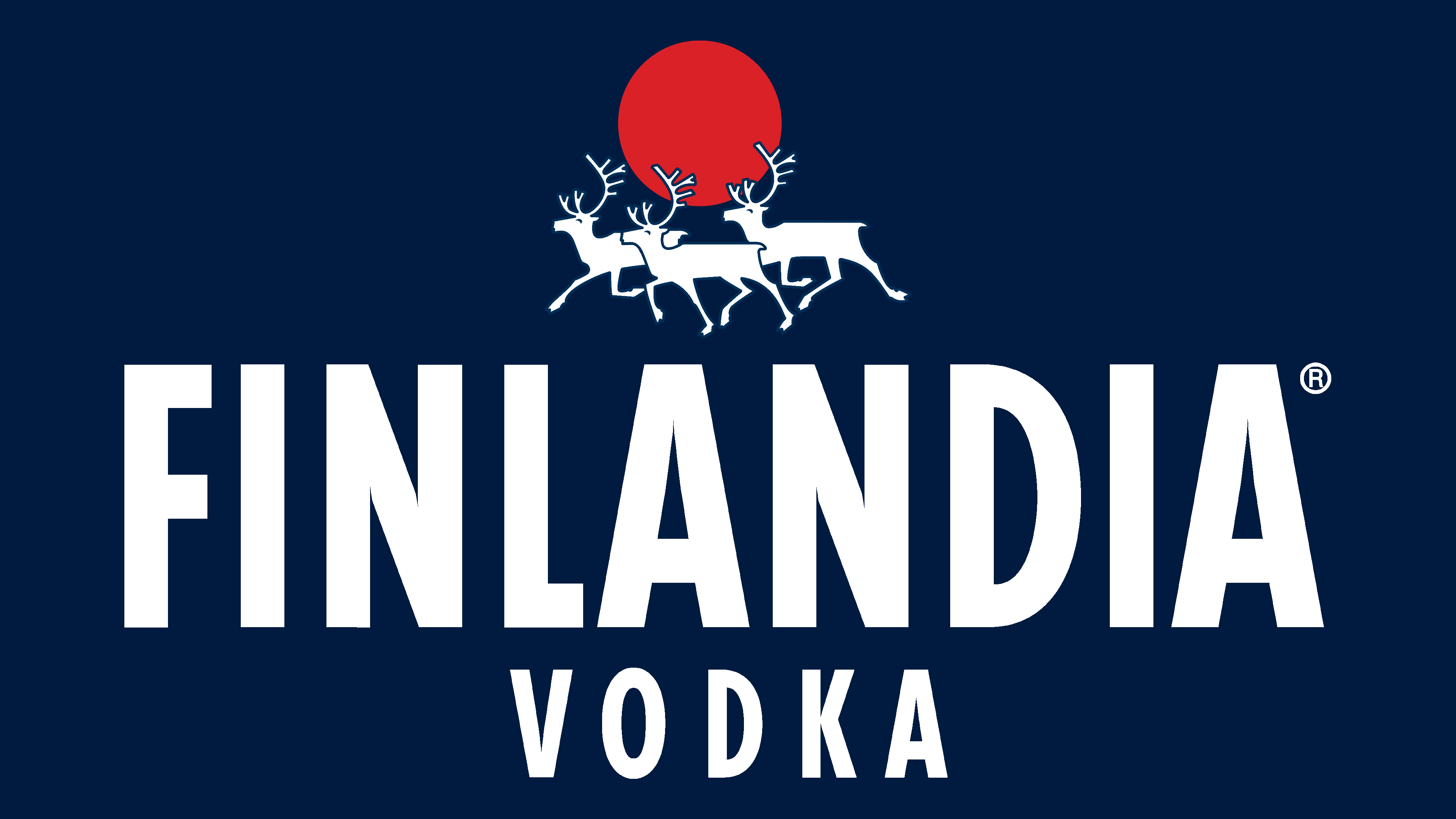
In the first year, the black logo depicted three snow-white reindeer against the backdrop of the rising sun. It looks like a large red ball, on which the horns of proudly running animals stand out effectively. The contrast between black and white emphasizes the bottle’s iciness and its contents, making the vodka look frosty. The brand’s name is also written in white, indicating the vodka’s place of production. The letters are elongated, with miniature points at the top.
1998 – 2003
![]()
The next-generation logo shows the same three deer, but in a flat projection, emphasizing a dark-blue outline and a white center. In this version, the animals have a miniature stroke denoting the eye. The horns are highlighted and also circled in blue. The inscription is made in a perfectly even font as if it were fragments of melting ice. The letters are capital, geometric, with sharp points at the inner corners of the “N,” “A,” and “V.” The second line is half the size of the first, both in character size and length.
2003 – 2011
![]()
After the redesign, the bottle received a melting-ice texture and a corresponding logo. It complements the glass container’s original design, so the white elements on it have a silver tint. The designers typed the drink’s name in thinner letters and added the italic inscription “Vodka of Finland.” In addition, a light horizon appeared, due to which the red semicircle of the sun rises.
2011 – 2018
![]()
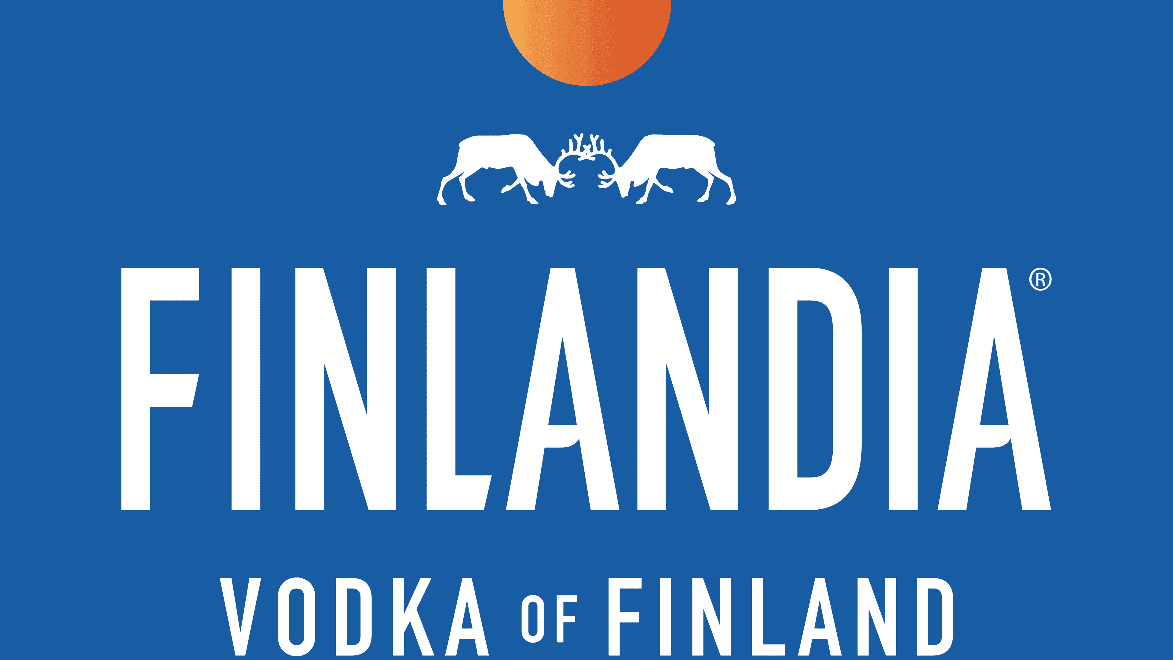
A dark blue color dominates this emblem. Deer are depicted as fighting: their antlers are linked, their heads are lowered, and their front legs are raised. Above them is a red dot representing the sun. Below are the inscriptions: the vodka’s name and the country of production. They are set in different fonts: the first part is set in grotesque, the second in Antiqua.
2018 – today
![]()
In the modern logo, the developers have changed the design of the inscription: “A” has rounded corners on the sides of the crossbars, and “F” has a central element cut diagonally. The deer are completely preserved:
- They still have the tops of the horns linked.
- Their heads are tilted.
- One leg is raised.
Above them hangs a red sun, depicted as a semicircle after the authors removed the upper half, with an elderly white color on an ultra-blue background.
Font and Colors
Almost every logo redesign is associated with a bottle update. This approach allows the luxury vodka producer to maintain a harmonious relationship between the glass container and the label. Moreover, each sample has a specific name: Frozen Ice, Hammered Ice, Glacial Ice, and Melting Ice. The icy coolness of the drink and its Arctic origin are conveyed in the emblem’s main element: the reindeer, which lives in the Arctic North.
The inscription in the Finlandia logo is made with several variations of the News Gothic Bold Condensed typeface. Typographer Morris Fuller Benton designed this sleek sans-serif typeface. The Finnish brand’s corporate palette comprises four colors. Among them are blue (background, letters, contours), white (deer), red (sun), and silver (inscriptions and animals).