The First Air logo represents the airline’s role in connecting and serving the remote communities of Canada’s Arctic region. It reflects the company’s mission to bridge the northern territories with the rest of Canada, providing essential and reliable air transport. This symbol highlights First Air’s commitment to accessibility and connectivity, emphasizing its importance to the communities it serves.
First Air: Brand overview
Based in Kanata, Ontario, First Air has always been and continues to be a trusted provider of safe and reliable air transportation for Canadians. The airline’s network covers 34 communities in Nunavut, Nunavik, and the Northwest Territories. First Air caters to the needs of travelers and business travelers alike.
In 1946, Russell Bradley undertook a pioneering endeavor by launching First Air with a single aircraft in Ottawa. Focusing on cargo and mail transportation to remote regions of Canada, First Air began its journey to becoming the leading airline in the North.
The 1960s marked a turning point for First Air as it expanded its passenger services and fleet, revolutionizing transportation to Canada’s isolated northern regions. By establishing strategic hubs in Iqaluit and Yellowknife, First Air played a key role in supporting the operations of mining, oil, and gas companies by providing reliable charter flights to these remote areas.
On November 1, 2019, a momentous event occurred: two prominent Canadian airlines, First Air and Canadian North, merged into a powerful new entity: Canadian North. By combining resources, Canadian North has become one of the most reliable airlines in the country.
Meaning and History
What is First Air?
The Canadian airline, Bradley Air Services, serves the Arctic region. It operates scheduled passenger and cargo flights and charters, connecting remote communities in the Northwest Territories, Nunavut, and other northern regions with major cities in southern Canada. The company is known for its ability to operate in extreme weather conditions. Its fleet includes aircraft suitable for passenger and cargo operations, providing access and connectivity in challenging Arctic conditions.
1946 – 2017
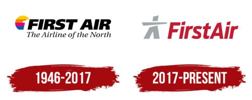
The company’s first emblem has a very romantic appearance. It features a circular sun painted with multicolored lines, sinking into the water’s surface. Horizontal stripes create a sense of rotation and flight, hinting at journeys available throughout the year and in various directions.
A bright striped ball is adorned with a white number 1, symbolizing leadership and priority. The number’s white color, resembling snowy fields, reflects the company’s choice of Canada’s most remote areas for its initial flights, presenting it as a pioneer.
Large black letters spelling out the name convey the carrier’s strength, courage, and reliability, which operates under harsh conditions. At the bottom of the logo, the “Northern Airlines” inscription highlights the company’s specialization in air transport to northern regions, where nature’s unique beauty and majesty prevail.
The emblem was introduced no earlier than 1973, as before that, the carrier was known by the name of its founder: Bradley Air Services.
2017 – today
The dominant element in the First Air logo is a gray figure of a person. This is a stylized Inuit – an image representing the indigenous people of North America. He is depicted in loose-fitting national clothing. His arms are widely spread as if he wants to embrace someone. This is a friendly greeting from the airline, showing a warm disposition towards customers. To the right is the company name, written as one word. To make its parts distinguishable, the designers made the first letter of each word uppercase, with the rest remaining lowercase.
The First Air logo features a gray figure representing an Inuit person, symbolizing the indigenous people of North America. The figure, dressed in traditional loose-fitting clothing, has arms spread wide, suggesting an embrace and conveying a friendly greeting from the airline. This highlights the airline’s warm and welcoming attitude towards customers. To the right of the figure is the company name, “FirstAir,” with the first letter of each word capitalized and the remaining letters lowercase.
The Inuit figure with outstretched arms symbolizes openness and hospitality, reflecting the airline’s dedication to providing a welcoming experience. The traditional clothing connects the airline to the cultural heritage of North America’s indigenous people.
The gray color of the figure adds neutrality and professionalism, balancing the friendly gesture with a sense of reliability and trust. Placing the company name to the figure’s right keeps the logo clean and organized.
The company name’s mixed capitalization enhances readability and adds a modern touch. This design choice helps distinguish the two parts of the name, making it easy to recognize and remember.


