


![]() Fisker Logo PNG
Fisker Logo PNG
The American company Fisker has a simple, serious logo. It corresponds to the automotive direction, appears to be a metalized print, and includes branded elements. This marking adds even more luxury to luxury cars, setting a new standard of technical sophistication. The stylish sign looks great even in exclusive salons.
Henrik Fisker was born in Denmark in 1963 and later studied at the Art Center College of Design in Switzerland. He worked at BMW and Ford, then led design at Aston Martin, where he created the DB9 and V8 Vantage. In 2005, Fisker left Aston Martin and, with Bernhard Koehler, founded Fisker Coachbuild in Newport Beach, California. The shop built 13 Tramonto cars based on the Mercedes-Benz SL and 2 Latigo CS cars based on BMW models before the 2008 financial crisis hit demand.
On September 5, 2007, Fisker and Koehler founded Fisker Automotive with Quantum Technologies and Kleiner Perkins Caufield & Byers. The Fisker Karma plug-in hybrid debuted at the Detroit Auto Show in January 2008. Tesla sued Fisker over Model S-related claims but lost in November 2008 and paid Fisker more than $1.1 million in legal costs.
Fisker raised over $1 billion in private funding, including money from Leonardo DiCaprio, and received a $528 million loan from the US Department of Energy in 2009. Karma production began at Valmet in Finland in July 2011. Recalls, A123 Systems battery failures, and Hurricane Sandy’s damage to 338 cars in Newark soon weakened the company.
In 2012, the Energy Department froze the loan at $192 million. Fisker left in March 2013, and Fisker Automotive filed for Chapter 11 on November 22, 2013. Wanxiang bought the assets in 2014 and renamed the business Karma Automotive. Fisker founded Fisker Inc. in 2016, went public via a SPAC in 2020, launched deliveries of the Ocean in 2023, and filed for bankruptcy on June 17, 2024.
Meaning and History
![]()
This brand was created to produce a hybrid electric vehicle, becoming almost the pioneer of this direction in the automotive industry. He was one of the first to make such a luxury car, which debuted at the North American International Auto Show in 2008. The Fisker Karma began shipping in its third year in 2011. The company produced about 2450 copies during its work, more than 2000 of which were successfully sold.
But then the enterprise began to experience interruptions in the supply of the main component – the charging battery, since its manufacturer went bankrupt. This happened in 2012. Then the firm decided to engage in the design improvement of Karmas, producing spare parts and equipment for cars at its Delaware plant.
What is Fisker?
Fisker is an automotive company that succeeded Fisker Automotive. It was founded in the United States in 2016 and announced the launch of the mass-market electric SUV Ocean in 2019. In 2022, the manufacturer began accepting orders for the new electric vehicle PEAR.
Two years later, it was taken over by the Wanxiang Group, which renamed it Karma after buying the manufacturing sites and the rights to the car, but not the brand. His name and emblem remained with the founder, Henrik Fisker. Having closed one company, he almost immediately founded a second, retaining the same name and logo. At the same time, the new structure of Fisker Inc. is a completely different organization with no affiliation with Fisker Automotive.
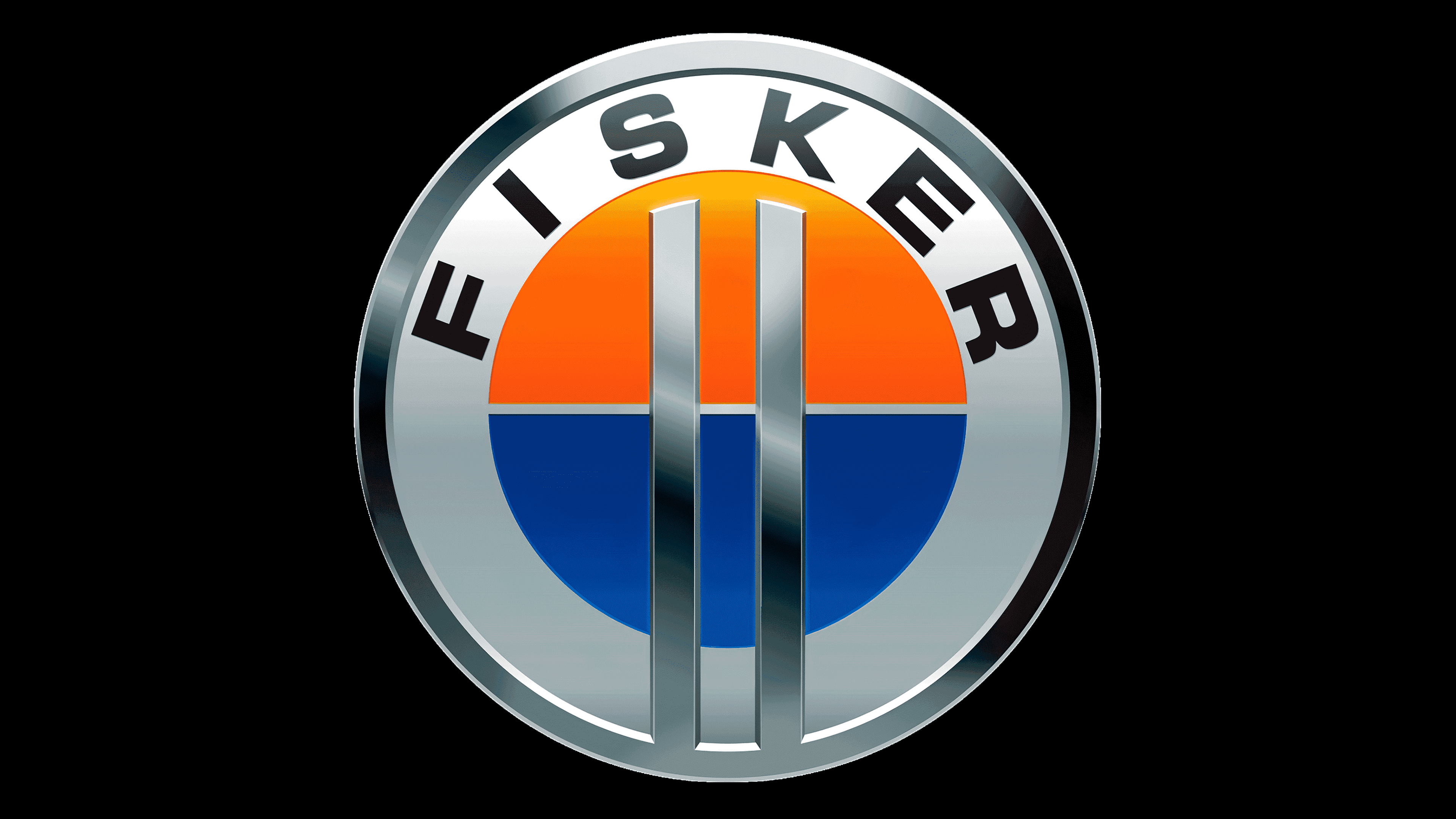
The basis of the American company’s identity was the classic rondelle. It was centered on the logo, with a clearly defined middle, a wide band around the edge, and a circular border. In the central part of the icon, there was a colored circle divided into exactly two parts: the upper half was orange, the lower half blue. Above them were two parallel, silvery vertical stripes. They started at the lower border of the badge and ended before reaching the edge of the orange area.
The middle was surrounded by a wide line of white and gray with a gradient transition. Above it was black lettering “Fisker” in block capitals. The word was curved in an arch and had a wide array of symbols. At the edge was a double bezel: the inner border was dark silver with distinct highlights, the outer one looked like a thin black stripe.
Font and Colors

For the Fisker logo, the designer chose a sans-serif typeface close to the classic. It was a bold typeface with wide letters, which was especially evident in the “S,” “R,” and “E.” They were elongated and looked larger than usual.
The corporate palette consisted of three colors: orange, deep blue, and silver in several shades – from graphite to gray-glossy. They made the emblem energetic and dynamic.