


![]() Five Finger Death Punch Logo PNG
Five Finger Death Punch Logo PNG
Each Five Finger Death Punch logo expresses the protest that characterizes the heavy metal genre. This way, the music group demonstrates its unconventional attitude towards life. Like the songs, the emblem is part of creative self-expression, but it uses bright visual imagery instead of powerful guitar riffs.
Five Finger Death Punch was founded in 2005 in Las Vegas, Nevada, by guitarist Zoltan Bathory, who combined aggressive thrash and hardcore punk influences with melodic heavy metal. Initially joined by Caleb Andrew Bingham, Jeremy Spencer, Matt Snell, and vocalist Ivan Moody, the group quickly gained recognition with their debut album, The Way of the Fist, which featured heavy riffs and powerful lyrics. They rose in popularity, touring with bands like Korn and Disturbed, and later released successful albums such as War Is the Answer and American Capitalist. Despite lineup changes, including the departures of Bingham, Snell, Spencer, and guitarist Jason Hook, the band remained resilient, producing chart-topping albums like Got Your Six and F8. Five Finger Death Punch frequently supports military veterans, as highlighted by their influential video for “Wrong Side of Heaven.” As of 2025, led by Bathory, the only original member remaining, they continue performing worldwide, solidifying their status in modern metal.
Meaning and History
![]()
The basis of most Five Finger Death Punch logos lies in the group’s name. It was inspired by a martial arts technique used by characters in the movie “Kill Bill Vol. 2”. However, in the original, this method was called differently: “five-point-palm exploding heart technique.” It is also mentioned in other older action films, but there, it’s more commonly known as the “dim mak” or “death touch.” In real life, fighters in hand-to-hand combat don’t use such a strike, although theoretically, it is possible: its basis is the medical concept of commotio cordis. This rare heart rhythm disorder sometimes occurs in baseball players after being hit in the chest by a ball flying with an energy of at least 50 joules and striking at the right moment of the heartbeat at a specific point.
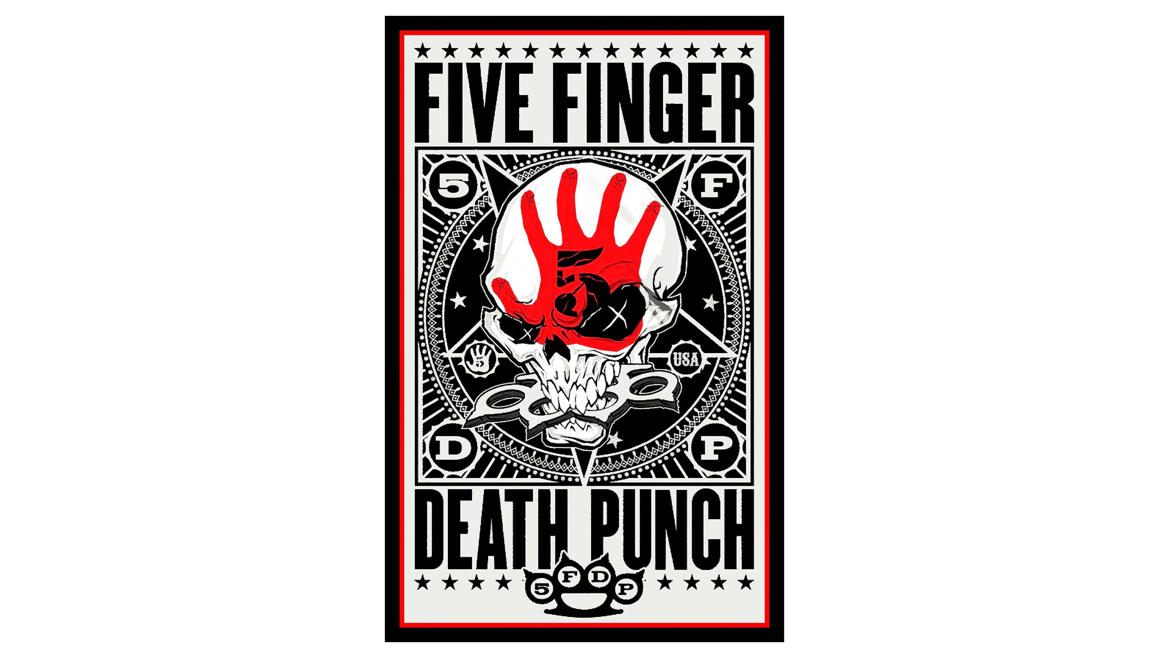
Guitarist Zoltan Bathory confirmed the history of the group’s name in an interview he gave a few months before the release of the debut studio album. Interestingly, its cover featured the wordmark “FIVE FINGER DEATH PUNCH” and an image of the mascot named Knucklehead. Its head resembles a skull with a red palm print, the number 5 on its forehead, and sharp teeth gripping a spiked brass knuckle. In 2018, it was revealed that World Class Fireworks had stolen this symbol and used it for the Inferno Punch set without permission. The full version of the 5FDP name is contained in several logos with different designs. They changed as new music albums were released.
What is the Five Finger Death Punch?
Five Finger Death Punch is a rock group that plays music in the genres of heavy metal, thrash metal, nu-metal, hard rock, post-thrash, and stadium rock. It was formed in 2005 in Las Vegas and released its debut studio album, The Way of the Fist, in 2007. The composition of the creative collective has constantly changed, so by 2018, the only remaining founding member of 5FDP was the original rhythm guitarist Zoltan Bathory.
2007 – 2009
![]()
This emblem appeared in 2007 when Preemptive Strike and The Way of the Fist were released. Here, the inscription “FIVE FINGER DEATH PUNCH” is split in half, with the first line tilted diagonally as if the words are skewed and slowly sliding downward. Each letter is in its cell, but its boundaries are blurred. The edges of the base are not perfectly straight; they have sharp serrations, protrusions, and height variations. At the very top is a brass knuckle, almost the same shape as the knuckle in Knucklehead’s teeth. Its round holes feature glyphs “5”, “F,” “D,” and “P.” For the group’s abbreviated name, designers used a font with rectangular serifs, and for the full version, a bold grotesque. The black-and-white color palette emphasizes the music’s seriousness and brutality.
2009 – 2011
![]()
The cover of the second studio album, War Is the Answer, featured a black-and-white Gothic-style logo. The words “DEATH PUNCH” are in Old English font, characterized by ornate letters with many sharp angles. It features intricate decorations, including spikes, hooks, and other elements, making the inscription more expressive. This part of the emblem is enlarged and arched.
Slightly above is the phrase “FIVE FINGER,” placed inside a black spot with long, sharp protrusions. Unlike the lower half of the text, it is designed in a contrasting serif font. At the top is a brass knuckle, with the number “5” and letters “F,” “D,” and “P” in its circular holes.
2013 – today
![]()
For the fourth album, The Wrong Side of Heaven and the Righteous Side of Hell, Volume 1, a completely new logo was created, executed in a bold sans-serif font. Because of this design, the text appears massive, and the narrow letter spacing enhances this effect. The small inscription “FIVE FINGER” stands on the huge phrase “DEATH PUNCH.” Both lines are painted in the same yellow gradient, creating a glossy metallic shine. The edges of the glyphs are highlighted in dark yellow lines and additionally outlined in thin black contours.
Font and Colors
The typography of the 5FDP name has frequently changed across different albums. The debut featured a bold, grotesque typeface similar to Bebas or Wearetrippin Display. In the following album, the design shifted to an Old English-style font with Gothic traits. Since 2013, the lettering has returned to a dense, compact sans-serif typeface resembling Impact URW D Bold Condensed. The thick letterforms create a strong contrast against the background.
![]()
The color scheme gradually evolved from the traditional black-and-white style typical of rock to more saturated tones. On the cover of the fourth album, the emblem features a yellow gradient combined with metallic surface effects that simulate wear and reflective highlights.