


![]() Flickr Logo PNG
Flickr Logo PNG
The Flickr logo states, “Amateur or professional, the portal is happy to see what your lens is looking at.” The emblem symbolizes photographers’ bright shots and indicates the importance of quality and high resolution.
Flickr began as a side product of a failed online game, not as a planned photo platform. In 2002, Stewart Butterfield, Caterina Fake, and Jason Classon founded Ludicorp in Vancouver to build Game Neverending, a multiplayer world inspired partly by Neopets. During development, the team added real-time photo sharing between players. When the game failed to find an audience, that feature became the business.
On February 10, 2004, Flickr launched at the O’Reilly Emerging Technology conference in San Diego. Digital cameras, blogs, and personal websites were growing fast, and users needed a public place to store and share images. In August 2004, Flickr added tags, photostreams, comments, favorites, and groups. Its tag system, known as a folksonomy, lets users organize large photo archives by meaning rather than by folders. Yahoo bought Ludicorp on March 20, 2005, for about $35 million. Under Yahoo, Flickr grew from 250,000 users to over 2 million in less than a year.
By 2007, Flickr was the world’s leading dedicated photo-sharing service. In 2008, Getty Images began selecting Flickr photographers for commercial licensing. The same year, Butterfield and Fake left Yahoo. Instagram, Facebook, and Google Photos then reshaped the market, pushing Flickr toward a smaller community of serious photographers. In 2017, Verizon acquired Yahoo and folded it into Oath. In April 2018, SmugMug bought Flickr, limited free accounts to 1,000 photos, and kept the service alive. In December 2022, SmugMug created the Flickr Foundation to preserve community photos for the long term.
Meaning and History
![]()
The United States did not originally own the web portal; it was developed by a Canadian specialist company based in Vancouver. Moreover, Flickr was built on tools created for Ludicorp’s multiplayer online game Game Neverending. However, the project turned out to be broader than the intended framework, so the computer game was postponed. The earliest versions of the service were reoriented to a chat called FlickrLive. He assumed the function of sharing pictures in real time. However, it was just a prototype of today’s service without integral tasks and a logo.
When the website’s precise focus emerged, the developers focused on the option to download and store user content. After improvements, the service began operating, offering all registered users a convenient way to post and embed their images on blogs and social networks. Then, many other useful features were introduced.
What is Flickr?
This is a site where you can post images and videos for later use as you see fit. It is considered one of the most popular photo hosting sites, offering storage, keyword search, and the ability to create interest groups. The service was launched in 2004 and became one of the first Web 2.0 projects. Smugmug currently owns it.
In the spring of 2005, Flickr was acquired by the American company Yahoo, which had acquired the Canadian company Ludicorp. Within a week, the new owner transferred all the files from the servers in Canada to his Internet platform in the United States. After monetizing the web portal, restrictions were introduced on the volume of uploaded photos and the duration of videos. In 2013, the site’s largest-scale redesign took place, but the logo remained the same. The changes did not affect him.
After a series of resales, Flickr became the property of SmugMug. This event is dated May 2019. After that, the owner transferred over 100 million accounts and content to the AWS (Amazon Web Services) platform. The procedure took approximately 12 hours. Today, photos and videos on the portal are available without registration, but you must create an account to upload them. The logo has remained the same for instant recognition of the Internet platform.
Font and Colors

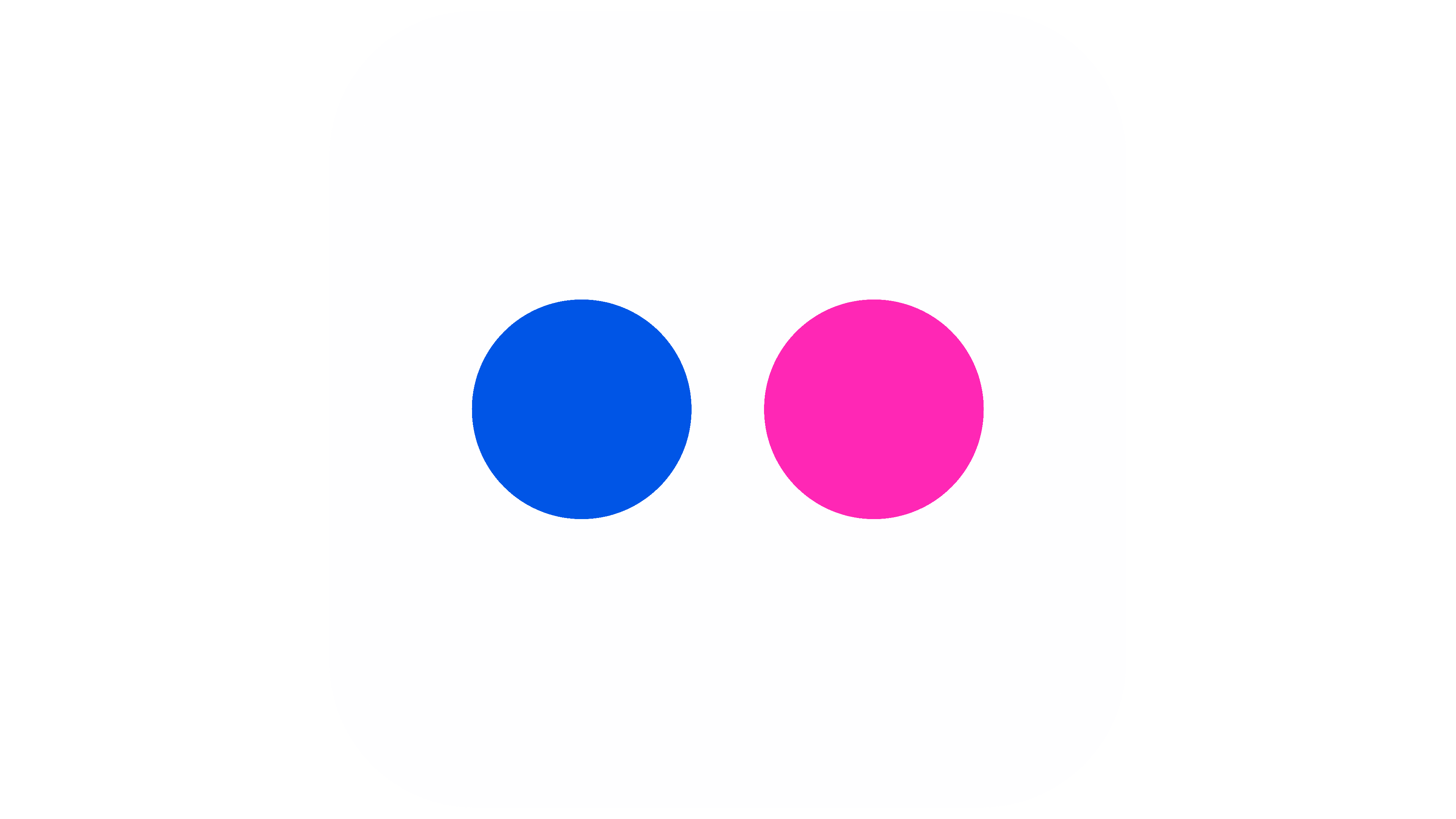
The service’s visual identity is conveyed vividly yet minimally. The stylish, modern icon consists of two parts and is often used separately as a stand-alone logo. The graphic contains two large dots that look more like colored circles. They symbolize the lens of a camcorder and a photo camera. The geometric shape on the right is colored neon pink; it is deep blue on the left.
The text is rendered in lowercase and divided into two color-coded sections: “flick” is blue, and “r” is pink. These are two branded shades of the Internet site. They represent creativity, passion, zeal, and professionalism. The fact that the gamut is rendered in bright colors demonstrates a positive attitude, a progressive approach, and a young spirit of the web service.
The Flickr logo uses a classic sans-serif typeface. It resembles Frutiger or Centuma Black with minor modifications (JC Design Studio developed the latter).
The signature palette includes two rich colors: pink, reminiscent of fuchsia (shade #ff0085), and bright blue, like a deep summer sky (code #0063dc).
FAQ
What is the symbol of Flickr?
The symbol consists of two circles: blue and pink. The blue circle symbolizes professionalism, trust, and reliability, while the pink circle symbolizes passion and creativity. These attributes are essential for a platform where users share photos and interact with the community.
The design is simple and versatile, making it recognizable across digital and print media. The two colors help the symbol stand out, making the brand distinct.
The balance of the two circles represents the harmony between technical excellence and creative freedom. This design reinforces the brand’s personality, creating a strong visual connection with users.
Is Flickr a social media platform?
Yes, it is a social media platform. It allows users to upload, share, and discover photos and videos. Users can follow others, like and comment on posts, and join interest groups. The brand is known for its community of photographers and enthusiasts who interact and collaborate.
The platform has features to enhance the social experience. Users can organize photos into albums and collections, making it easier to share specific sets of images. The platform supports tagging, helping users categorize their photos and make them searchable.
Does Flickr still exist?
Yes, the brand still exists. It is a platform for uploading, sharing, and searching for photos and videos.
The brand was once very popular and known for its active photography community. People from all over the world shared and discussed images, creating a thriving environment. The site is still operational, but not as popular or active as it was at its peak. Despite this, the brand continues providing services to those who value quality photo sharing and a dedicated photography community.
What does the Flickr logo mean?
The logo consists of two multicolored circles resembling camera lenses, conveying the platform’s focus on photo and video hosting. The circles represent image capture, the platform’s main function.
The color scheme is blue and pink. Blue signifies trust, reliability, and professionalism, demonstrating the brand’s commitment to a trusted platform. Pink symbolizes passion, creativity, and innovation, important qualities for photographers and artists who use this service.
The logo combines these elements into a simple and meaningful design. It reflects the technical side of photography and the community’s creative spirit. It is easily recognizable and reflects the brand’s values.
What is the logo of Flickr?
The logo consists of two parts. The first part is the word “Flickr” written in lowercase sans-serif letters. The text is blue for “flick” and neon pink for “r.” This color choice emphasizes the brand’s modern and creative personality.
The second part of the logo consists of two symmetrical circles above the inscription. These circles correspond to the text’s colors: one is blue, and the other is neon pink. The circles resemble camera lenses, indicating the platform’s focus on photo and video hosting.
Logo elements, wordmarks, and circles can be used together or separately, providing branding flexibility. The design is simple yet distinctive, making it easy to recognize and remember.
What is the font of the Flickr logo?
The logo uses the Frutiger font, designed by Adrian Frutiger for Charles de Gaulle Airport in Paris. This bold sans-serif font is clear and easy to read from a distance, making it ideal for signage.
Its clean lines and modern appearance have made it popular for a range of applications, from corporate branding to public signage. The font is known for its versatility and legibility, which is why designers and brands prefer it. The font selection enhances the logo’s visual appeal and effectiveness, helping create a strong, recognizable brand that attracts users.