“If you’re going to a service, open your bag wide,” advises the Flipkart logo. Finding the necessary thing on the platform is easy and simple, and you can make a purchase instantly. The logo demonstrates significant time savings through online ordering.
Flipkart: Brand overview
| Founded: | 2007 |
| Founder: | Sachin Bansal, Binny Bansal |
| Headquarters: | Bangalore, Karnataka, India |
| Website: | flipkart.com |
Meaning and History
Started as a small, limited online store, Flipkart has expanded year after year until it has become a serious competitor to Amazon. It now also includes a mobile payment service that operates under the same logo as the parent company. And she has two of them, and both are related to the topic of sales.
What is Flipkart?
It is an Indian commercial company and its virtual marketplace. The online service appeared in 2007 and initially focused on books, but it has overhauled its range over time. Its founders are Sachin and Binny Bansal. The brand is now owned by the Walmart chain of stores, which owns more than half of the shares. The headquarters is located in Bangalore (Karnataka).
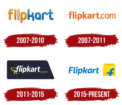
2007 – 2010
The very first Flipkart logo contained the name of this company. It was done in a custom bubble font with rounded corners. The word used lowercase glyphs, with the “i” replaced by a white exclamation mark with orange outlines. The first half of the inscription (“f”, “l”, “p”) was bright orange, and the second (“k”, “a”, “r”, “t”) was blue with a slight gradient.
2007 – 2011
In 2007, another logo appeared – this time with the company’s name, after which there was a point and the domain name “com” was indicated. The part of the lettering up to the dot was bolder because the designers wanted it to stand out. The letters had rounded corners and slanted edges. The main color is bright orange.
2011 – 2015
Initially, the logo depicted a stylized grocery cart used in supermarkets. A handle is drawn on the left, as well as two wheels. On the right is the online store’s e-mail address (domain “.com”), which makes the logo advertising-informative. In the middle is the full name of the commercial site in lowercase characters – “Flipkart.”
To form the shape of the grocery basket, the designers used the letter “f.” They bent the leg to the left, and the result is the bottom element where the wheels are attached. Long and short strokes under the label convey forward movement. All elements are located on a horizontal rectangle with a cut off the right corner, which adds even more dynamics to the logo.
2015 – today
The current version consists of two details: the name of the retail chain and the grocery package’s images, which are usually issued at the checkout. The designers placed the word “Flipkart” on the left side and radically changed their font.
On the right side of the logo is the top half of the bag with a hanging handle. On a yellow background, there is a lowercase “f” with the bottom cut off. She has a blurred horizontal stroke, which gives her originality and perfectly reflects the dynamics of movement. Outwardly, this symbol is very similar to the Facebook icon: the same rounded and smooth lines, except for a slight tilt.
Flipkart: Interesting Facts
Flipkart is a leading e-commerce giant in India, known for its rapid growth and innovative approaches.
- Beginning: In 2007, Sachin Bansal and Binny Bansal, both alumni of IIT Delhi and former Amazon employees, started Flipkart. The company initially focused on selling books online before expanding into various other categories.
- Introducing Cash on Delivery: It was one of the first in India to offer Cash on Delivery (CoD), gaining trust among customers who were hesitant about online payments.
- Big Billion Days Sale: Known for its massive annual sale event, “Big Billion Days,” Flipkart offers huge discounts, attracting millions of shoppers.
- Walmart’s Acquisition: In 2018, Walmart bought a major part of Flipkart for $16 billion, one of the biggest e-commerce deals worldwide. This deal highlights Flipkart’s value in the Indian market.
- Logistics Innovation: Facing India’s unique logistical challenges, Flipkart developed its logistics arm, Ekart, to ensure timely deliveries across numerous locations.
- Flipkart’s Brands: The company introduced brands like MarQ and SmartBuy, offering electronics, appliances, and consumer goods at competitive prices.
- Tech and AI Investment: Flipkart invests in technology, AI, and data analytics to enhance customer service, streamline its supply chain, and tailor marketing efforts, keeping it competitive.
- Eco-Friendly Efforts: Committed to sustainability, Flipkart uses electric vehicles for deliveries and eco-friendly packaging to lessen its environmental impact.
- Empowering Small Businesses: Flipkart’s marketplace helps thousands of small and medium businesses in India access a broader market, boosting the digital economy and job creation.
- Focus on Digital Payments: In 2016, Flipkart bought mobile payments company PhonePe, boosting its role in India’s digital payment scene and enhancing its ecosystem.
Flipkart’s rise from a simple online bookstore to an e-commerce powerhouse mirrors the evolution of India’s digital market and its significant influence on the nation’s online retail sector.
Font and Colors
Both logos are based on the name and trade theme, expressed in different elements. If earlier it was associated with a grocery cart, now the emphasis has shifted to a shopping bag for shopping. In both the first and second versions, the designers kept the same palette by simply rearranging the colors.
The 2015 emblem uses the Riona Sans Bold Italic typeface by Mika Melvas. The “r” has a third of the cap removed, “l” has a lower element added as if it were a lowercase letter, and “p” and “a” have oval gaps. Simultaneously, the original logo was in Dundee RR Condensed Extra Bold by designer Pat Hickson.
The color of the logo is stable because almost the same range is presented in both the debut and the current versions. The current emblem uses a selection of colors from Vivid Orange Peel, Banana Yellow, and True Blue, which were combined by Keshav Naidu.
FAQ
What is the font used in the Flipkart logo?
The logo uses Riona Sans Bold Italic, which has been modified to fit the logo’s design. The modifications include rounding the sharp corners and curving the upper cross stroke of the “k.” These changes give the logo a unique and distinctive look while keeping Riona Sans’s clean and modern style.
Using Riona Sans Bold Italic helps create a strong visual uniqueness for the brand. The bold and italicized letters convey dynamism and energy, reflecting the brand’s vibrant and forward-thinking nature. The rounded corners and curved elements add friendliness and approachability, making the logo appealing to a wide audience.
What is the brand color in Flipkart?
Flipkart’s primary brand colors are blue and yellow. Blue is consistently used on the top header across all platforms, providing a recognizable and cohesive look. This shade of blue conveys trust, reliability, and professionalism, key aspects of the brand’s identity.
Yellow is used to draw attention to notifications and hover actions. This bright and vibrant color grabs attention and highlights important information.
What does the Flipkart logo mean?
The logo reflects trade and commerce. It features a package symbolizing the products available for purchase and the site name in the modern Riona font. The large “F” with a bar-shaped crossbar highlights the dynamic buying process, suggesting speed and efficiency.
The logo uses yellow, blue, and white. Yellow grabs attention and suggests positivity, blue conveys trust and reliability, and white adds clarity and simplicity. These colors create an inviting and professional image.
Who is designing the Flipkart logo?
The brand’s design team, which included Umbrella Design professionals, created the modern logo. They aimed to design a distinctive and versatile logo that works well across different media platforms, from desktops to billboards.
Keshav Naidu was crucial in choosing the color palette and making the logo vibrant and appealing. The design team and Umbrella Design ensured that every logo element, from its shape to its colors, would stand out and be easily recognizable.
