


![]() Foo Fighters Logo PNG
Foo Fighters Logo PNG
Foo Fighters’ logo changed simultaneously with the release of new albums and appeared on their covers because it is the group’s main “visiting card”. In all cases, an inscription based on the rock band’s name was used as a symbol because the designers focused on it.
Foo Fighters began in October 1994, when 25-year-old Dave Grohl booked Robert Lang Studios in Shoreline, Washington, for six days. After years in Nirvana and Kurt Cobain’s death, Grohl recorded alone, playing drums, guitar, bass, and vocals. The sessions were personal rather than commercial, with no plan for a public release.
The tape reached other musicians and labels, but Grohl kept control by creating Roswell Records. The project name came from World War II pilot slang for unidentified flying objects. Foo Fighters’ debut album was released through Capitol Records on June 26, 1995, in the United Kingdom and on July 4 in the United States. Within months, it was certified platinum.
A full band followed. Grohl brought in William Goldsmith and Nate Mendel from Sunny Day Real Estate, plus Pat Smear, formerly of The Germs and a touring guitarist for Nirvana. During work on The Color and the Shape, Goldsmith left, and Grohl rerecorded the drum parts. Taylor Hawkins, who had toured with Alanis Morissette, joined as drummer. The 1997 album, led by “Everlong” and “Monkey Wrench,” placed the band among the major post-grunge acts of the period.
The lineup later included Chris Shiflett, Smear’s return, and keyboardist Rami Jaffee. Albums such as One by One, In Your Honor, Wasting Light, Sonic Highways, and Concrete and Gold kept the group active through the 2000s and 2010s. Wasting Light won a Grammy for Best Rock Album, and in 2021, Foo Fighters were inducted into the Rock and Roll Hall of Fame. Hawkins died in Bogotá on March 25, 2022. Josh Freese joined in 2023, but Here We Are followed that June, and in 2025, Ilan Rubin replaced Freese.
Meaning and History
![]()
The name Foo Fighters was chosen quite by accident and, as Dave Grohl later admitted, was not very successful. The fact is that the former Nirvana drummer did not originally plan to create a band. He just wanted to record an album of the songs he managed to compose during his time in the cult grunge band. The musician did not show these lyrics to anyone because he was unsure of their quality. After the collapse of Nirvana, he decided not to pursue a career as a drummer but to release his own 15 songs. He had to perform all the vocals and play almost every instrument to avoid involving anyone in the project. For complete anonymity, Dave did not mention his name on the cover. Instead, he called the album Foo Fighters, hoping the plural would make listeners think a whole group of musicians worked on the songs.
The phrase “foo fighter” is a term used during WW2 to refer to UFOs flying over a war zone. After the first album’s success, the name was moved to a rock band formed by Dave Grohl. As the former Nirvana drummer later admitted, if he had planned to form a band in advance, he would have chosen a completely different name. But the Foo Fighters logos changed constantly, and each time they were wordmarks with a different design. The modern version first appeared on the sixth album, Echoes, Silence, Patience & Grace, released in 2007.
What is Foo Fighters?
Foo Fighters are a rock band that used to be just one man, Dave Grohl. Then several other talented musicians joined the former Nirvana drummer. They live in the USA and play pop rock, hard rock, grunge, and alternative music. The band members achieve an interesting sound by combining heavy and melodic elements.
1995 – 1997
![]()
For the Foo Fighters’ debut album, a simple black logo was created that represented both the band’s name and its musical style. The phrase is set in a straight, thin-serif font. Its size is reduced due to very wide letter spacing.
1997 – 1999
![]()
In 1997, the rock band released an album called The Color and the Shape. Its cover was decorated with a bright red inscription “Foo Fighters.” For the design, the designers used a handwritten-style font: Boxer Script JF by Jason Anthony Walcott. This is a right-handed retro typeface with horizontal strokes connecting adjacent letters within words.
2002 – 2005
![]()
In 2002, the fourth album by the American group One by One was released. At the same time, a new logo appeared that also included the phrase “FOO FIGHTERS.” In this variant, all letters were black and capitalized. The lower ends of “F,” “I,” “H,” “T,” and “R” were sharp, like nails or daggers. The jittery, unevenly thick lines gave the impression that the glyphs had been drawn with a fine brush.
2005 – 2007
![]()
The cover of the fifth album, In Your Honor, featured an arched inscription “FOO FIGHTERS.” The retro style of the logo is evident in the antique font, characterized by ornate protrusions at the edges of the glyphs. Due to the abundance of decorative elements and the pale gray color of the letters, they lose their sharpness, and the dark gray shadows further blur them.
2007 – 2011
![]()
The debut of the sixth album, Echoes, Silence, Patience & Grace, in 2007 was marked by the appearance of a new wordmark, “Foo Fighters”. Now it is not a deep black but dark gray, divided into two lines with left alignment. Both parts of the logo use the same stylized font with bold strokes and very narrow letter spacing, making the two “O”s shaped like coffee beans. The glyphs look massive and disproportionate.
2009 – 2015
![]()
This wordmark was used in two albums: Saint Cecilia EP and Greatest Hits. It stands out from other emblems with its internal energy, reflected in several horizontal lightning bolts. One harmoniously connects to the “G,” while the other replaces the middle stroke in “E.” Two more short zigzags cross the letters “O,” making them look like cracked glass.
2011 – 2014
![]()
The album Wasting Light was graced with a bright red logo, a color that conveys a wide spectrum of emotions. The font, on the other hand, looks standard: a straight geometric grotesque, vertically elongated. All letters are uppercase and have the same thickness. The only memorable feature is the exaggerated horizontal strokes.
2017 – 2021
![]()
While the Foo Fighters had previously used only their full name in their logos, in 2017 they broke this tradition by adorning the cover of Concrete and Gold with a stylish monogram. Two uppercase “F”s in dark gold form a diamond, divided in the center by a thin white line. Inside the quadrilateral are two parallel stripes, making it resemble a pause button on a music player.
2021 – today
![]()
For the album Medicine at Midnight, a wordmark with the black inscription “FOO FIGHTERS” was created. The phrase is divided into two lines, aligned to the left. Designers chose a modern, bold sans-serif font, similar to Watchmen Regular by SpideRaYsfoNtS. It features massive, vertically elongated letters.
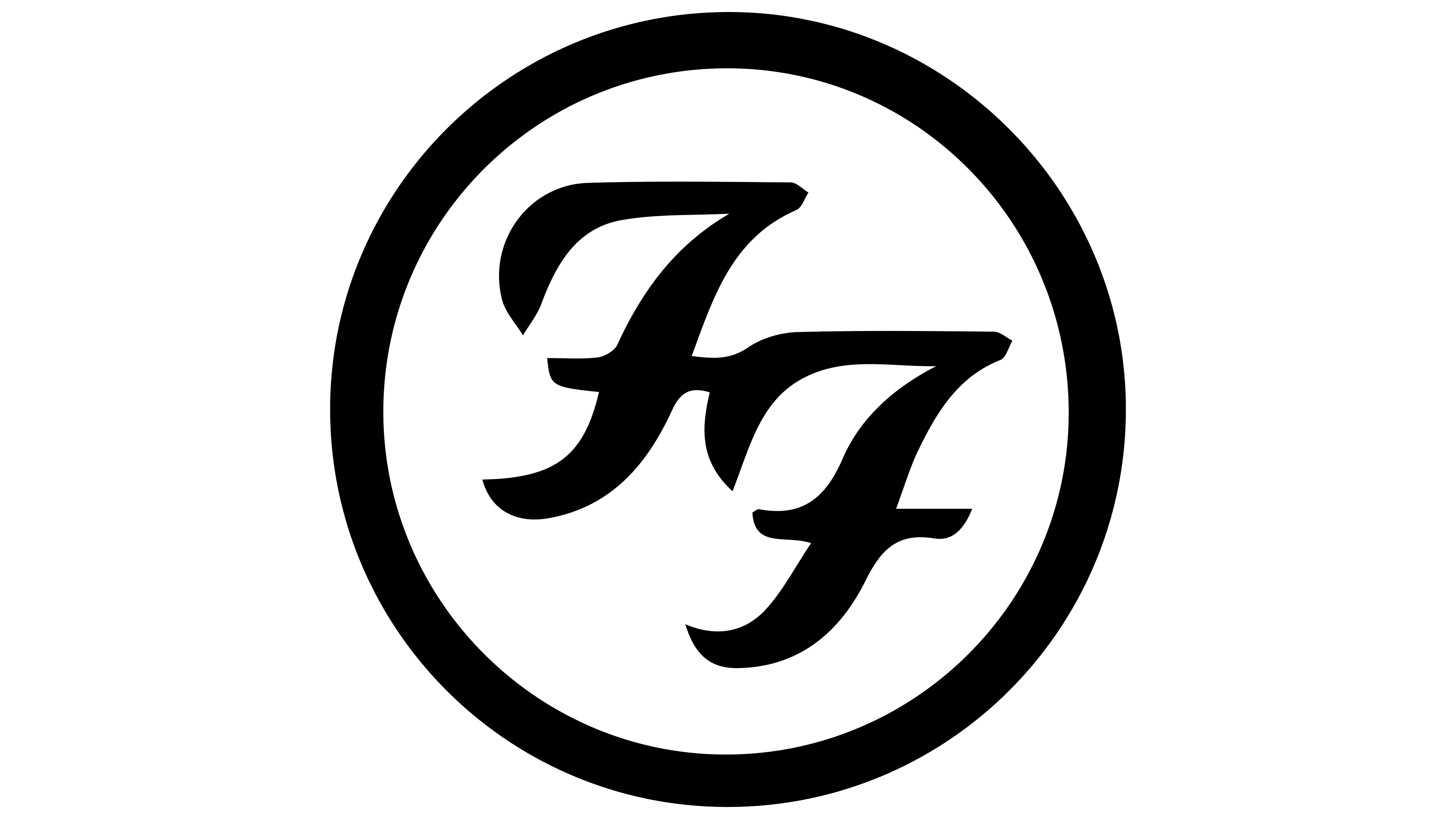
1998 – today
![]()
One of the band’s most famous emblems is the image of two stylized “F”s within a burgundy circle. The letters resemble two sevens and are positioned at an angle. Both parts of the monogram are painted black, with a white outline each. The outer frame of the logo also uses a black-and-white palette, with the colors alternating across four rings of varying thickness.
Font and Colors

Throughout the rock band’s history, Foo Fighters’ album covers have been adorned with inscriptions in various styles, from retro to futuristic. It was a demonstration of the musical group’s individuality, a symbol of creative search and inspiration. Since 2007, the wordmark has become visually heavier, as if its creators were compensating for the excessive thinness of the letters in the 2002 emblem.
The font of the Foo Fighters logo changed over time because the band used different spellings of their name.
In 1997, it was Boxer Script JF, or something similar, in italics, styled to look handwritten. In 2002, the letters became thin and uneven, as if they had been painted with a brush. In 2007, a version of the wordmark appeared, set in an individual typeface with massive letters that lack intra-letter gaps in the classical sense.
For some elements of the group’s logo, the Foo Fighters used the Kabel Black font, created in 1927 and now one of the world’s most famous fonts. Font Kabel Black belongs to the grotesque (Grotesque) family, characterized by a simple, minimalist form. It has clear lines and a recognizable geometric shape.
In the color scheme, there was a transition from red to black and then to dark gray.