


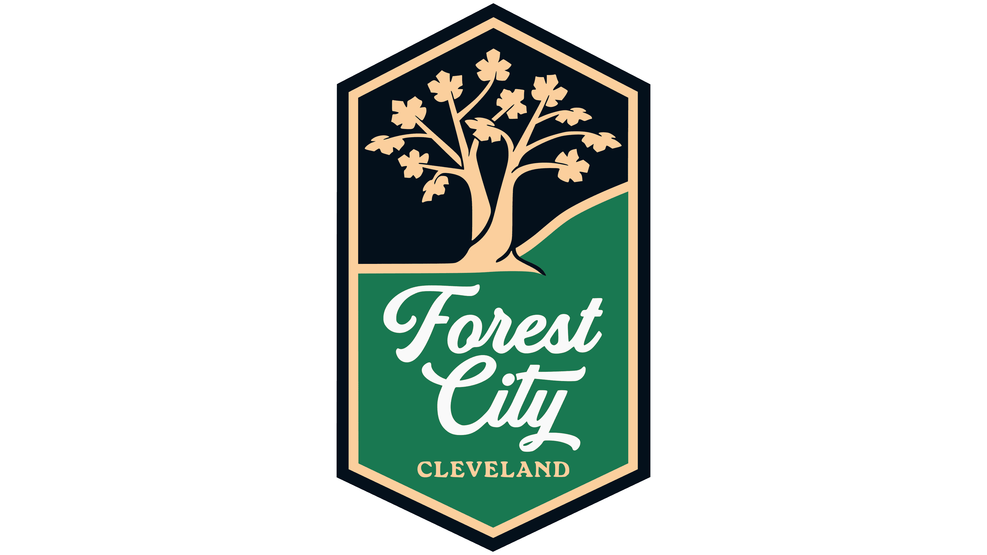
Forest City Cleveland introduced an identity connected to Cleveland, its history, and local symbols. The new men’s professional soccer club unveiled the brand on March 10, 2026, ahead of its MLS NEXT Pro debut in the 2027 season. The name Forest City comes from an old nickname for Cleveland. The abbreviation FC connects it with soccer.
The club’s image was created together with city residents. More than 3,000 people took part in the process, including players, families, longtime supporters, and new fans. Through surveys, interviews, and focus groups, the team sought a mark connected to Cleveland, Northeast Ohio, soccer culture, and the memories of different generations. The club wanted to look like part of the city.
The identity is based on a vertical crest. Its tall shape recalls classic soccer badges. The double hexagonal frame refers to Cleveland’s Art Deco architecture and the Guardians of Traffic. Inside the crest is an American sycamore from Cuyahoga Valley National Park. It is known as the Die Hard Tree. The tree is more than 350 years old. It is older than Cleveland, which was founded in 1796, and belongs to the Moses Cleveland trees. Its story became the club’s main symbol. After crown damage, the trunk with a heart-shaped hollow survived and grew new branches. For Forest City Cleveland, the tree is connected to the city’s memory, difficult periods, and the growth that followed.
The tree in the crest is rendered in gold. Its form includes references to Art Deco, old botanical illustrations, and the Tree of Life. The twelve sycamore leaves are connected with the players on the field and the community around the team. The roots along the shoreline recall the Cuyahoga River and Lake Erie. The natural imagery becomes a soccer badge rooted in local history.
The Forest City name sits on the lower green section of the crest. It is set in a large handwritten style. Cleveland appears below it. The overall feel is warm, urban, and slightly vintage. In mood, the club is closer to a team with local heritage than to a standard sports franchise.
The colors are tied to the region. Forest City Green recalls Cleveland’s trees and the Emerald Necklace park system. Lake Erie Midnight is connected with the night sky above Lake Erie. Golden Era adds a warm architectural accent, evoking the Colonial Arcade, the Guardians of Traffic, and the Terminal Tower. Together, the three colors connect the crest with nature, water, architecture, and the city’s industrial memory.
The logo signals a new team and serves as a compact map of Cleveland. For Forest City Cleveland, the identity became a way to present the club as a team grown from the city and aimed at future supporters.