The Formica logo captures the essence of the company: producing composite materials. Everything is subject to this concept—the glyphs, the composition, and the palette. Together, they form an atmosphere of care for the work, a professional approach, originality, and high quality. Although the main elements of the mark are classic, they reflect the personality of the brand, its integrity, and confidence in the growth of production capacity.
Formica: Brand overview
Formica is a line of composite materials from the Formica Group. This laminate is considered one of the most common in the world, and for a good reason: it can be seen in homes, offices, school buildings, hospitals, and other facilities in most countries—branded HPL panels clad surfaces, including countertops, furniture, walls, and interior doors.
Formica, established in 1913 by Daniel O’Conor and Herbert Faber in Cincinnati, Ohio, has become a key player in high-pressure laminate (HPL) surfaces. Originally making electrical insulation materials, Formica shifted gears in 1927 to produce HPL surfaces. The brand name, hinting at the toughness of ant exoskeletons, became known for its durable, easy-to-clean laminates, becoming essential for countertops and furniture by the mid-20th century.
Embracing the mid-century modern design trend, Formica introduced new patterns and textures in the ’50s and ’60s and continued to innovate with products like post-forming and compact laminates. Acquired by Fletcher Building in 2007, Formica expanded its global reach and product range, maintaining its status as an HPL industry leader with a wide selection of homes and businesses.
Formica is committed to sustainability, focusing on eco-friendly practices such as using recycled materials and creating low-VOC products. Its legacy continues as Formica products enhance spaces from kitchens and bathrooms to commercial interiors and furniture, remaining synonymous with durability, versatility, and innovative design.
Meaning and History
Production of Formica laminate was established in 1913. Still, it was not a familiar-facing material but a substitute for mica for electrical insulation. Hence its name: “For” plus “Mica.” It is consonant with the name of wood ants, from the acid from which scientists extract a special substance to manufacture resin. However, it is melamine resin, part of the classic Formica product.
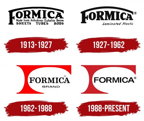
The brand name was present in all four logos. First, the designers played with the first letter “F,” turning its top line into an arch. Then, they made the word “Formica” solid and placed it to the right of the anvil shape. It is believed that Raymond Loewy invented this element.
What is Formica?
Formica is the name of the laminate and the company that makes it. The product is a multilayer material consisting of kraft paper with a special resin impregnation. HPL panels are manufactured by one of the Dutch group Broadview Holdings divisions.
1913 – 1927
The history of Formica began in 1913 when Herbert A. Faber and Daniel J. O’Conor patented a special composite material that was later used as a laminate for surface cladding. The visualization of the Formica Products Co. logo from 1913 recreates the vintage style of the early 20th century. At the top of the image is the word “FORMICA,” where the letter “F” is made in the shape of an arch, and the remaining letters are placed below it, aligned in a row. Directly under the company name is the phrase “Made from Anhydrous Bakelite Resins,” highlighting the uniqueness of the materials used. At the very bottom of the logo are the words “SHEETS TUBES RODS,” indicating the range of products. All inscriptions are black on a neutral background, giving the logo a classic and refined appearance.
1927 – 1962
In the 1930s, the designers made the company’s name more pronounced. To do this, they increased the arc’s curvature from the “F” and extended the rest of the letters vertically. All other inscriptions were removed and replaced with the italic phrase “Laminated Plastic,” aligned to the right.
1962 – 1988
An unusual design appeared on the trademark logo called the “anvil.” It was a stylized letter, “F,” with many horizontal lines. It looked like an archway. Beneath its arched part was the name of the laminate line, written in serif type. Even lower, the designers placed the word “BRAND” without serifs. The phrase “laminated plastic” has been moved to the bottom and aligned to the left. In this version, she became a little flattened.
1988 – today
In the mid-1970s, the designers improved the logo, retaining only the arched structure and the brand name. They removed extraneous inscriptions to focus on the capital letter “F.” In the current version, its drawn part is not striped, as before, but completely painted over in red. The word “FORMICA” no longer has serifs and uses a simple Helvetica-like font.
Font and Colors
The base of the logo is formed from two ovals of different sizes. One of them (the smaller one) is on the left and is located vertically, and the second (large) is placed on the right and flipped horizontally. You can’t see these hidden ovals because they only create the silhouette of the red “F.”
The Formica brand name has traditionally been written in a bold serif typeface. Only after the 1970s were these serifs removed. Judging by the shape of the glyphs, the logo creators used a Helvetica modification. To emphasize the visual harmony of the inscription and the geometric figure in the form of “F,” they chose the most attractive combination of colors: red, black, and white.
FAQ
When did Formica become popular?
Formica became very popular in the 1940s and 1950s when the economy was booming, and new designs and materials were in high demand. People loved Formica because it was affordable, looked good, and was easy to keep clean. It fits perfectly with the desire for modern, low-maintenance materials for homes and public places.
What made Formica stand out was its versatility and quality. It had a modern style with smooth lines and came in many patterns, colors, and finishes that imitated more expensive materials. This made it a great choice for kitchen counters, tables, and other surfaces without the high cost or need for constant upkeep.
Because it was durable and easy to clean, Formica was used everywhere, from homes to diners. This shows the optimism of the time and a move towards a more modern, consumer-focused society. Its practicality and good looks made it a favorite choice for many.
Why is Formica called Formica?
“Formica” originated in 1913, when Daniel J. O’Conor and Herbert A. Faber discovered they could use high-pressure plastic resins to make electrical parts. This was a big deal because it offered an alternative to mica, a material commonly used for electrical insulation but hard to get and expensive.
O’Conor and Faber wanted a synthetic option that worked like mica without problems. They succeeded, which was a big step forward in developing new materials. They decided to call their invention “Formica,” indicating it was intended to be used instead of mica. The name pointed out its purpose as an alternative and its benefits as a synthetic, versatile product.
This smart choice of name showed their aim to make a more accessible and practical material than natural mica. Over the years, Formica became much more than just an insulation material. It’s now widely used for decorative and structural purposes, especially for surfaces. The name “Formica” has grown to represent durability, flexibility, and innovation, keeping its historical significance while being used in many more ways than its inventors first thought.
What font is the Formica logo?
The Formica Group logo uses a special version of the Helvetica font. Helvetica, created in 1957 by Swiss designer Max Miedinger, is known for being clear, simple, and timeless. It fits well with the Swiss design style, which likes things to be neutral and practical. Because of this, Helvetica is great for many uses, like company logos and signs, thanks to its easy-to-read and flexible nature.
Choosing a custom Helvetica for the Formica logo shows the brand values clear and functional design, just like their products. This special tweak to the Helvetica font gives the Formica logo a unique look but keeps the font’s easy readability and simplicity.
This approach is part of a bigger trend where companies use familiar fonts like Helvetica but add their touch to stand out. For Formica, using a customized Helvetica matches its history of innovation and its reputation for making durable, high-quality materials for different uses.
Do you capitalize Formica?
Yes, the word “Formica” should always be capitalized because it’s a registered trademark for a specific type of laminate product made by the Formica Corporation. Trademarks are like special names, and using capital letters helps clarify that we’re talking about something specific, not just any laminated product.
Even though it’s a rule to capitalize it, you might notice “Formica” written without a capital letter in texts or chats that are more casual, like when people are talking online or sending messages to friends. This happens because sometimes brand names get used so much that people use them as ordinary words to describe similar items. But, when it comes to official writing, such as in ads, reports, or any professional documents, it’s important to capitalize “Formica.” This shows respect for the brand’s rights and ensures everyone understands we’re talking about a special product from the Formica Corporation, not just any laminate.
