The desire to stand out among competitors formed the basis for Foster’s Beer’s visual identity. Its conciseness and brightness of color distinguish the Foster logo. The informality of the informative symbol’s execution ensured brand recognition.
Foster: Brand overview
| Founded: | February 1889 |
| Founder: | William M. and Ralph R. Foster |
| Headquarters: | Australia |
| Website: | fostersbeer.com |
Meaning and History
The Foster logo is an excellent example of the use of contrasting colors. The brand’s color palette includes iconic blue, gold, and bright red. The recognizable red letter “F” is in a golden circle. The serrated “F” symbol has oblique crosses and a white outline. After the last change, the word “Melbourne” appeared inside the circle and in other places on the packaging.
The brand aims to stand out better on store shelves, and Foster effectively uses the large letter “F,” underscored on the main label of the bottle and the neck so that it can be easily recognized from a distance. The Foster logo is modern and bright, with an informal and informative character. It has a symbolic representation, and you can innovate using only the most important for your brand – a strong circle of personality.
What is Foster?
Foster is the informal name of the brand Foster’s Lager, under which light beer is produced. Worldwide, it is the best-selling beer brand in Australia, while at home, it is not in high demand. The brand is owned by Carlton & United Breweries, which has belonged to the Japanese company Asahi Group Holdings, Ltd since 2020.
1889 – 2001
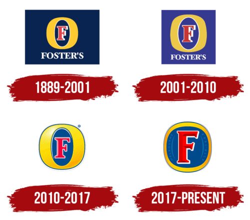
The early logo of the Foster’s beer brand set the tone for all subsequent ones. It contained a red letter “F,” outlined with a white contour of uneven width, and was in a dark blue oval. This oval served as the inner letter space for the large yellow letter “O,” which, in turn, served as a decorative frame for the “F.” The form of “O” was not perfect: overly broad protrusions on the right and left combined with thin lines at the top and bottom. Below the symbol was the white inscription “FOSTER’S” with noticeable serifs. The spacing between some glyphs was so narrow that they merged. A huge dark blue rectangle stretched vertically was used as a general background.
2001 – 2010
After the redesign, the sides of “O” became even wider, and the bends were not as smooth as before. This allowed for increasing the inner letter gap and the red “F” located in it. In turn, the lower inscription “FOSTER’S” was reduced so that its length visually corresponded to the size of “O.” The rectangular base acquired a square shape. But most of all, the colors changed: the designers made the dark blue lighter and dustier, the red darker, and the yellow paler.
2010 – 2017
In 2010, a new visual style for the Foster’s brand was introduced a year before the conglomerate SABMiller acquired the product line. The redesign can be called radical, as familiar elements acquired an unusual three-dimensional look and more premium, emphasizing the Australian heritage of the brand. The logo demonstrated warmth, lightness, informality, and joy. With a bright yellow gradient, white highlights, and orange inclusions, the letter “O” resembles the sun, associated with light, progress, and positivity.
Without the square base, “O” turned into a real golden medallion. At the same time, its shape was corrected so there were no disproportionately protruding sides. The inner blue oval became brighter. The red letter “F” acquired a rich raspberry shade and an even white outline. The new logo was created by designers at BrandMe under the leadership of Creative Director John Wynne. It started being used in 2010 on all bottles, cans, branded glasses, and secondary packaging.
2017 – today
In the spring of 2017, Foster’s beer received a modern emblem. This was the result of cooperation with the branding agency VBAT, located in Amsterdam. Nothing was left of the letter “O” – only a narrow yellow stripe around the edge, slightly widening at the top and bottom. Its warm orange-honey gradient looks fresh and positive. Most of the logo is occupied by a dark blue circle with an irregular shape with the letter “F.” The letter has significantly increased and seems voluminous due to the “ribbed” surface formed by different shades of red. To the left of it is the light blue word “MELBOURNE,” and to the right is “ESTD. 1888.” They are located on the side and separated from the letter “F” by long, thin arches.
Foster: Interesting Facts
Foster’s Lager is a famous beer that started in Australia but is loved by people worldwide.
- Started in Australia: In 1888, two brothers from America, William and Ralph Foster, started making Foster’s in Melbourne, Australia. They brought new ways to brew beer, like using cold air to keep it fresh, perfect for Australia’s hot weather.
- Cool Brewing Trick: The Fosters were the first to cool down their beer while making it. This allowed them to make a tasty lager beer that people could enjoy all year.
- Loved Everywhere: Even though it comes from Australia, more people drink Foster’s in other countries than in Australia. It’s become a famous beer all around the world.
- Famous Ads: Foster’s ads are fun and often joke about Australian life. They made a famous one called “How to Speak Australian” that people worldwide loved.
- Sponsorships: Foster’s has helped support big sports events, like car races and the Australian Grand Prix, making it a well-known name in sports, too.
- New Owners: Even though it started in Australia, a big company from Britain called SABMiller now owns Foster’s. This shows how a small beer from Melbourne became part of a huge global business.
- Australian Symbol: In many places, people think of Foster’s when they think of Australia. The beer ads show a fun and friendly Australian way of life.
- More Than Just Lager: Foster’s has made new kinds of beer, like Foster’s Gold and Foster’s Premium Ale, to give people more choices.
- Super Cold Beer: Foster’s is famous for being extra cold, which makes it refreshing, especially when it’s hot outside.
Foster’s story is about how the two brothers’ new ideas and smart advertising made their beer a favorite around the globe. It’s not just about being from Australia; it’s about making a beer everyone wants to drink because it tastes good and cold.
Font and Colors
The new logo has a recognizable letter “F” with serifs, but in this version, it is redrawn. Its ends on the right side are tilted at the same angle, creating a visual effect of movement. Other inscriptions are not as noticeable because a completely different font is used in them: thin, small, and without serifs.
Foster’s classic color palette: red, blue, and gold. It has been preserved even after several decades, but now the shades have become more saturated and shiny. The yellow color reminds of the amber color of the beer and is associated with freshness and sunlight. Due to the light gradient, the emblem seems voluminous. Thin white outlines around the letter “F” and the silver frame of the medallion dilute the overall brightness.
Foster color codes
| Yellow | Hex color: | #ffd400 |
|---|---|---|
| RGB: | 255 212 0 | |
| CMYK: | 0 17 100 0 | |
| Pantone: | PMS 187 C |
| Dark cerulean | Hex color: | #004785 |
|---|---|---|
| RGB: | 0 71 133 | |
| CMYK: | 100 47 0 48 | |
| Pantone: | PMS 2945 C |
| Jasper | Hex color: | #e4414b |
|---|---|---|
| RGB: | 228 65 75 | |
| CMYK: | 0 71 67 11 | |
| Pantone: | PMS Red 032 C |
FAQ
What does the Foster logo mean?
The Foster logo is stylized as a standard alcoholic beverage label. The red letter F denotes the brand name, and the yellow ring around it represents the letter O and light beer. You should see the shape of the ring: its uneven thickness creates a 3D effect, as if the logo is placed on a protruding object, such as a can or bottle.
What does Foster say about symbols?
Professor Thomas K. Foster has written several books on literature. He reflects on symbols and how they should be interpreted in many of them. Here’s what he said about it: “Symbols usually don’t lie on the surface of a novel; they need to be searched for.”
What is the font of the Foster logo?
The font of the first logo is called Foster’s. It was created in 1989 by typographer Adrian Williams for The Quite Extraordinary Design Partnership, which was branding Foster’s Lager beer. The developer adapted the text for printing labels on aluminum cans and advertising materials. In 2017, the letters acquired a new, more elongated form. The serifs remained but became more distinct.
