The Freightliner logo conveys the massiveness and strength of the vehicles produced by the brand and the willingness to work with heavy loads and place them inside closed containers. The emblem guarantees the careful handling and safety of the luggage entrusted to the company.
Freightliner: Brand overview
| Founded: | 1942 |
| Founder: | Leland James |
| Headquarters: | Portland, Oregon, U.S. |
| Website: | freightliner.com |
Freightliner is a major American manufacturer of massive trucks and tractors powered by diesel engines. It produces up to 100 thousand cars a year.
The manufacturer’s history can be counted from 1929, with the emergence of Consolidated Freight Lines for the transportation of goods in 10 states. Gradually, the company began to transform trucks for its own needs, and by 1940 new Freightways-100 trucks rolled off the assembly line. In 1941, the name was changed to Freghtliner. By 1942, a separate division of the Freightliner Corporation was opened, and after the war, in 1947, the serial production of cars continued.
Meaning and History
In the company logo, everything points to cargo and transportation. The sign evokes a feeling of massiveness and connection with transport. Talks about roads and signposts along the way. The author of the first logo is unknown, but the variant turned out to be so successful that in the future, it was repeated many times with minor modifications over 80 years.
What is Freightliner?
A truck brand manufactured in Portland by the famous Coca-Cola truck maker Leland James. It ranks 2nd in terms of volume in the US. It is part of the Daimler concern.
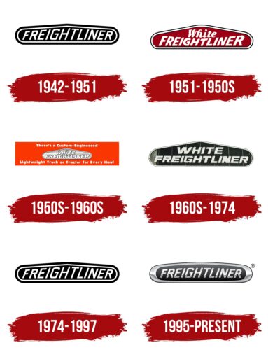
1942 – 1951
The emblem consisted of a plaque similar to the top of the grille on the hood of a truck. Therefore, at a glance, an association with the car immediately arose.
Inside the tablet is the name, the letters gradually increasing towards the center and decreasing along the inscription’s edges. Placement personified the large size of the machines and the ability to carry an impressive load.
After the war, the company switched to developing more powerful tractors than pre-war ones. Their cabins were made of steel and aluminum, and products from Buda and Hercules were installed as engines.
The image on the logo repeated the truck’s profile with a small hood, a large cab, and a low platform for cargo.
1951 – 1950s
The White Corporation, America’s largest truck manufacturer, bought the company. The new owner gave Freightliner significant freedom in the development of models helping financially and with the implementation. At the same time, he introduced their most successful solutions into his production.
The cars developed in the commonwealth were called the White Freightliner, which was reflected in the logo. To accommodate another word, the top of the tablet was enlarged, and the letter sizes of the Freightliner were resized. In the center were the smallest elements, and at the edges – were the largest.
The two halves of the name were written on top of each other in different fonts to distinguish the two separate companies. White – in words, as in the original manufacturer’s mark. The top position showed patronage. Freightliner – in capital letters in upper case, to emphasize the company’s primacy in developing and producing cars.
Large letters along the edges seem to “hug” the central inscription, saying that the company works for the owner’s benefit and is grateful to him for his care.
Both inscriptions were tilted to the right, showing movement and development. The red background of the plate complemented the message of progress, hinting that the result of joint work is better in the community.
1950s – 1960s
In 1952, with the corporation’s participation, a new factory was built for Freightliner, where the WF42, WF64, WF-7564, Spacemake, WF-6364, and WF-8164T models were assembled.
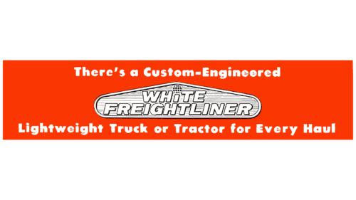
For their implementation, a new logo was used. The usual sign was decorated, stylized as a radiator grille. Both parts of the White Freightliner name resulted in a single typeface, improving perception.
The dot above the I has been turned into a globe to show:
- New trucks from the company are capable of delivering goods around the world.
- White delivers trucks to any part of the world.
The resulting stylish sign was placed on a red rectangular background. Such a move was intended to draw attention to the proposal. The main message was in white letters above and below the rectangle: “There is a Custom-Engineered lightweight truck or tractor for every haul.” The white inscription spoke of novelty and new developments.
1960s – 1974
Cooperation with White went very well. In addition to the Portland plant, which has been significantly expanded, capacities are opening in Indianapolis and Vancouver, making production international. Sales are growing from 1.5 thousand trucks a year to 6.5.
The new international logo returns to a black background to demonstrate the company’s power and weight in the global market. The letters of the inscription become large, bold, and capitalized in both words. In this case, resizing at the edges or the center is no longer used.
The inscription also conveys the idea of strength, size, and power. Among the company’s latest developments were the largest 50-ton Sugar Liner trucks at that time and the Turbo Liner and WFP-7564T tractors. The cabin length of the latter reached 2.5 m. White color is a symbol of new models.
1974 – 1997
New requirements for heavy vehicles and an energy crisis allowed Freightliner to leave White’s control and return the trucks to their former name and abbreviation, FL. The sign of 1942 was used as a logo. The termination of the transaction was documented in 1977.
1995 – today
The company, having tried independence, nevertheless decided that it was more profitable to be under the auspices of large concerns. Therefore, in the 1980s, it became the American subsidiary of Daimler AG, which, after the latter merged with Chrysler in 1998, opened up huge opportunities for the truck manufacturer.
The new logo kept the Freightliner name in the center of the nameplate. However, the shape of the emblem has changed to an oval one with a wide metal border. The changes showed the influence of the Mercedes-Benz sign (a metal circle with three rays) on the logo. After signing an agreement with Daimler, Freightliner began assembling Mercedes-Benz trucks, which led to the crossing of logos.
Smooth, streamlined lines and the sheen of metal on the sign echoed the shining bodies of the trucks. There were many large metal parts in the elements of the cars: a bumper, a radiator grill, pipes, and reinforcements on the cab in front.
In the future, the penetration of brands into each other went further, and already joint hybrids appeared, on which the new emblem looked very organic.
Font and Colors
The main colors that have passed throughout the company’s history are white, black, and red. These perfect contrasting combinations attract attention and make the sign bright and stylish.
- Red – strength, superiority, speed.
- Black – power, the ability to carry multi-ton cargo, large cabins.
- White – renewal and development, constant new models.
Boxed Round Bold Italic lettering font with smooth glyphs and rounded ends, demonstrating the streamlining of the bodies and the organic assembly.
Freightliner color codes
| Black | Hex color: | #010101 |
|---|---|---|
| RGB: | 1 1 1 | |
| CMYK: | 0 0 0 100 | |
| Pantone: | PMS Black 6 C |
| Granite Gray | Hex color: | #646568 |
|---|---|---|
| RGB: | 100 101 104 | |
| CMYK: | 4 3 0 59 | |
| Pantone: | PMS Cool Gray 10 C |
| Gray | Hex color: | #78797b |
|---|---|---|
| RGB: | 120 121 123 | |
| CMYK: | 2 2 0 52 | |
| Pantone: | PMS Cool Gray 9 C |
| Silver | Hex color: | #c2c5c7 |
|---|---|---|
| RGB: | 194 197 199 | |
| CMYK: | 3 1 0 22 | |
| Pantone: | PMS 428 C |
| Gainsboro | Hex color: | #dadadc |
|---|---|---|
| RGB: | 218 218 220 | |
| CMYK: | 1 1 0 14 | |
| Pantone: | PMS Cool Gray 1 C |
