


![]() French Consulting Company Logo PNG
French Consulting Company Logo PNG
The French Consulting Company logo means close support for the military. All the elements used in the logo bear witness to this. Therefore, it symbolizes constant contact with the military professions, approval of their activities, sympathy, and timely assistance. The stylish emblem represents the many areas in which the organization supports its charges and conveys the hope for a better future.
Meaning and History
French Consulting Company was founded in Germany in 2007 and has since established itself as a world leader in management consulting. All thanks to the founder and owner of this international organization – Benjamin P. French. He served for many years in the US Army, was involved in awarding Department of Defense contracts, held senior positions, and began managing the business at BearingPoint after his retirement.
In 2007, Benjamin founded a consulting company and named it after himself, French Consulting. His main clients were US military personnel living in Europe who were having difficulty finding employment. Therefore, from a strategic point of view, the most suitable place for the headquarters was the German city of Sinsheim, where an American military base was still operational at that time.
What is a French Consulting Company?
French Consulting Company is an international organization headquartered in Sinsheim (Germany) and Colorado Springs (USA). It provides consulting services to military and civilian personnel who have traveled abroad. Its main areas of activity are logistics, medicine, and public services for the army.
The range of services has gradually expanded, allowing the French Consulting Company to confidently position itself as a “bridge” connecting people and various organizations. This also includes assistance in overcoming cultural and language barriers, as the company’s employees are equally fluent in German and English. In addition, they possess an excellent understanding of tax and labor laws in many countries worldwide, ensuring strict adherence to all rules.
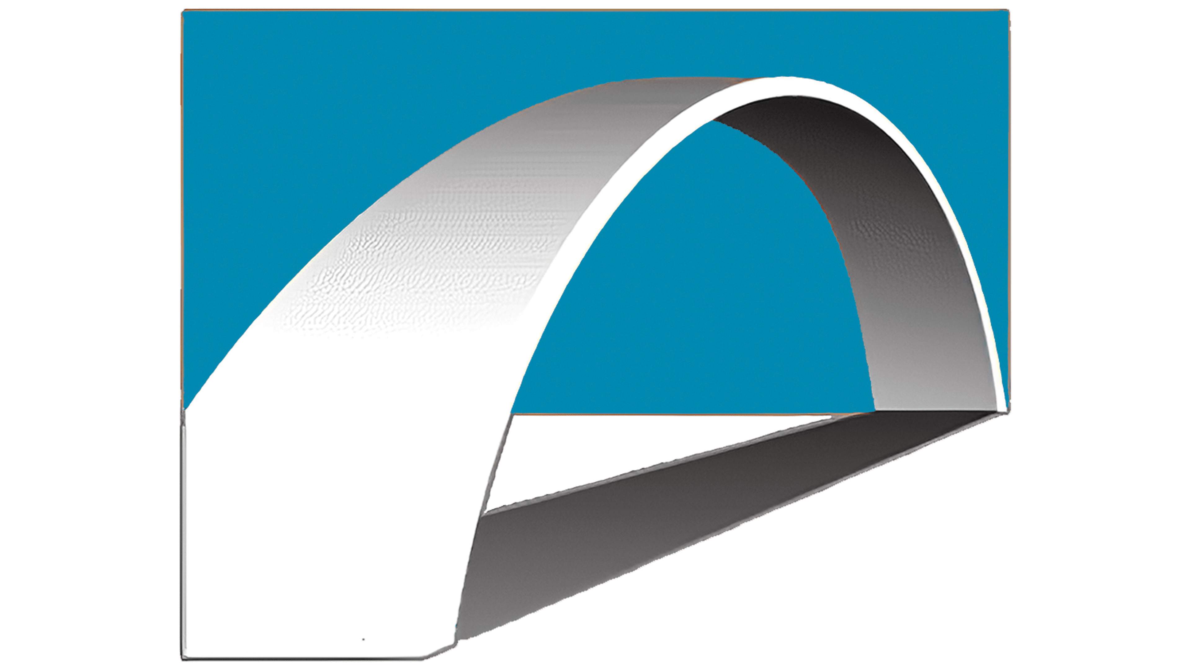
The concept of “the bridge that leads to success” is reflected in the logo of the French Consulting Company. The artists depicted the road structure in a simplified form, making it look like a large arch. It’s essentially a 3D arc with a white-to-gray gradient. Its near side is in the lower-left corner, and the far end extends to the right. The background for the improvised bridge consists of two white-and-blue rectangles. Judging by the gradient and the way the arch casts a shadow, there should be a light source somewhere to the left above it.
On the right is the black word “FRENCH,” and below it, “consulting.” The first half of the name is written in large black sans-serif letters. The second part is much smaller. It uses a lowercase font with rounded glyphs.
The arch, depicted against a background of two rectangles, represents the same bridge mentioned in the company’s motto: “Your Bridge To Success.” It symbolizes reliability, interconnection, trust, support, and help. In this case, the consulting organization itself serves as the bridge, helping people move toward their goals.
Font and Colors
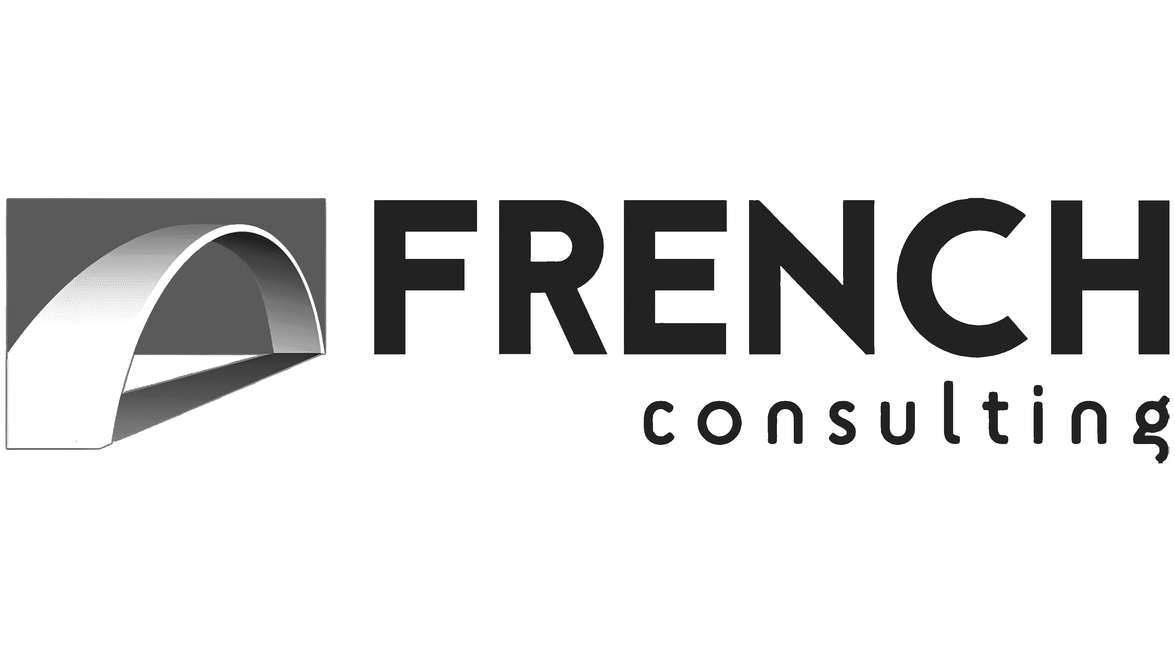
The creators of the French Consulting Company logo decided to diversify the inscription, using two different fonts. The typeface of the first word is very similar to HVD Fonts’ Brandon Text Black, but has a more elongated shape. Both are bold and grotesque, with numerous angles. For the “consulting” section, the designers chose a font identical to Flyerzone’s SciFly Sans. It is characterized by rounded glyphs and a recognizable lowercase “g” with its tail cut off.
The black inscriptions blend harmoniously with the bridge’s white-gray gradient. The only bright spot is a large blue rectangle that serves as a background for one of the emblem fragments.