The Frigidaire logo is as cozy as a home filled with the aroma of baked goods and as high-tech as a space shuttle. The emblem represents modern appliances that ease domestic labor and create an optimal home climate.
Frigidaire: Brand overview
| Founded: | 1918 |
| Founder: | Electrolux |
| Headquarters: | Charlotte, North Carolina, U.S. |
| Website: | frigidaire.com |
In 1916, the journey of what would become Frigidaire began in Fort Wayne, Indiana. The original enterprise, named the Guardian Frigerator Company, was the brainchild of Alfred Mellowes and a group of financial backers. Mellowes innovated by coupling an electric cooling system with a wooden storage cabinet, essentially creating the blueprint for modern refrigerators.
Two years later, in 1918, William C. Durant, the brain behind General Motors, took notice and acquired the fledgling company. With this change in ownership came a new name: Frigidaire. The enterprise revolutionized the market that year by introducing the first self-contained refrigerator unit. By 1919, General Motors formally took over Frigidaire, propelling it to become the dominant force in refrigerator manufacturing by the end of the 1920s. The company didn’t stop at refrigeration; it continued to push the envelope, pioneering the inaugural household freezer in 1929 and venturing into room air conditioners in 1931.
The brand was so ubiquitously popular that, by the 1940s, nearly one in every two American homes boasted a Frigidaire refrigerator. Moreover, the company diversified its portfolio to include various household appliances such as cooking ranges and laundry machines.
In 1979, General Motors decided to part ways with Frigidaire, selling it to White Consolidated Industries. The brand’s ownership narrative took another turn in 1986 when Electrolux, a Swedish multinational, snapped it up. Even under foreign ownership, Frigidaire has retained its quintessentially American brand identity.
Frigidaire has been a trailblazer in refrigerator and appliance technology since its inception. It soared to prominence under General Motors’ wing, remained a household name throughout the 20th century, and now exists as a subsidiary of Electrolux while preserving its iconic American branding.
Meaning and History
The Guardian Frigerator Co. was the brainchild of refrigerator inventor Alfred Mellowes. It was established in 1916. The emblem of this period is unknown. The first recorded symbols were an embedded letter F with a crown. These marks appeared in 1918, after the company was sold, and were present on the logos for a long time. In 1919, Frigidaire became a subsidiary of General Motors. The new owners added their GM initials to the emblem. Subsequently, the logo underwent minor changes and transformations, but the original symbols remained almost until the 2000s when they lost their relevance.
What is Frigidaire?
An American household appliance manufacturer with production facilities in Dayton. The company’s heyday came in the pre-war years of the 1920s and 1930s when it operated the largest refrigerator plant and employed 20,000 workers. In the 1990s, thanks to massive efforts and investments from parent company Electrolux, the brand secured the third spot in the American market and ranks among the top 10.
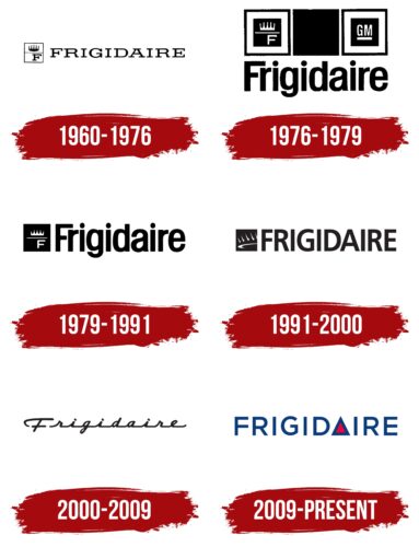
1960 – 1976
The 1960 emblem consists of a graphic sign and elegant lettering.
An elongated rectangle divided into two halves resembles a refrigerator with a freezer. The upper “door” features a crown symbol. This item indicates that the company’s appliances allow a woman to feel like a queen in the kitchen. For confirmation, Frigidaire’s advertising campaigns featured girls wearing crowns.
The lower “door” displays the capital letter F, the first letter in the company name, and the word “cold.” The symbol represents the Fahrenheit temperature, designated by the letter F.
William Durant coined the company name after the acquisition. He renamed Guardian Frigerator Co to Frigidaire Corporation and sold it to General Motors in 1919.
Technically, the name consists of two words: Frigid and air. Another version posits that the name is an abbreviation of the word “refrigerator.”
1976 – 1979
In 1976, General Motors changed the brand emblem. The update attempted to save Frigidaire from closure or sale. Imported companies flooded the market, leading to price drops and financial issues for most American manufacturers.
The new graphic element consisting of three identical squares looked stylish and effective. The squares symbolized appliance sets. General Motors offered groups in various color schemes. This marketing tactic attracted women, allowing them to create a unique kitchen design.
Two small black squares, surrounded by a wide white border and a large black one, resembled an oven and stove. The dark core looked like the window on appliance doors. The black square in the center represents a dishwasher.
The uniform size indicated appliances of the same height, creating a cohesive kitchen ensemble. The image contrast conveyed a modern, impressive appearance of the products.
The first square housed the familiar sign with a crown and the letter F. The second contained the General Motors corporate logo—GM. This tactic associated the manufacturer with a well-known and successful parent company, eliciting greater loyalty from consumers.
Below the squares, the full brand name Frigidaire spanned the length of the graphic.
1979 – 1991
Transformation attempts failed to yield results, and after losing around $30,000, GM decided to part with the brand. In 1979, Frigidaire was sold to Industries Consolidated White. The new owner, who intentionally acquired struggling brands, refreshed the identity, removing traces of the former owner.
The crown symbol and the letter F on a black background remained. Yet the royal symbol now more closely resembled the flame of a gas burner, also produced by Frigidaire. The symbol communicated that heating and cooling appliances were offered under the brand.
The new owners kept the logo font, but it became cleaner and neater.
1991 – 2000
In 1986, Industries Consolidated White was purchased by Electrolux. The company revisited the role and identity of its subsidiary brands. The Frigidaire emblem was redesigned to include a sleeker crown.
The new logo featured a portion of a royal crown set against a familiar black rectangle, as seen from below. The design hinted at an ellipse, suggesting a cosmic orbit. This interpretation of the crown symbol indicated the brand’s leading market position and cutting-edge technology.
Electrolux intended to make Frigidaire the head of a tandem of five leading brands, uniting them under the Frigidaire Group. The significance of the crown in the logo thus changed. Each point of the crown represented one of the brands considered a step-up alliance, elevating in class from one brand to the next. Frigidaire is the most coveted, elite, and best-label at the tiara’s base.
Electrolux initiated the release of stainless steel products, positioning the brand as a progressive European entity. The orbital sign in the logo indicated advanced “space-age” technology and enhanced durability that could withstand even flight.
The image also conveyed the broad ambitions of the new owners to sell the brand’s appliances globally. The tall, black capital letters pushed the brand into the premium segment.
2000 – 2009
At the dawn of the new millennium, Frigidaire updated its logo, leaving behind 20th-century symbols. The crown and the letter “F” became part of history. The brand acquired a new emblem style in the form of a cursive brand name, dubbed the “script.” The continuous writing emphasized the release of sets of appliances, offering a complete range of household devices.
2009 – today
In 2009, a new company logo was introduced. The brand name remains, but its main feature transforms the letter “A” into a triangle. This change highlights the word’s division into two components: “Frigid” and “air.” Yet some perceive the name as “frigid” and “rage,” negatively impacting the brand’s image.
The red triangle implies:
- An image of a motor compressor, which becomes very hot during operation. Its temperature can reach 90 degrees Celsius. General Motors brochures advertising refrigerators show the device in cross-section as a wheel with a red core.
- The red triangle outlined in blue implies two parts of the system—condenser (red) and evaporator (blue). The refrigerator function is based on the boiling and cooling of Freon, which removes heat from the chamber.
The enclosed triangle appears as a prototype of closed systems in devices produced by the brand. Increased spacing between letters hints at evaporator coils.
Some see the triangle as a window into a warm, bright home, aligning with the company’s mission to create a happy future.
Font and Colors
The font and color of the inscription have been changed to align more closely with Frigidaire’s area of operation. Blue symbolizes cold. Despite the expansion of the product line, the most well-known items remain those that use refrigerant: freezers, air conditioners, and refrigerators. Blue is also used to hint at water in washing machines.
Red represents the heating element essential for both cooling and quality washing. The color depicts the active internal processes that underlie the functioning of the devices.
A strong, confident style was chosen for the inscription, with glyphs of uniform thickness and square ends. The letter ‘A’ has been uniquely transformed to distinguish the font.
Frigidaire color codes
| Safety Blue | Hex color: | #0a3b7b |
|---|---|---|
| RGB: | 10 59 123 | |
| CMYK: | 92 52 0 52 | |
| Pantone: | PMS 294 C |
| American Rose | Hex color: | #f9003a |
|---|---|---|
| RGB: | 249 0 58 | |
| CMYK: | 0 100 77 2 | |
| Pantone: | PMS Bright Red C |
