


![]() Frontier Communications Logo PNG
Frontier Communications Logo PNG
Communication over long distances is not a problem for the operator; the Frontier Communications logo guarantees it. The elements reflect the quality and accuracy of signal transmission even from the most distant points. The emblem encodes energy, activity, and love for users.
Frontier Communications is a US telecommunications operator offering a wide range of services. He is engaged in telephone communications (local, long-distance, and digital), Internet access (wireless and fiber-optic), and television (satellite and cable). Previously, the company covered only the countryside, but now cities are also on its subscriber list because it operates in 29 states. The service appeared in 1995. Its headquarters are in Norwalk, Connecticut.
The foundation of the modern service was laid by the Public Utilities Consolidated Corporation, which appeared in Minneapolis in 1935 and was owned by Wilbur B. Foshay. Citizens Utilities was created from its remains and later renamed Citizens Communications Company. Under this name, it existed until 2008, when it adopted a new name: Frontier Communications Corporation. This event took place at the annual shareholders’ meeting in the spring of 2008. The adopted decision officially entered into force in the summer of the same year. The telecommunications operator owns several subsidiaries, grouped by service type.
The active expansion of the service began in 1993 when it began acquiring access lines in rural areas. The first subscribers were connected to four states: Idaho, Tennessee, West Virginia, and Utah. In 1994, the company continued its wide expansion, adding several hundred thousand lines to its structure. The last attempt to buy was in 2001, but it was unsuccessful because Citizens did not want to close the deal. Then the telecom operator focused on service. However, in the spring of 2020, it crashed and filed for bankruptcy.
Meaning and History
![]()
Frontier Communications Corporation did not get its name immediately, but as telecommunications networks expanded. This strategy left a mark on the identity every time and was reflected in the logos. Until 2000, it was known as Citizens Utilities; until 2008, it was Citizens Communications. At the same time, all the emblems belonging to her are concise and simple. The company’s management emphasized that the new logo results from internal modernization in Frontier.
What is Frontier Communications?
Frontier Communications Parent is a company that provides internet, digital television, and telephone services to several million customers in 29 states across the United States. Founded in 1935, it initially operated only in small communities but has since become popular in larger cities. By 2020, Frontier’s revenues had declined, forcing it to declare bankruptcy and undergo restructuring.
1995 – 2016
![]()
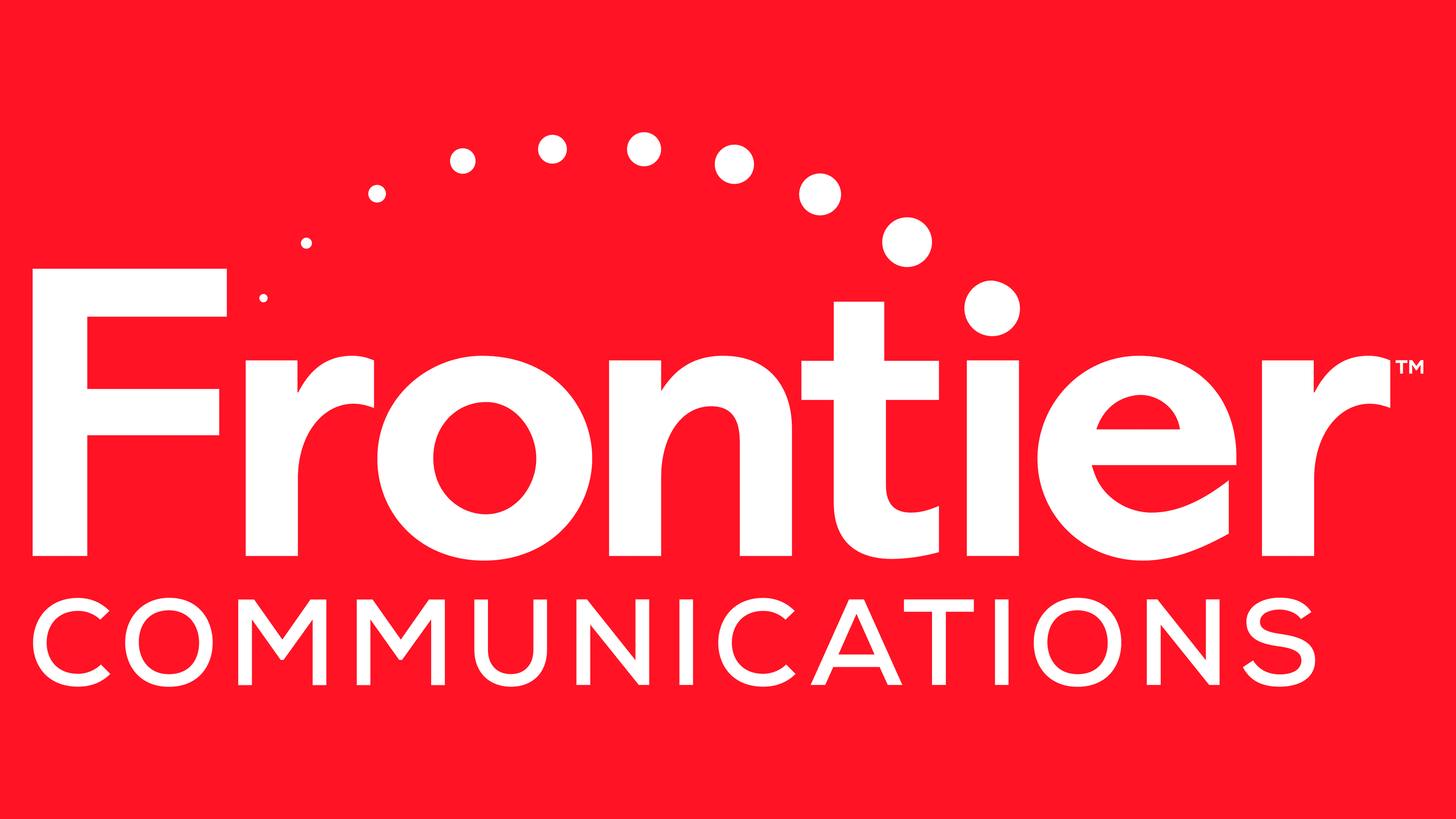
A new name is presented on the corporate emblem, decorated originally. From the dots on the letters “f” and “i,” a narrow strip is laid: on the right, it is wide, and on the left, sharp, like a needle. Such a line personifies the connection – cable, satellite, wave, and wired. Points are the source and destination of the signal.
A unique typeface was used for the inscription, with cuts in the upper part. Horizontally elongated strokes look very impressive and stylish. Moreover, some symbols are connected and form the original configuration. For example, the crossbar of the lowercase oblique “f” flows smoothly into the upper part of the “r,” and the horizontal dash “t” forms a bunch with the “i.” Below the bottom in the interval between “r” and “m” is the word “Communications.” It is dyed gray, and the Frontier is crimson.
2016 – 2022
![]()
The developers have changed the font and logo design. Now he has become more businesslike. The characters are strict, classic: capital “F,” all other lowercase. “Communications” is enlarged and in uppercase. She, as before, is made with thin lines. The authors removed the upper line from the word “Frontier” and added round dots along the same trajectory. They begin at “i” and then go to the left into the distance, gradually disappearing, and end at the first letter.
February – April 2022
![]()
The designers took the previous logo and removed the semicircular line of dots and the word “Communications.” As a result, the only element that remained was the company’s name. And they worked with him, too: they reduced the width of the lines that made up the letters and changed the color. As a result, the scarlet shade of red is a thing of the past, and crimson has taken its place.
2022 – today
![]()
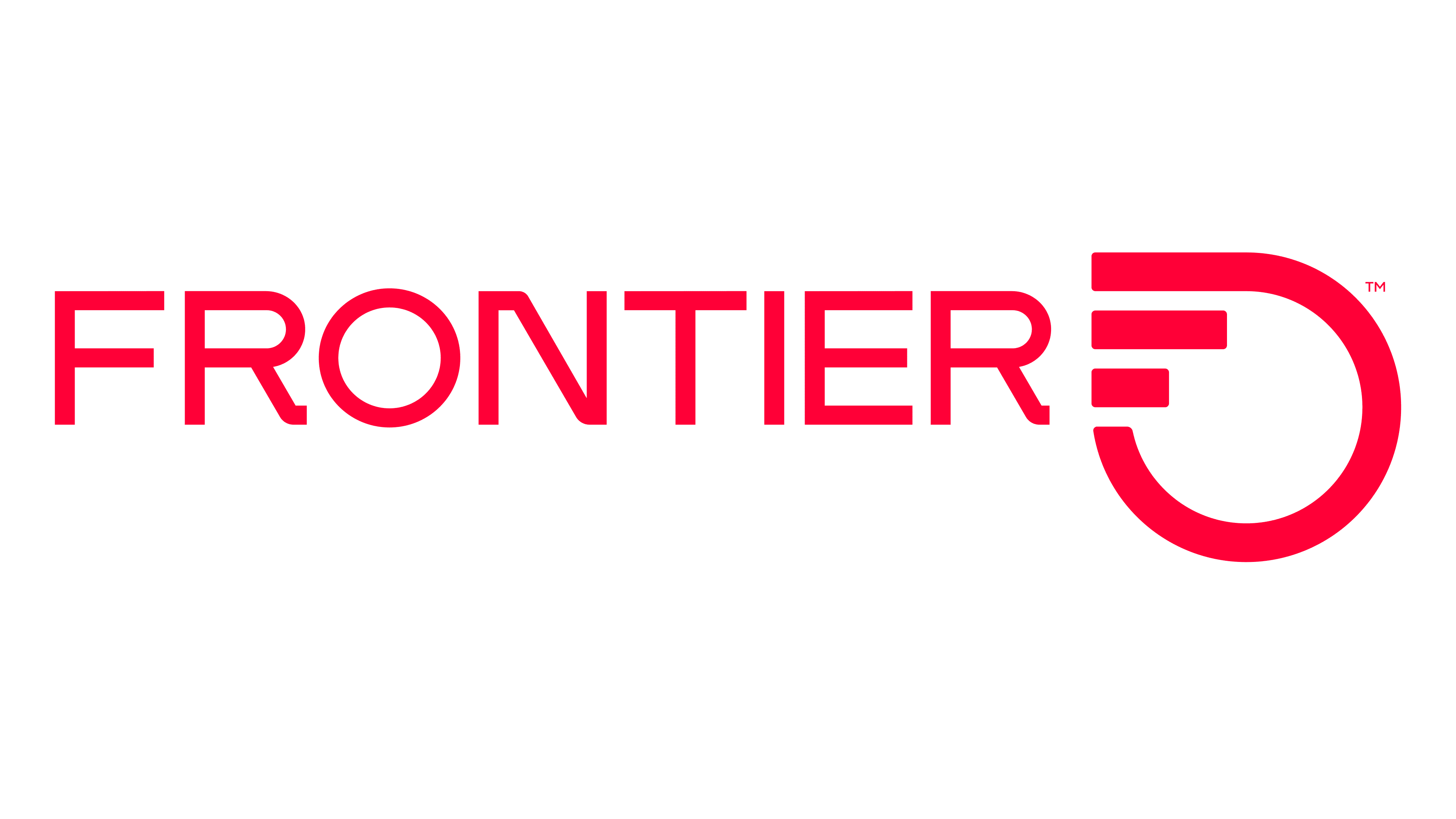
The current logo stands out from the rest because it harmoniously combines text and graphics. Moreover, the drawing occupies a dominant place in the identity, while the inscription is modestly nestled at the bottom of the unusual sign. It is an open semicircle with two horizontal lines of different lengths. Incredibly, this is how the designers stylized the first letter of the telecommunications company’s name, “F.” It is well recognizable in the outlines of the new corporate symbol, where there is no vertical leg.
In addition, the ring represents the inclusive connection among the country’s inhabitants: it outlines its borders and is therefore recognized as a new type of cult circle. Another meaning of this symbol is that it conveys a high data rate, a reference to the word “Gigabit.” And the first letter of the logo is a block “G.” The bottom text is typed in thin sans-serif glyphs. The font has been converted to uppercase.
Font and Colors
The predecessors of the telecommunications operator had their own identity signs, so the logo’s history dates back to 1995. As the identity changed, the font was updated, and the rest was adjusted accordingly. The color also evolved: from crimson, it eventually became truly red.
The first emblem uses a custom font with long serifs at the top of the letters and an italic “f.” In the second case, the typeface is Graphie Bold with a slight correction of the uppercase “F.” The combination of red #d9272d and gray #58595b was chosen for the color scheme.
Since the Frontier Communications logo update, a custom typeface with an unusual “N” has been used for the lettering. The upper part of the left leg is slightly elongated. Otherwise, the font in the company name resembles Midpoint Pro Medium, developed by Mint Type. The only thing that unites the old and new typography in the emblem is the lack of serifs on the glyphs. The palette is more standard: it remained in the red spectrum, only changing the shade. Therefore, now the crimson color prevails in the identity.