The new visualization of the Japanese brand’s audio and video technology and accessories has become a reflection of the effective symbiosis of a deserved past and a promising present. The Fujifilm logo, shaped like a clapboard, symbolizes the balance and stability of the company.
Fujifilm: Brand overview
| Founded: | January 20, 1934 |
| Founder: | Daicel Corporation |
| Headquarters: | Tokyo, Japan |
| Website: | holdings.fujifilm.com |
Meaning and History
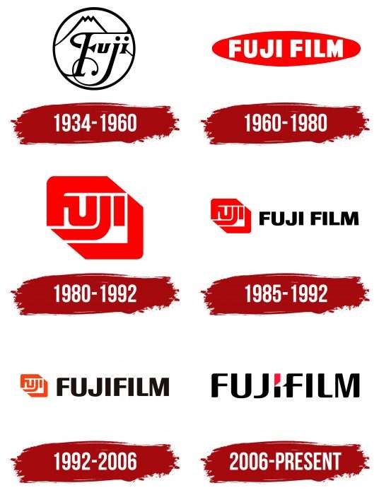
The logo appeared simultaneously with the launch of the business project. It has undergone several versions, one of which is still in use today.
What is Fujifilm?
Fujifilm is a Japanese company founded in 1934 as a manufacturer of photographic film. It currently produces cameras, lenses, printers, and other photography and printing products. In addition, the corporation manufactures various medical devices, including diagnostic systems and X-ray equipment. The product range also includes various pharmaceutical and cosmetic preparations.
1934 – 1960
The debut logo depicted Mount Fuji, after which the company is named. It was black and white.
1960 – 1980
The brand transformed from monochromatic to vibrant: white capital letters were placed inside a red ellipse.
1980 – 1992
The wordmark was replaced with a graphic one. Designers stylized the company’s name and presented an emblem with Asian motifs – like a hieroglyph. The color remained the same.
1985 – 1992
The logo of that time looked very minimalist, although the picture was supplemented with word designations.
1992 – 2006
This year, we perfected the previous version: enlarged the letters to match the size of the hieroglyph on the left.
2006 – today
Developers revisited the old logo and created an original symbiosis. They took the name, written in a lowercase font, and replaced the dot over “i” in the word Fuji with a slanted rectangle. Now, the letter resembles a movie clapboard. This version is maximally balanced in form and color.
Fujifilm: Interesting Facts
Fujifilm, or Fujifilm Holdings Corporation, started in Japan in 1934. It first made camera film and cameras but has grown a lot since then. Now, it works in healthcare and high-tech, too.
- How It Started: Fujifilm began to make its camera film in Japan so the country wouldn’t have to buy it from other places. It became a top company for camera film and cameras.
- Leading in Photos: Fujifilm has tried new things with cameras and photos. For example 1986, they made the first disposable camera, “QuickSnap.”
- Changing with Time: Fujifilm changed its focus when digital cameras became popular. It started working in healthcare, making equipment for medical images and special chemicals and products for industry.
- Digital Cameras: Fujifilm made a big comeback with its X-Series digital cameras in 2011. These cameras are known for great pictures, a cool old-fashioned look, and new technology. They’re loved by both experts and people who just love taking pictures.
- Instax Cameras: Even with digital cameras everywhere, Fujifilm’s Instax instant cameras are very popular, especially with young people. It’s like the old days of instant pictures but for today.
- Helping Health: Fujifilm isn’t just about pictures. It’s also big in healthcare, making things like equipment for examining the body and medicines. It even develops treatments for diseases.
- Film Look on Digital: Fujifilm’s digital cameras can make pictures look like they were taken with old Fujifilm camera film. This lets people take modern pictures that look classic.
- Into Skincare: Fujifilm also makes skincare products under its Astalift brand. It uses its knowledge from film production to create these products.
- Keeping Up with Changes: Fujifilm did well when the world moved from film to digital by trying new things early on. This helped it stay strong and keep growing.
Fujifilm has moved from making films to being a big company in many areas. Its story shows how being open to change and trying new things can lead to success.
Font and Colors
The distinctive mark of the legendary video and photography equipment manufacturer always contained the full name. Sometimes, it was solitary, and sometimes, it was accompanied by a complex corporate icon. The current version is a simplified symbiosis of text and graphics. In 2006, the inscription Fujifilm with a double letter I was approved. The letter consists of two fragments – red and black. The first is at the top and looks like a serrated and pointed element. The second is located at the bottom and, in configuration, resembles a vertical rectangle. The letter “F” has a triangular protrusion that, by design, divides the previous letter into two parts.
In the previous version of the logo, designers used the custom font Fuji Sans – a beautiful bold sans serif font. The current emblem contains updated, streamlined letters. They became more elongated, rounded, and balanced without sharp transitions. The only sharp detail is the protrusion on the leg of “F” and the angle at the adjacent “I.” The color palette consists of black and raspberry red on a white background.
Fujifilm color codes
| Red (Munsell) | Hex color: | #ee1337 |
|---|---|---|
| RGB: | 238 19 55 | |
| CMYK: | 0 92 77 7 | |
| Pantone: | PMS 185 C |
| Raisin Black | Hex color: | #1d191a |
|---|---|---|
| RGB: | 29 25 26 | |
| CMYK: | 0 14 10 89 | |
| Pantone: | PMS Neutral Black C |
