The elegant Fujitsu logo matches the sophisticated Japanese style. And since the Japanese love symbolism, there are many hidden meanings to be found in the emblem. In short, it all comes down to the idea of globality and continuous growth. It is the epitome of endlessly evolving technology.
Fujitsu: Brand overview
| Founded: | June 20, 1935 |
| Headquarters: | Tokyo, Japan |
| Website: | fujitsu.com |
Fujitsu is a large Japanese computer and telephony conglomerate with $34 billion in revenue. Headquarters in Tokyo. The Fujitsu logo unites 540 companies on five continents.
Fujitsu was “spun off” by the large Japanese corporation Fuji Electric Company in 1935. Starting with telephones, she switched to computers in 1978 and has been working in these two areas ever since. With each new step, discovery, and market, she singled out a separate company for work, turning into a conglomerate.
Meaning and History
What is Fujitsu?
Japanese joint stock company engaged in communications and technology. The enterprises employ 126,000 people in 100 countries.
1935 – 1962
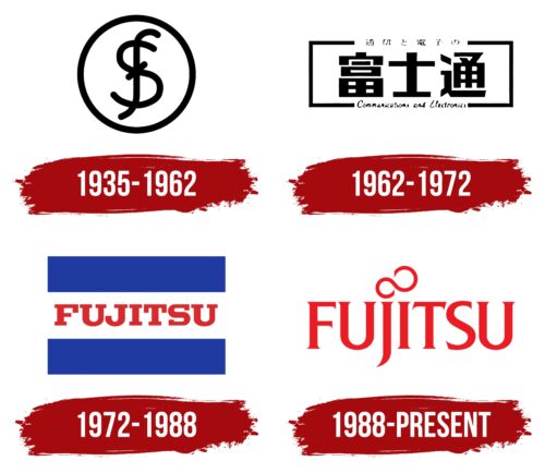
The first logo was a seal in which the letters F and S were superimposed on each other. The monogram is associated with the parent company from which the company separated. It is a joint venture between Siemens and Furukawa. It is their initial letters that appear on the logo. At the same time, the overlay creates a dollar-like sign, which hints at high incomes and profits.
The combination of letters was pronounced “Fuji,” drawing a parallel with the highest mountain in the country. The name predicts the company’s sustainability, being at the top, and victory over all competitors.
The circle is a sign of completeness and perfection. The logo indicated flawless work, quality parts, and complete fulfillment of their obligations. The figure is the central part of the Japanese flag and therefore links the company to its country of origin.
1962 – 1972
In 1962, the company for European countries was renamed Fujitsu Limited. In addition to telephones, the company is actively engaged in the production of computers, having come to the development of the second generation of its devices. It no longer depends on the parent company. Therefore, the logo of that time focuses on displaying the direction of the giant.
The brand name has become more technical and strict. The rectangular shape inside the hieroglyphs is made of squares and rectangles. They denoted the abbreviated Japanese name Fujitsu (officially adopted in the country only in 1967).
Visually, the hieroglyphs resemble the icons of a computer and a telephone exchange and demonstrate the two main areas of the company’s work: communications and electronics. Between them is a hieroglyph resembling a plus.
The full Japanese name in hieroglyphs is inscribed in a square frame on top, and “Communications and electronics” are added in beautiful, elegant English cursive below.
In general, the logo was aimed at both domestic consumers and foreign buyers.
1972 – 1988
In the Japanese and European markets, the company received the same name. This is reflected in the logo.
The new sign resembled a flag. Above and below are two blue stripes. They symbolized the environment of Japan with water and, in a broader sense, the rest of the world.
In the center, a white stripe and a red Fujitsu inscription are associated with Japan and its flag. At the same time, white is a prototype of purity and innocence. He personified honest business conduct and an impeccable reputation. The red inscription in the center of the “flag” showed a giant corporation. She showed his energy and passion in his job and glorified the country. Like the Sun on the Japanese flag, Fujitsu rises in the world sky.
1988 – today
The company is a large corporation with offices around the world. Therefore, an emblem is being developed that will be understandable to all users. The hieroglyphs leave the logo, and the international English language is taken as the basis. It can be read on all continents. A large list of manufactured goods does not allow us to associate a company with a specific pattern. The word logo will be suitable for all subsidiaries. Therefore, the choice fell on the name in capital letters.
The peculiarity of the logo is in the infinity sign instead of the dot above the i. As conceived by the designer, it symbolizes the connection between the Earth and the Sun. It shows that the way to the Universe is open for earthlings. There is no more competition for Fujitsu. There are only endless possibilities. The corporation will develop and rise higher and higher towards the Sun. Already, Fujitsu has reached such heights that nothing stands between it and the luminary.
The company’s technologies are cosmic and ahead of their time. In the early 2000s, the corporation released smartphones capable of video calling, fingerprint unlocking, and having two cameras. Their phones have pedometers, heart rate monitors, and calculators. Memory expansion is possible. Apple will come to fingerprinting only in 2008, and the first camera in apple devices will appear in 2007.
Capital letters with soft rounding and small serifs show that all firm subsidiaries have reached the heights. There are no weak links in a corporation. Soft lines are user-friendly solutions, the ability to find the perfect option.
Font and Colors
The main color of the logo is red. It is associated with the following:
- Love. Fujitsu is passionate about what they do.
- Energy. Over the past 90 years, the company has maintained a leading position, surviving difficulties, economic downturns, and competition.
- Enthusiasm. The company is in constant development. Offers all new modern solutions, opens new offices.
Canting Regular logo font.
Fujitsu color codes
| Pigment Red | Hex color: | #ec1c24 |
|---|---|---|
| RGB: | 236 28 36 | |
| CMYK: | 0 88 85 7 | |
| Pantone: | PMS Bright Red C |
