The emblem informs that the company’s wines create a unique bright bouquet. Drinks have a special taste, are warm, and give positive emotions. The Gancia logo represents the gold standard and is a premium brand.
Gancia: Brand overview
| Founded: | 1850 |
| Founder: | Carlo Gancia |
| Headquarters: | Turin, Italy |
Meaning and History
It so happened that the beginning of the distillery was laid by Carlo’s parents, for whom growing grapes and making wine was their life’s work. The family had a plantation in the northern region of Italy, which was inherited by the seventh son of Caterina Rosso and Michele Gancia. But first, the future winemaker went to Torino, where he received an education in the field of chemistry and pharmacy, along the way discovering a new recipe for making vermouth.
Then the young man went to France. There he delved into the study of the production of sparkling wines, trained, having spent two years in one of the wine companies as a simple worker. His return to Italy took place in the middle of the 19th century, together with his brother Edoardo, to start reworking the old methods with new ones adopted from the French. So, they expanded vineyards and mastered foreign technologies in the wake of vigorous activity.
Then Carlo Gancia settled down, got married, but was still engaged in the production of sparkling wine based on local Muscat. He had an innate intuition as to when to interrupt must fermentation to obtain a low-alcohol sugary wine suitable for making into a popular sparkling drink. After the death of Carlo, his business passed to Camillo – the first son. Thus a whole dynasty was born.
The brand, distillery, plantations, and company passed from generation to generation until the Russian oligarch Rustam Tariko became interested in the success of the Italians. In 2010, he gradually began to buy shares in Gancia, eventually becoming the company’s majority owner and brand. He joined them with his Standard Russian group, improved and expanded production. The new leader also increased the assortment by adding vermouths and aperitifs to sparkling wines. Each of them has its sign.
After transferring the former family business into other hands, the company did not lose its original face. She kept it and still uses it today. We are talking about Italian sparkling wine: the original logo remained identical to the debut version. Only aperitifs and vermouths, the production of which has intensified after joining the Standard Russian concern, received an individual mark.
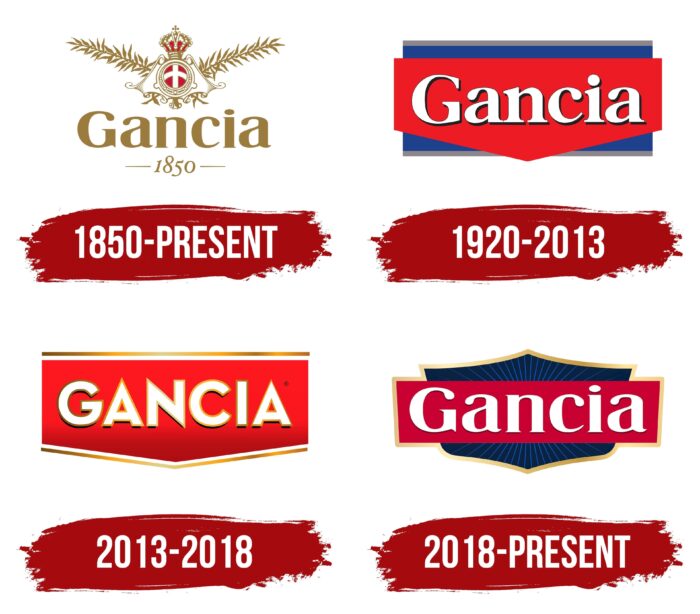
1850 – today
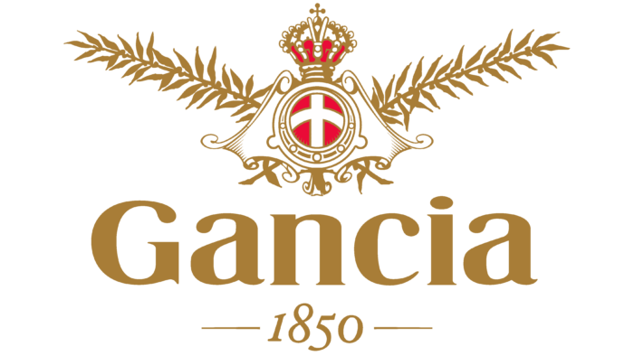
The very first logo was preserved for sparkling wine. It exactly corresponds in form and content to the debut emblem. It features the Savoy cross, symbolizing the Italian monarchy. The white cross is depicted in the very center, where it takes pride of place on a red round background. Around it is a figured element reminiscent of the open robe of royalty.
To the right and left are laurel branches – as a sign of superiority, exceptional recognition, and the highest degree of respect. The whole is crowned with a richly decorated crown with a red lining. Below is the name of the wine company and the year of its establishment. They are made in golden colors, like the contours of the rest of the elements. This palette is chosen to match the contents of the bottles – sparkling wine.
1920 – 2013
The logo, introduced in 1920, is a step towards strict geometry and perfectly aligned lines. Its base is a blue rectangle, decorated with a dark silver stripe along the visible edges. It serves as a background for a red figure with a downward angle. The name of the alcohol brand is typed on it in contrasting white letters. The font of the antiqua is complemented by a thin line on the right side of each character, which makes the inscription three-dimensional.
2013 – 2018
After the total transition to a new owner (to the Standard Russian company), the logo of vermouths and aperitifs has changed a bit. The designers simplified it by removing the blue background rectangle that seemed redundant. They retained the top and bottom stripes but repainted them bronze and separated them from the main element with a thin white line. The developers also modernized the inscription: the serifs disappeared on it, and thin points appeared at the “A” and “N.” In addition, they converted the letters to uppercase and added a gradient to the red color. As a result, the logo became similar to a chevron.
2018 – today
After a series of manipulations with graphics, a modern logo appeared, in which the first and previous versions are combined. To ensure their compatibility and maintain brand recognition, the designers returned the blue background but depicted it not as a rectangle but in the form of a small hexagonal shield. On it, needle-shaped blue stripes diverge from the center, reaching a golden border. There was a horizontal rectangle of red-crimson color in the middle with bronze edging on the right and left. The name of the brand is written on it in white letters.
Font and Colors
The Italian alcohol brand Gancia has two logos. With one, she marks sparkling wines, emphasizing their antiquity and personal uniqueness; with the second, she marks vermouth and aperitifs. Consequently, the first sign is older and emphasizes the winery’s roots. It traces the bias in heraldry and history. The modern emblem is distinguished by precise geometric proportions, which indicates the scrupulous observance of the balance of all components of the wines offered. The key stages of its redesign are connected with the company’s transition to a new owner and with the expansion of the range of alcoholic products.
In the first and last logo of the Gancia winery, the inscriptions are made in the same typeface: a classic printed, streamlined shape reminiscent of Times New Roman. The difference between them is only in the shadows. The text on the emblem for vermouths and aperitifs is very different. In it, each letter is circled along the contour with an individual border. At the same time, the font is sharp, geometric, “pungent.”
The corporate palette of the Italian wine producer consists of a golden color, which is present in both versions of the logo. They also use red, silver, white, and navy.
Gancia color codes
| Red | Hex color: | #c90132 |
|---|---|---|
| RGB: | 201 1 50 | |
| CMYK: | 0 100 75 21 | |
| Pantone: | PMS 185 C |
| Sunset | Hex color: | #f1d28f |
|---|---|---|
| RGB: | 241 210 143 | |
| CMYK: | 0 13 41 5 | |
| Pantone: | PMS 1345 C |
| Satin Sheen Gold | Hex color: | #cea550 |
|---|---|---|
| RGB: | 206 165 80 | |
| CMYK: | 0 20 61 19 | |
| Pantone: | PMS 7563 C |
| Sapphire | Hex color: | #0254bd |
|---|---|---|
| RGB: | 2 84 189 | |
| CMYK: | 99 56 0 26 | |
| Pantone: | PMS 2728 C |
| Space Cade | Hex color: | #0b2241 |
|---|---|---|
| RGB: | 11 34 65 | |
| CMYK: | 83 48 0 75 | |
| Pantone: | PMS 282 C |
