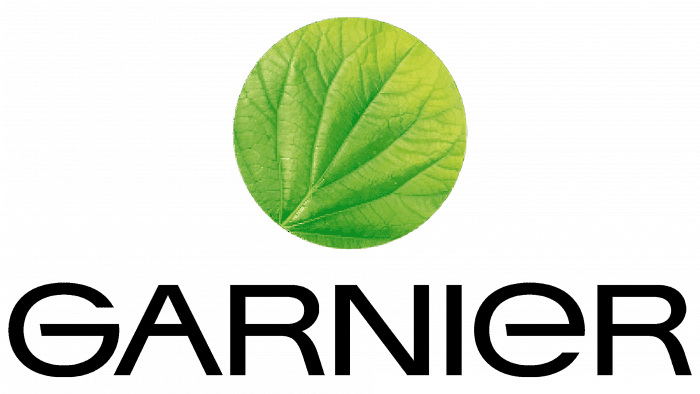
The Garnier logo combines two contrasting characteristics: elegance and simplicity. Designers deliberately depicted a leaf fragment with all its details because they wanted to draw parallels between plant cells and human skin cells, which also require moisture and nourishment. The emblem represents the “circle of life,” and the large letter “G” at the center has already become Garnier’s signature mark.
Garnier: Brand overview
| Founded: | 1904 |
| Founder: | Alfred Amour Garnier |
| Headquarters: | Clichy, Hauts-de-Seine, France |
| Website: | garnier.co.uk |
Meaning and history
The logo of the well-known French cosmetic brand has been around for more than 115 years. All this time, it has accurately reflected its line of business, clearly presenting itself in all spheres – from consumer to marketing. The logo design is clean, open, and welcoming, emphasizing the pursuit of beauty and health. Currently, it has five emblems and several variations of them.
What is Garnier?
Garnier is a division of the global cosmetic conglomerate L’Oreal. It is a French brand specializing in the production of beauty and health products. The company was founded in 1904 and named after its founder, Alfred Amour Garnier, who started the business with the invention of a hair product based on plant components. Since the 1980s, the company has been widely using natural extracts of herbs and fruits.
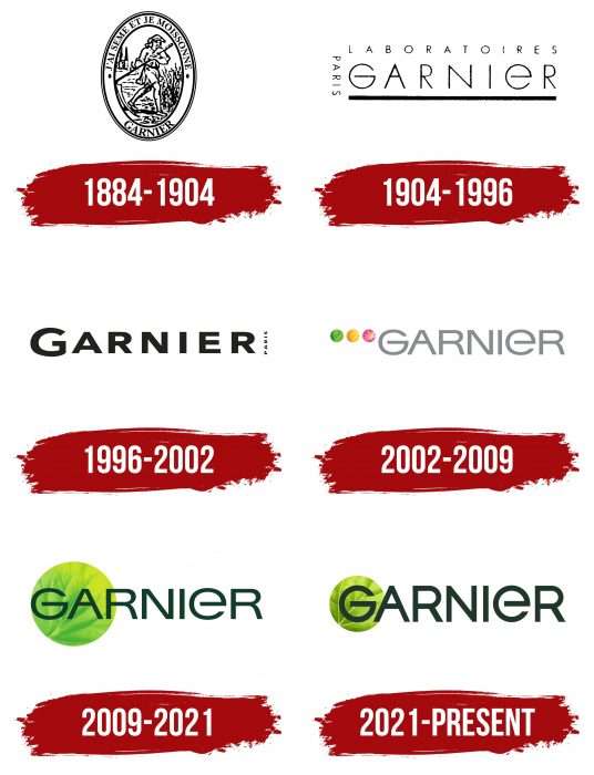
1884 – 1904
The first logo was in the form of an oval medallion. At the center was an image of a mower in a meadow. He was mowing grass against the backdrop of several tall trees. Overall, the composition resembled an old engraving done with printing press impressions. It was surrounded by a wide band with several inscriptions: at the top was the phrase “J’ai seme et je moissonne.” This is a slogan in French. Below, separated by two lateral points, was the company’s name – “Garnier.” A bold serif font was used for the text. The emblem was surrounded by a double thin frame: the inner line was slightly wider than the outer one.
1904 – 1996
The original logo contains many words. Due to the abundance of letters, the inscription is difficult to read. The words are piled on top of each other: in the middle – Garnier, above it – Laboratoire, to the right – Paris. They are written in thin lowercase letters.
1996 – 2002
This year’s version acquired an individual font, which was used in subsequent logos. But the word Paris remained illegible, as it was written in too small letters.
2002 – 2009
The company left only the brand name on its branding. Developers increased the font size so that the word Garnier stood out clearly. Next to it (top left) appeared three multicolored circles: green, yellow, and pink. Each of them had an individual pattern.
2009 – 2021
The emblem of the cosmetic brand underwent changes again. In this version, designers removed two circles, shifted and enlarged the third, and changed the letters from gray to dark olive.
The evolution of the identity of the French cosmetic brand went from standard to original. Therefore, at the beginning of its career, the company had a classic logo, usually used in this industry to look good both on narrow tubes and on wide cans. At the turn of the 20th and 21st centuries, large dots of different colors appeared next to the word “Garnier”: green, yellow, pink. They indicated the ingredients of the cosmetics and emphasized their naturalness. In the modern version, the dot remained – just one, but very large, turned into a circle. Designers shifted it to the right and made it the background for the first two letters of the brand name – “G” and “A.” The veins of a green leaf are visible on it.
For the logo, developers chose a font that most closely resembles two fonts – Univers and Helvetica. If you look closely, you can see that the symbol is a combination of personal symbols. For example, “G” and “E” speak of individual designs, which in shape are exact copies of each other but flipped.
Garnier’s brand palette includes three shades of green: #407E06 – avocado, #042B19 – acid green, and #BCCF11 – dark green.
2021 – today
The designers worked on the color, texture of the leaf, and font. As a result, the green palette shifted towards the lighter spectrum, the veins in the circle became much more distinct, and the letters acquired an elongated shape, although they remained in the same font. Additionally, developers removed half of the letter “A” from the circle, leaving a single “G” at the center of the leaf.
Garnier: Interesting Facts
Garnier is a well-known beauty brand started in 1904 in France by a guy named Alfred Amour Garnier. It’s grown a lot since then, especially after being bought by L’Oréal in 1965, a huge company making many beauty products.
- Beginning: Garnier first made a hair and scalp treatment called “Lotion Garnier,” which was a big deal because it was new for hair care.
- Joining L’Oréal: Since L’Oréal bought Garnier, the brand has been able to sell its products worldwide and develop lots of new stuff, thanks to L’Oréal’s big research labs.
- Cool Products: Garnier was one of the first to make BB Cream popular in Western countries, changing how many people think about skincare by making a product that does a bunch of things at once.
- Natural Stuff: Garnier uses natural ingredients like fruit extracts and essential oils in its products, which many people like because they’re gentle and come from nature.
- Caring for the Planet: Garnier works hard to be good to the environment. It uses ingredients that are okay for the planet, makes packaging that’s better for the earth and doesn’t test on animals. Some of its products even got a special certification for being eco-friendly.
- All Over the World: Garnier products are available in more than 120 countries, meaning many people use them for their beauty needs.
- Always Getting Better: With help from L’Oréal’s labs, Garnier develops new and better products to meet people’s wants and needs.
- Helping Out: Garnier doesn’t just make beauty products; it also tries to do good things, like helping recycle more and supporting education for girls through its partnerships with other organizations.
- Lots to Choose From: Garnier makes all kinds of beauty products, from stuff for your hair and skin to sunscreen, so you can find whatever you need.
From its first product to being a big name in beauty, Garnier has always focused on making quality stuff that uses natural ingredients and is kind to the planet. It keeps coming up with new ideas and ways to be even better, making it a favorite for people looking for beauty products.
Font and Colors
In the modified version, the Helvetica Now font was used – a clean Swiss classic font adapted to modern design. The characters are now elongated, so they look taller than in previous logos. The green color has become slightly lighter.
Garnier color codes
| Avocado | Hex color: | #407e06 |
|---|---|---|
| RGB: | 64 126 6 | |
| CMYK: | 49 0 95 51 | |
| Pantone: | PMS 2278 C |
| Acid Green | Hex color: | #bccf11 |
|---|---|---|
| RGB: | 188 207 17 | |
| CMYK: | 9 0 92 19 | |
| Pantone: | PMS 583 C |
| Dark Green | Hex color: | #042b19 |
|---|---|---|
| RGB: | 4 43 25 | |
| CMYK: | 9 0 42 83 | |
| Pantone: | PMS 5463 C |
