The GAZ logo is inseparably linked to the company’s Soviet past, which is reflected in nearly all interpretations of the emblem. The logo conveys scope, strength, boldness, the drive for leadership, and the desire to create the best vehicles.
GAZ: Brand overview
Founded in 1932 in the city of Gorky (now Nizhny Novgorod), GAZ – the Gorky Automobile Plant – began its journey as a prominent player in the Soviet automobile industry. Initially equipped with Ford Motor Company equipment and know-how, the plant began by building Russian adaptations of Ford’s Model A and Model AA trucks.
Between the 1930s and 1950s, GAZ switched to producing passenger cars, introducing iconic models like the M-1, M-20, Pobeda, and Volga. These cars made the company a staple in the Soviet automobile industry.
After the collapse of the Soviet Union in the 1990s, GAZ changed from a state-owned enterprise to a private one. Nevertheless, it retained its position as the leading manufacturer of commercial vehicles in Russia.
GAZ Group has expanded its portfolio to include a wide range of automotive products, such as light commercial vehicles, buses, trucks, engines, and passenger cars. These are sold under various brands, including Gazelle, Sobol, and Volga. The company is still headquartered in Nizhny Novgorod, where it was founded more than nine decades ago.
GAZ is a historical pillar of the Russian automotive industry, embodying both the legacy of the Soviet era and the dynamically developing modern Russian industry.
Meaning and History
What is GAZ?
It is a Russian automobile manufacturer that produces many vehicles, including trucks, buses, vans, and cars. Based in Nizhny Novgorod, it has a long history of supplying reliable and durable vehicles for both civilian and military use. The company is known for models such as the GAZelle, a popular light commercial vehicle, and the Volga, a series of passenger cars. GAZ.” The company plays an important role in the Russian automotive industry and exports its products to many countries worldwide.
1932 – 1946
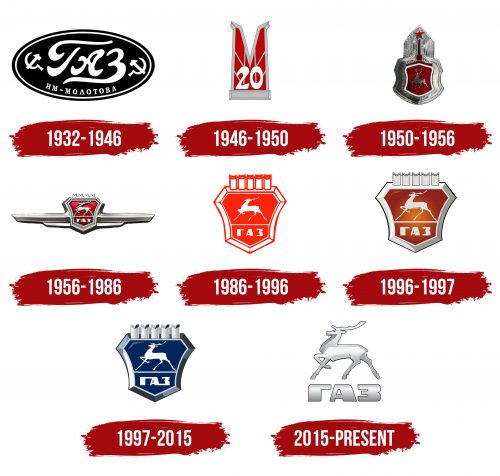
The GAZ company’s first logo is an example of a concise and memorable design. It features a black oval, symbolizing the organization’s technical focus and practical nature. This element highlights the reliability and functionality of its products.
Sickles and hammers placed on either side of the oval add to the image, indicating the Soviet origin of the company. These symbols show that the enterprise was founded in the Soviet Union to serve the workers and peasants of the country.
GAZ stands for “Gorky Automobile Plant.” The plant was named after the city of Gorky, renamed from Nizhny Novgorod in 1932 to honor the 40th anniversary of the writer Maxim Gorky’s creative activity.
The plant, established in the USSR during Vyacheslav Molotov’s era, was named in his honor, and this period in the company’s history marked the beginning of large-scale automobile production, symbolizing the Soviet Union’s industrial progress and technical achievements.
1946 – 1950
After the war, the company completely updated its model lineup. The new flagship brand became the “Pobeda” M-20, reflected in the updated logo. The emblem features a giant red “M,” standing tall like a pedestal, emphasizing the importance and greatness of this model for the company and the country.
The red color of the letter honors the Red Army, symbolizing the blood shed for victory and the victory itself. This color represents triumph, resilience, and strength, reminding us of the heroism and sacrifice shown during the war. The logo resembles a monument of glory, representing the memory of those who fought and died for freedom.
The logo’s white number “20” marks a new chapter in the company’s history. It signifies the launch of the “Pobeda” M-20 model, symbolizing post-war revival, technical progress, and hopes for a bright future.
1950 – 1956
A new emblem was created for the executive-class ZIM (Zavod Imeni Molotova) cars. The emblem’s design represents reaching for the stars, with stars glowing on top of the Kremlin instead of the sky. This symbol reflects the high standards set by the Soviet Union for all its productions, highlighting the pursuit of greatness and excellence.
A deer was chosen as the factory’s symbol because this animal lived in Nizhny Novgorod and became part of the city’s coat of arms. The deer emphasizes the company’s roots and the location of its production, linking the emblem to the region’s historical and cultural traditions. This symbol shows the factory’s deep connection to its hometown and surrounding nature.
The top part of the logo resembles the pinnacle of the Palace of the Soviets in Moscow. Though never completed, this project was intended to be the tallest building in the world, showcasing the triumph of socialism and the power of Soviet architecture. The ZIM emblem includes elements of this ambitious project, reflecting the drive for innovation and greatness characteristic of the era.
1956 – 1986
The introduction of the “Volga” GAZ-21 marked a new era for the Gorky Automobile Plant. With the release of this model, the company unveiled an updated emblem. The proud deer, the factory’s symbol, remained the central element, embodying strength and grace.
New elements were added to the emblem, including side stripes resembling wings. These stripes represent the cars’ speed and agility, highlighting the new model’s high technical specifications and dynamic performance. They create an impression of movement, swiftness, and innovation.
The top of the emblem features the crenellations of the Kremlin walls, demonstrating full compliance with the party’s directives and connection to the state. This element emphasizes the factory’s national importance and role in fulfilling state plans and objectives.
The “Volga” GAZ-21 became a symbol of status and prestige. It became the regular transport for high-ranking officials in Moscow, further cementing its position as a car for the elite. The “Volga” model was associated with reliability, comfort, and status, reflecting the factory’s commitment to producing top-class automobiles.
1986 – 1996
In 1986, the GAZ factory emblem underwent significant changes, crystallizing key elements symbolizing new stages in the company’s development. The central element of the logo remained the deer, honoring the enterprise’s historical roots and connection to the coat of arms of Nizhny Novgorod. The deer represents grace, speed, and strength, reflecting the key qualities of the vehicles produced.
The deer was placed against a shield backdrop, emphasizing the protection and reliability associated with GAZ products. The shield symbolizes the strength and confidence that GAZ vehicles provide to their owners. Above the shield, the Kremlin’s crenellations are stylized as car pistons, linking the emblem to industrial heritage and technical excellence.
During this period, GAZ shifted its focus to producing car engines and car bodies, expanding its manufacturing capabilities and strengthening its market position. The emblem’s red and white shades highlighted the products’ premium quality. These colors symbolize the factory’s high achievements and prestigious awards. The red color recalls the Lenin Order awarded to the factory for outstanding industrial success. The white color reflects the purity and perfection of the manufacturing processes.
In 1986, the factory celebrated a significant milestone by producing 10 million GAZ vehicles, marking sustained growth and substantial achievements for the enterprise.
1996 – 1997
Changing the shade of the emblem gave it a more three-dimensional and visually appealing look. The cool metallic shine pairs well with the noble red color, highlighting GAZ vehicles’ power and high quality. The updated emblem reflects the incorporation of the latest technologies in production, including modern engines that significantly improved performance and reliability.
The red emblem symbolizes prestige and exclusivity and recalls the company’s rich historical heritage, numerous achievements, and significant awards. The metallic hue emphasizes the products’ durability and longevity, a key characteristic of GAZ vehicles.
This period marked another achievement for the factory: 15 million vehicles were produced. This number underscores the scale of production and the successful operations of the enterprise over many decades.
1997 – 2015
The GAZ logo features a proud deer in a majestic pose. The deer stands on a pedestal, symbolizing the animal’s speed and agility, reflecting the swiftness and maneuverability of GAZ vehicles. The emblem represents a unique brand known for overcoming the toughest off-road conditions and quickly reaching set goals. The steel shine on the logo highlights the strength and endurance of the vehicles, emphasizing their reliability and durability. This logo was the first to lose its direct connection to the USSR while maintaining the company’s historical roots and its close ties to Nizhny Novgorod, where the brand was founded.
2015 – today
The GAZ logo features a simple, elegant deer, symbolizing grace and agility, key qualities of the brand’s vehicles. The deer is designed with clean lines and shapes, giving it a sleek, metallic look. Several shades of gray, black contours and silver gradients create a shiny appearance, suggesting durability and modernity.
This minimalist deer design ensures the emblem is easily recognizable, regardless of size. Its scalability makes it versatile for various uses, from vehicle badges to marketing materials, without losing detail or clarity. Combining gray shades and a metallic sheen adds sophistication, highlighting the brand’s focus on technological advancement and quality craftsmanship.
Below the deer, the brand name “GAZ” is displayed in bold Cyrillic letters, reinforcing the company’s Russian heritage. This bold lettering ensures the brand name stands out, providing a strong visual anchor for the entire design.
The interplay of the deer symbol and the bold Cyrillic brand name creates a balanced logo. The minimalist deer conveys elegance and precision, while the bold letters add weight and authority. Multiple shades of gray and subtle gradients enhance the logo’s three-dimensional effect, giving it depth and a polished look. This visual texture mimics metal, emphasizing the brand’s automotive nature.
The GAZ logo captures the essence of the brand. The deer suggests elegance and strength, while the bold Cyrillic letters underscore the company’s heritage and prominence.
