


![]() Gears of War Logo PNG
Gears of War Logo PNG
Eliminating aggression, tension, and anger embodies the Gears of War logo. The emblem conveys the sharpness of the plot and the sinister, warlike atmosphere within the game. “Face your fears! Fight, win or die!” This is the symbol’s motto.
The development of Gears of War grew out of earlier work at Epic Games rather than a single concept. Cliff Bleszinski joined the studio in 1992 after showing Tim Sweeney his game, Dare to Dream. During the 1990s, he worked on Unreal and Jazz Jackrabbit, gaining influence inside the company.
In the early 2000s, Epic developed Unreal Warfare, a multiplayer shooter with vehicles and large maps. As the market shifted toward cinematic campaigns, the team reworked the project. Key references came from Capcom with Resident Evil 4 and Namco with Kill Switch, introducing an over-the-shoulder view and cover mechanics. Bionic Commando informed movement between cover points. Rod Fergusson handled production.
Ahead of the release, Microsoft and Epic produced a documentary that aired on MTV2 on May 19, 2006. During final preparations, Peter Moore suggested removing the chainsaw weapon, but the team kept it. After the demo, Bill Gates praised the feature. Gears of War launched on November 7, 2006, for Xbox 360 in North America and on November 17 in Europe. A trailer built around “Mad World” by Gary Jules drew attention. The game became a flagship title for Xbox 360, competing with Bungie’s Halo. A Windows version followed on June 11, 2007, with People Can Fly.
Sequels arrived in 2008 and 2011, expanding scale and narrative. Judgment followed in 2013. By January 2014, the series had sold over 22 million copies. In 2012, Bleszinski and Fergusson left the studio. On January 27, 2014, Microsoft acquired the franchise and assigned it to The Coalition. New entries were released in 2016 and 2019, with further expansions across comics and novels.
Meaning and History
![]()
According to the plot, the battles are centered on the planet Sera, where people are drawn into a war against the reptilian Locust Horde. The main character is Marcus Fenix, who leads a small squad. The key task for the players is to use cover effectively and execute tactics accurately. To achieve this, it is proposed to join the main character in co-op mode or engage in multiplayer combat.
The logo debuted alongside the launch of Gears of War. It completely reflects the inner state of a video game: mystery, danger, and gloom. Its main goals are immersion in unpredictable situations, a spirit of struggle, and active strategic planning. Moreover, each shooter version is accompanied by a separate logo that corresponds to its content. There are four options in total, based on the number of issues.
What are Gears of War?
Gears of War is a strategy computer game that focuses on team tactics. By genre, these are third-person shooters. Microsoft owns the franchise, and the series has been developed by the Canadian studio The Coalition since 2013.
2006
![]()
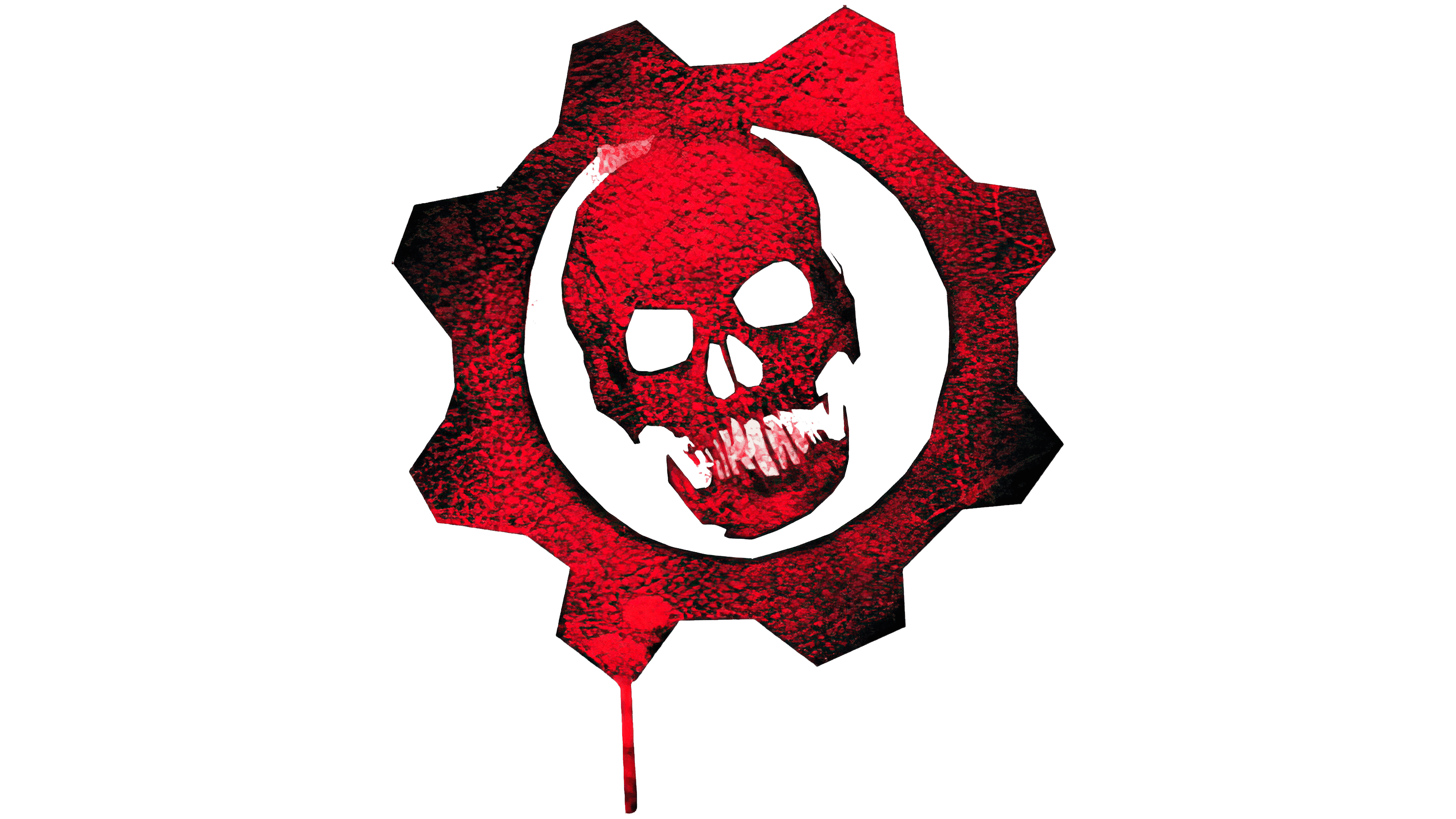
The debut emblem consists of a crimson human skull in gear. The style of painting is frightening. The eye sockets are uneven; the sinuses are in the form of elongated slits. The head is positioned at the center of the white circle, making it appear impressive and visually appealing. It is surrounded by a gear with protrusions of different heights as if it had worn out from constant load. Black dots, stripes, and shadows emphasize this impression. On the left, there is an inscription of the video game’s name. It is composed of geometric symbols arranged in a strict configuration, much like a stencil. The letters are covered with white longitudinal lines that emphasize the signs’ metallic texture.
2008
![]()
The developers added even more intimidation to the previous design: they darkened the upper-left corner and added two streams of blood flowing down from the gear. Among the changes are also a large number “2” at the end of the name and white letters covered with black dirt spots.
2011
![]()
The third version of the shooter featured a more modest logo, devoid of a skull, gear, or blood. The image contains only the text “Gears of War” with a red number “3”. The name is written in one line in black stencil-type characters.
2016
![]()
The latest version of the game is framed with a familiar icon, but it is not set against a dark background; instead, it is set against a light one. The designers have added volume to the gear by incorporating shadows at the top and bottom teeth, creating a 3D effect. The letters are metallic gray as if covered with ash.
Font and Colors
The Gears of War logo’s formidable style is sustained from the very first to the last version. The theme of bloody battles, grinding, and warlike battles is reflected in the skull, bloody cogwheel, crimson streaks, and stencil inscriptions. The letters in the shooter’s name represent the metal that has gone through the crucible of war; they are scratched, then covered with mud, and finally powdered with ash. Each version is numbered except for the first.
For the game, the authors chose a typeface reminiscent of the GCF Locust Resistance. These are strict, geometrically verified letters, grotesque, even, sharpened, and chopped. Additionally, they are wide and squat and are located in the upper register. The “G” has a sharp end pointing inward. The colors are traditionally military: black, ash, metallic, off-white, red, and purple.