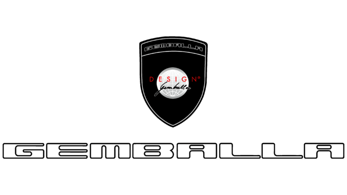
Gemballa uses a global logo because it represents our planet. It symbolizes the international level – the fact that the cars of this manufacturer drive around the world, as proof – a personal inscription on the background of the globe. Another important detail is the shield. It represents excellent protection and superior product quality.
Gemballa: Brand overview
| Founded: | 1981, 2010 (new company) |
| Founder: | Uwe Gemballa |
| Headquarters: | Leonberg, Germany |
| Website: | gemballa.com |
Gemballa is a successful and dynamically developing company specializing in the automotive industry. It is registered in Leonberg (a city in Germany), where the main facilities are located. A feature of the enterprise is the specifics of the work. New models are created here, as well as tuning of various formats. But, we are not talking about a unique assembly but the production of new cars based on Porsche, Mercedes-Benz, and McLaren.
The brand’s visual identity includes elements of elitism, unique style, and uniqueness. These features accurately reflect the essence of the company itself, which works with some of the best brands in the automotive industry. An advantageous addition to the overall concept is a contrasting and expressive color scheme, emphasizing the best features of a world-famous company.
Meaning and History
The modern company Gemballa has a high status and recognition by many drivers from different countries. This is evidenced not only by the multi-million dollar profit but also by the luxurious visual identity. The logo shows the classic rigor of black, the energy of red, and the neutrality of white. This combination allows you to create images that have a special charm and extravagance.
In addition, the chosen palette is traditional for the automotive industry. White, red, and black are often used for high-end luxury car brands. But, such an icon appeared only after some time. Initially, the company had a different name and a simpler logo. Founder Uwe Gemballa created the brand back in 1981.
At that time, it was called G-Topline Automobiltechnik GmbH & Co. KG, and the corresponding emblem. But, in 2010, the entrepreneur went missing, and the company went bankrupt. The situation was saved by the current president of Gemballa GmbH – Andreas Schwarz. He brought the company to a leading position and made it one of the best in its field. During this period, rebranding and creating a new style for the renewed enterprise also began.
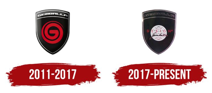
2011 – 2017
Having become the head of the company, A. Schwartz made many adjustments to the work and also decided to create a new logo. It reflected the values of the company, as well as respect for a key figure – Uwe Gemballa. Black was chosen as the background for the image. In the context of the brand style, it means classics, rigor, and elegance simultaneously. In addition, it immediately catches the eye and is quite memorable.
Usually, black color is used for font design. But, Gemballa designers departed from the traditional design and were able to create a real, exclusive logo with an expressive black background. In the upper part of it was the company’s name, which was painted white and included in a thin frame made with white lines.
The font was quite unusual. The letters had the same size and looked like one continuous strip. The readability of the inscription faded into the background, but it favorably emphasized the brand name. In the middle was another attribute of Gemballa – an icon in the form of a twisted spiral of the letter G. For the symbol’s design, bright red color was chosen, which goes well with white and black.
2017 – today
In 2017, the company again decided to change the visual concept. This was the desire to update the style and make the emblem more modern. The basis of the logo was its previous version with additions and improvements. Features of the new concept include:
- adding inscriptions;
- preservation of colors;
- the appearance of a new element in the form of a globe icon.
In addition, the thematic and elegant style was preserved, which emphasized the status of Gemballa. The new addition in the form of a globe appeared for a reason. The company entered the global market and expanded its reach. The new badge was a direct reflection of this change.
Font and Colors
The Gemballa logo is recognizable and unique. It reflects the values of the brand and, at the same time, conveys the respectful attitude of modern management towards the founder. This is evident in adding an inscription by Uwe Gemball in English. A very unusual and difficult to read font was chosen for the design. The letters are strongly elongated and made in the form of an inscription by hand. This design adds a special charm and emphasizes exclusivity.
The unique inscription is complemented by the word Design, made in large block letters located at some distance. Although the word marks are made in different formats, they complement each other favorably. The upper part of the logo remained unchanged. It consists of the inscription Gemballa, which is made in soft and voluminous letters. The coloring includes three colors:
- red;
- black;
- white.
The background color is black. The Uwe Gemballa lettering uses a combination of black and white, with the globe icon and top lettering in neutral white and the Design lettering in a vibrant red hue. The combination of rather contrasting colors makes the logo memorable and unique.
Gemballa color codes
| Red | Hex color: | #fb0304 |
|---|---|---|
| RGB: | 251 3 4 | |
| CMYK: | 0 99 98 2 | |
| Pantone: | PMS 172 C |
| Black | Hex color: | #000000 |
|---|---|---|
| RGB: | 0 0 0 | |
| CMYK: | 0 0 0 100 | |
| Pantone: | PMS Process Black C |
