


![]() Genesis Logo PNG
Genesis Logo PNG
The style of this emblem reflects a desire for flight and high speed, so the Genesis logo epitomizes the concept. The automotive manufacturer has focused on the machines’ aerodynamic qualities and on optimal body streamlining to improve airflow, a focus reflected in the brand logo.
Genesis began in the early 2000s, when Hyundai Motor Group was trying to move beyond its mass-market image. Lexus had shown that an Asian automaker could challenge Mercedes-Benz and BMW in the luxury segment. In 2003, Hyundai developed the Concept Genesis, a rear-wheel-drive sports sedan aimed at the business-class luxury car market. The company debated whether to launch it under Hyundai or create a separate marque.
Hyundai chose the cautious route. The first Genesis sedan debuted at the North American International Auto Show in 2008 with V6 and V8 engines. The model became a turning point for Hyundai. It won the 2009 North American Car of the Year, and the Tau V8 was named one of Ward’s 10 Best Engines. Hyundai later added the Genesis Coupe to appeal to a younger, sportier audience. A major restyling followed in 2012, and the second generation arrived in 2015.
On November 4, 2015, Hyundai announced Genesis Motor as a separate luxury brand, the first created by a Korean automaker. The new team included Manfred Fitzgerald from Lamborghini, Luc Donckerwolke from Bentley, Lamborghini, and Audi, and Albert Biermann from BMW M. Genesis announced the EQ900, known globally as the G90, on December 9, 2015. In 2016, G80 and G90 entered the US market through dedicated Hyundai dealer spaces.
The G70 followed in 2017 as a rival to the BMW 3 Series and Mercedes-Benz C-Class. Genesis then moved into SUVs with the GV80 in 2020, followed by the GV70. In 2021, it entered the European market and announced plans to expand into China. In August 2023, Genesis passed 1 million vehicles sold since the brand’s launch.
Meaning and History
![]()
In 2003, Hyundai introduced a conceptually new passenger car model featuring a modern rear-wheel-drive system. According to the plan, it was a progressive sports sedan. In 2007, she demonstrated the first model, which took three years to develop. Within the framework of the project, $500 million was spent and 800,000 miles traveled. After the tests, the parent company only sent the car to the North American International Auto Show.
According to Chris Hosford, Hyundai’s US spokesman, the Genesis series has gained an individual brand status for three reasons. First, these luxury cars have enjoyed great success over the past seven years. The second is that the sedan ranked in the top three in its segment in sales. Third, the buyers wanted the unit to become independent.
The original Genesis Motors dealerships were Hyundai distribution centers, while the newly formed structure designed its vehicles. As a result, its SUV debuted in the winter of 2020, and its electric car debuted in 2021. They bore the Genesis badge on the front, not the Hyundai Motor Group emblem. In general, this brand has three logo variants.
What is Genesis?
This brand, initially Hyundai’s luxury-vehicle division, later became an independent marque, marking South Korea’s entry into the luxury-car market. Its lineup includes the flagship luxury sedan G90, the sporty sedan G70, and the premium GV series SUVs, showcasing the brand’s attention to detail and high craftsmanship. The brand’s headquarters in Seoul attracts top talent from European luxury car companies to create vehicles that combine global luxury standards with Korean technological advancements.
2008 – 2015
![]()
In the early years, the brand was called the Hyundai Genesis. His symbolism was based on a winged image. In the center was an angular shield with a striped background and a triple edging of white and black lines. Horizontally, it was crossed by a rectangle with the name of the automobile line. The word was written in light letters with sharp edges that replaced serifs.
The wings were located to the right and left of the central element. Each consisted of three wide “feathers” and a tail. Due to the correct distribution of light and shadow, they appeared volumetric: the highlights were concentrated toward the middle, and dark zones appeared at the ends of the “feathers” and beneath them. There was also a separately placed brand name: it was at the bottom and was an exact copy of the inscription from the center. The only difference was in color: one word was white, the other was black.
2015 – 2020
![]()
After the division was officially declared a standalone Genesis Motors brand, it received a new emblem. It was a reworking of the old version. The designers narrowed the fenders to make them more compact, removed the tail section, replaced the striped background with a dotted one, and reduced edging stripes around the shield. They chose a combination of black and gray in several shades as the official palette.
2020 – today
![]()
The developers have even simplified the logo, turning it into a laconic sign. They flattened it by eliminating the 3D effect, split the top “feather” into two parts, lightened the background, and tweaked the shield, after which it took on a slightly different shape. In addition, the authors added a bottom caption and changed the font to a sleek, thin sans-serif.
Font and Colors
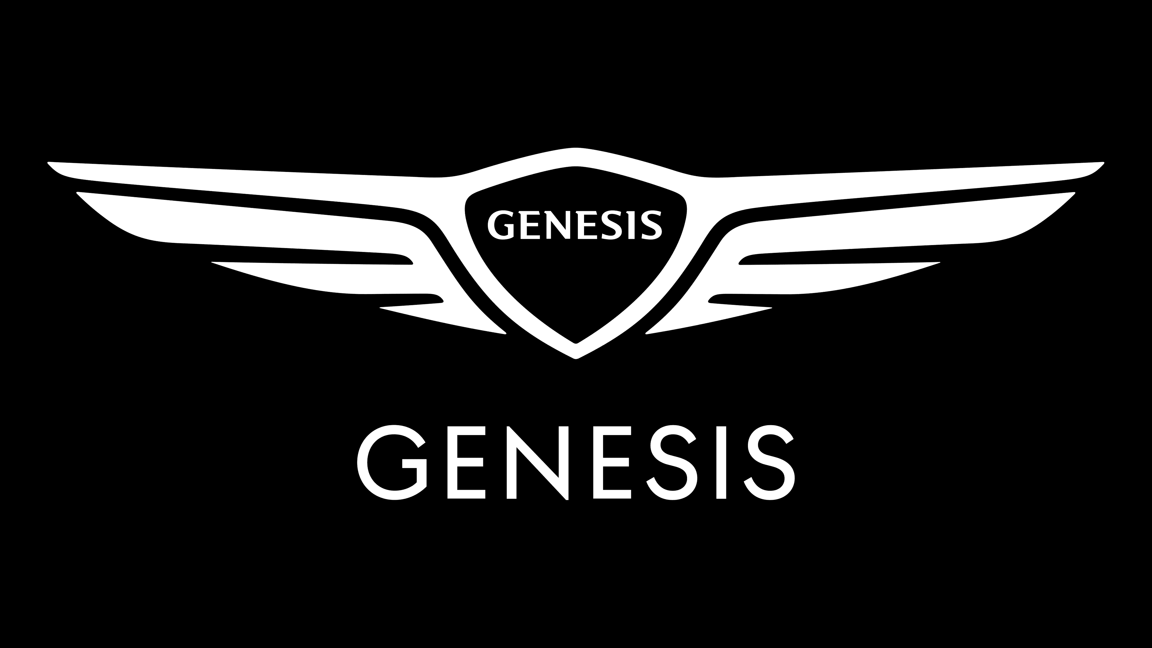
The Genesis Motors brand identity evolved from voluminous and complex to flat and simple. As a result, a completely different logo appeared, with three independent blocks. The first is a shield with a name and two lines extending to the right and left. The second is two wings, which include three “feathers.” The third is the bottom caption in sans-serif capital letters.
To express the concept of Genesis Motors, the designers used the Hyundai Sans Typeface as the basis, slightly altering the signs’ proportions and detailing. This change aims to achieve a distinctive look that is quietly Iconic. Like the Genesis cars, the look is premium but not luxurious; it’s refined and balanced. Guided by this principle, the developers embodied the new brand’s individual identity without losing the DNA connection to the parent company.

The authors of the personal typeface first rounded the corners slightly, giving the letters a geometric look. Thus, they demonstrated the machines’ extreme nature. Then, they changed the proportions of the alphabet, guided by the Romanis Capitalis font, in which straight characters are half the width of rounded characters. The roll call with the ancient Roman sans-serif typefaces, as if carved from stone, set a new rhythm for the inscriptions, sophisticated and exclusive.
The logo’s color scheme is not far from the parent company’s palette. It contains all shades of gray from light silver to dark graphite. They were used with a hidden gradient from light mid to dark edges. But this was only the beginning. Then, they were joined by monochrome, formed by combining black elements on a white background.
FAQ
When did Genesis change their logo?
The company began as a luxury car model under Hyundai and became its brand in November 2015. This change was accompanied by a new logo, denoting its place in the automotive industry as a separate entity. Hyundai aimed to enter the luxury car market by appealing to customers who value premium quality and exclusive design.
The logo, introduced in 2015, symbolizes Genesis’ independence and focus on luxury. The rebrand included a sophisticated badge to compete with established luxury automotive brands. The logo features a shield emblem representing security and prestige, and a winged design representing speed, freedom, and elegance.
Are Genesis cars part of Bentley?
The cars are not part of Bentley. Hyundai’s luxury car division was created to compete in the premium car market. The brand originated as part of Hyundai, one of South Korea’s largest car manufacturers, known worldwide for its wide range of vehicles that combine affordability and reliability.
The company was created to carve out a niche in the luxury car segment, offering high-end cars with advanced technology, exquisite design, and premium quality. The differences between the two brands are significant: each caters to a different segment of the luxury car market and adheres to distinct heritage and brand values.
What does the Genesis logo mean?
The logo, which features two wings separated by a black shield and the word Genesis, symbolizes the brand’s premium status. The winged design is similar to luxury brands such as Aston Martin, Chrysler, and Bentley, which use wings to convey luxury, speed, and ambition.
The logo’s wings symbolize grace and perfection and are well-suited to the luxury car market, where consumers seek status and achievement symbols. These images help the brand visually communicate high quality and superior performance. The black shield behind the brand name adds strength and protection, making the logo memorable and impactful.
Is Genesis a good car brand?
The company is known for its high-quality cars, especially modern models. The brand competes with luxury car manufacturers such as Mercedes-Benz, Lexus, and BMW, outperforming them in several ways.
Many models feature advanced technology, sophisticated design, and high-quality materials, standard features that are costly extras on other luxury cars. The cars are praised for their smooth handling, powerful engines, and responsive driving dynamics. They combine performance, elegant style, and a quiet, comfortable cabin, appealing to those seeking luxury without the hefty price tag. The brand offers generous warranty programs and customer service initiatives that enhance the ownership experience.
Why does the Hyundai Genesis have a different logo?
The company adopted a new logo to differentiate itself from Hyundai and establish itself as a separate luxury brand. Initially, the models bore the Hyundai logo because they were part of the Hyundai lineup.
As Genesis evolved into its brand, establishing a unique identity became important. This helps differentiate the vehicles from mainstream Hyundai models. Some owners add a wing badge to their vehicles, which is sold separately. This logo choice highlights the cars’ luxury. The badge’s elegant, sophisticated design better meets the expectations of luxury car buyers than the Hyundai logo.
Who makes the Genesis?
Hyundai owns and produces the brand, which was launched as a separate company in 2015 to enter the luxury car market.
Creating a separate brand for luxury models allows Hyundai to focus on design, technology, and customer service tailored to luxury car buyers. This approach helps the brand create a unique identity and driving experience, setting it apart from Hyundai’s more utilitarian vehicles. By maintaining ownership and production, Hyundai ensures Genesis benefits from its research, development, and quality control processes.