 Gentlemen’s Quarterly (GQ) Logo PNG
The GQ logo has a modern and stylish appearance, underscoring the magazine’s reputation as an authoritative source of information on fashion, culture, sports, entertainment, and technology. It symbolizes two seemingly incompatible things: ruggedness and elegance. The creators of the emblem managed to combine them in a way that reflects modern male aesthetics.
Gentlemen’s Quarterly (GQ): Brand overview
| Founded: | 1931 |
| Headquarters: | New York City |
| Website: | gq.com |
Meaning and History
The abbreviation GQ is formed from the old name of the magazine: Gentlemen’s Quarterly. This expression of its concept is manifested at all levels – from the choice of topics for articles to the logo. The magazine’s front page since 1958 has been decorated with a stylish monogram in which elegance and ruggedness are amazingly intertwined. The deciding factor in the design is the typography, as the symbol contains nothing but glyphs. The bold sans-serif font is perceived as bold and chunky. It catches readers’ attention and makes them think about what is hidden under the cover. It should be noted that the magazine was renamed several times, so its emblem was inconsistent.
What is GQ?
GQ is a men’s magazine dedicated to lifestyle. It is aimed at young people interested in fashion, self-improvement, travel, sports, and modern culture. Its editor-in-chief is Will Welch, and its publisher is the American company Condé Nast, headquartered in New York. Issues are published ten times a year in two languages: English and Spanish.
1931 – 1958
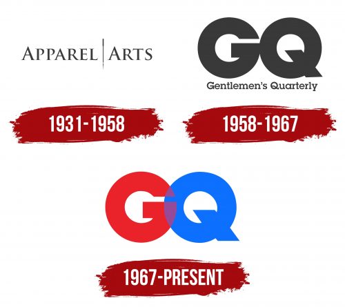
GQ started publishing in 1931 under the name Apparel Arts. It became the basis for the logo used as the headline. The font with thin serifs gave the inscription a fresh and attractive look. All letters were uppercase, but the designers deliberately enlarged the first “A” to make the emblem more substantial. Between the two words was a vertical bar – a sewing machine needle with a characteristic thickening at the top and a pointed loop at the bottom. This symbol reflected the magazine’s theme, intended for men’s clothing sellers.
1958 – 1967
Apparel Arts was transformed into Gentlemen’s Quarterly and began to use a two-tier logo without a sewing needle. Its new name was placed at the bottom and was almost invisible compared to the massive monogram “GQ.” For the long inscription, the designers chose a font with rectangular serifs and a very bold grotesque for the two letters.
1967 – today
Only the monogram remained on its emblem after the magazine’s name was shortened to GQ. In this version, the black letters overlap each other and form an inseparable figure from the two circles. Despite its massiveness, the logo looks dynamic. It expresses the idea of a stylish, modern man striving for elegance, success, and influence.
Font and Colors
A special font was developed for the monogram, characterized by its high boldness and lack of serifs. This is a demonstration of boldness and confidence. The black color was chosen with the same goal: to show the imposing character of GQ. It looks both rugged and refined.


