


 George Mason University Logo (GMU Logo) PNG
The George Mason University logo embodies freedom and education, key values at the core of the university’s learning experience. The emblem emphasizes the institution’s deep connection to America’s historical heritage, reflecting its role in shaping new generations focused on knowledge, freedom of thought, and respect for tradition.
George Mason University was founded in 1949 as a branch of the University of Virginia in Northern Virginia. At first, it operated from an elementary school in Arlington under the name Northern Virginia University Center, offering part-time courses. In 1956, it moved to the Bailey’s Crossroads area, expanded its programs, and became University College.
In 1959, the Virginia General Assembly approved George Mason College as a two-year institution named after George Mason, one of America’s Founding Fathers and author of the Virginia Declaration of Rights. In 1964, the college moved to a 150-acre site in Fairfax. In 1966, it gained the right to award bachelor’s degrees, opening the way for four-year programs.
In 1972, George Mason College separated from the University of Virginia and became George Mason University. During the 1970s and 1980s, it added the School of Business, the School of Law, and the School of Information Technology and Engineering. Its first doctoral program, in psychology, opened in 1979. In 1986, economics professor James Buchanan received the Nobel Prize in Economics.
The university continued to expand in the 1990s and 2000s, adding the Prince William campus, the School of Public Policy, later named for Colin Powell, the Krasnow Institute, and new research programs. Later milestones included the 2005 NCAA Final Four run, the 2016 naming of Antonin Scalia Law School, the 2017 Faster Farther campaign, EagleBank Arena in 2018, cybersecurity growth in 2019, the 2021 Digital Innovation Institute, Mason Virginia Promise in 2022, and entrepreneurship expansion in 2023.
Meaning and History
What is George Mason University?
Located in Fairfax, Virginia, the institute is a public research institution with campuses in Arlington and Prince William counties. It offers undergraduate and graduate programs in various fields, including business, law, engineering, social sciences, and the arts. It is the largest public university in Virginia. The university is known for its diverse student body and excellent academic programs. It is also lauded for its contributions to economics, public policy, and conflict resolution through its research projects. The university is known for its competitive athletic programs, active student body, and vibrant campus culture. The University offers students exceptional networking and internship opportunities in the public, non-profit, and for-profit sectors due to its proximity to Washington, DC.
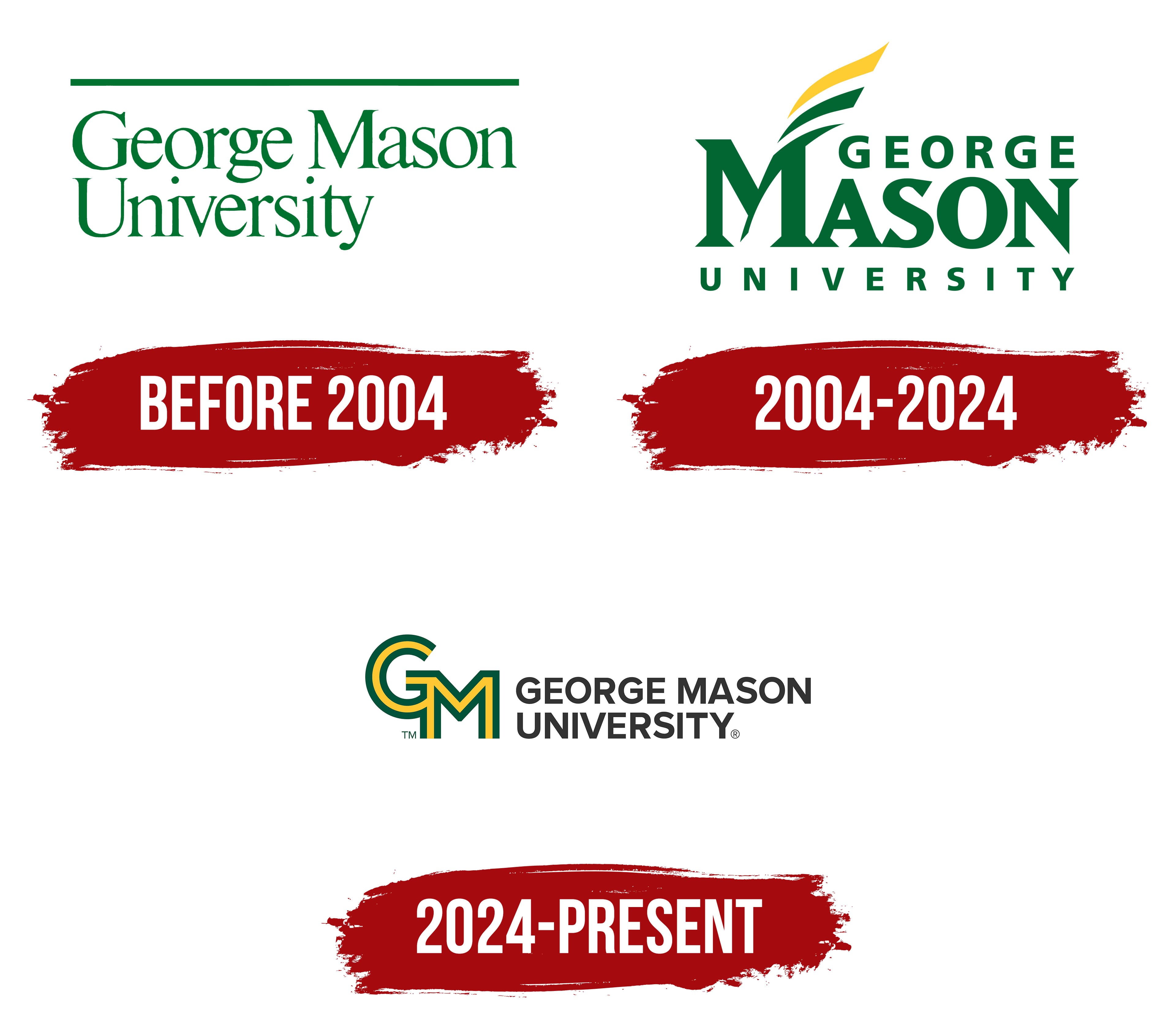
Before 2004
For the university’s first emblem, a rich green color symbolized growth, development, and prosperity. The university’s name was placed beneath a straight line, written in thin, serifed capital letters in two levels. This emblem did not appear until after 1958, when the professional development center was transformed into a college and became part of the university. The line symbolized the institution’s dependent status, as it initially operated as a branch of the University of Virginia. It was only in 1972 that the college achieved independent university status.
The name George Mason, featured in the logo, belongs to a prominent Virginian and one of the United States’ Founding Fathers. He was the author of the Virginia Declaration of Rights, which became the foundation for the Bill of Rights. Mason is associated with progress, development, and enlightenment, making his name a significant element in the university’s title.
Green, the institution’s official color, is traditionally associated with nature and freshness. For the university, it symbolizes the ongoing pursuit of innovation, success, and prosperity.
2004 – 2024
In 2004, the George Mason University logo was updated to adopt a more progressive, modern look while maintaining its connection to the institution’s historical heritage. The university’s name is now written in three levels: “George” and “University” are in smaller, more even letters, while “Mason” is highlighted in a large, completely different font. The letters of “Mason” have sharp serifs reminiscent of the university’s historical roots and its significance in educational history.
Attention is drawn to the crossbar of the letter “M,” which has been transformed into a quill symbolizing knowledge, education, and writing. This element embellishes the logo, enhancing its historical significance. The quill is colored in the university’s official colors, green and gold, adding brightness and symbolism to the logo. Green represents growth, development, and nature, while gold is associated with prestige, knowledge, and high achievements.
The choice of the quill as a decorative element in the logo resonates with the university’s academic tradition and history, preserving continuity and respect for the past. This reflects the university’s dedication to continuing the traditions of education and scholarship, while the sharp serifs on the “Mason” letters emphasize the institution’s seriousness and academic importance.
2024 – today
The George Mason University logo is a new and vibrant representation of the brand that perfectly reflects its modern spirit and ambitions. The letters “GM” are rendered in green and yellow, symbolizing growth, development, energy, success, and prosperity. The letters feature smooth yet defined lines, giving the emblem a contemporary yet stable and confident appearance.
The font is simple but powerful, with straight lines and clean shapes. It reflects the university’s commitment to clarity and transparency in its operations and educational mission. The dark color of the “GEORGE MASON UNIVERSITY” text, combined with the bright colors of the “GM” letters, emphasizes the contrast between tradition and innovation that intertwine in the university’s life.
The green color symbolizes prosperity and a connection to nature and the environment, which is significant given the university’s active support for environmental responsibility. The yellow color represents energy, creativity, and a drive for new achievements, aligning with the spirit of the times as the university actively expands its educational and research programs.
The symbolism of the “GM” letters is also important. These letters merge to create a unified whole, symbolizing the cohesion and unity of the university community. The visual connection of the letters speaks to the strong bond between students, faculty, and administration.
The new logo represents a transition to a new era in which the university has become not just a place of learning but also a center of innovation and creativity.
The Seal
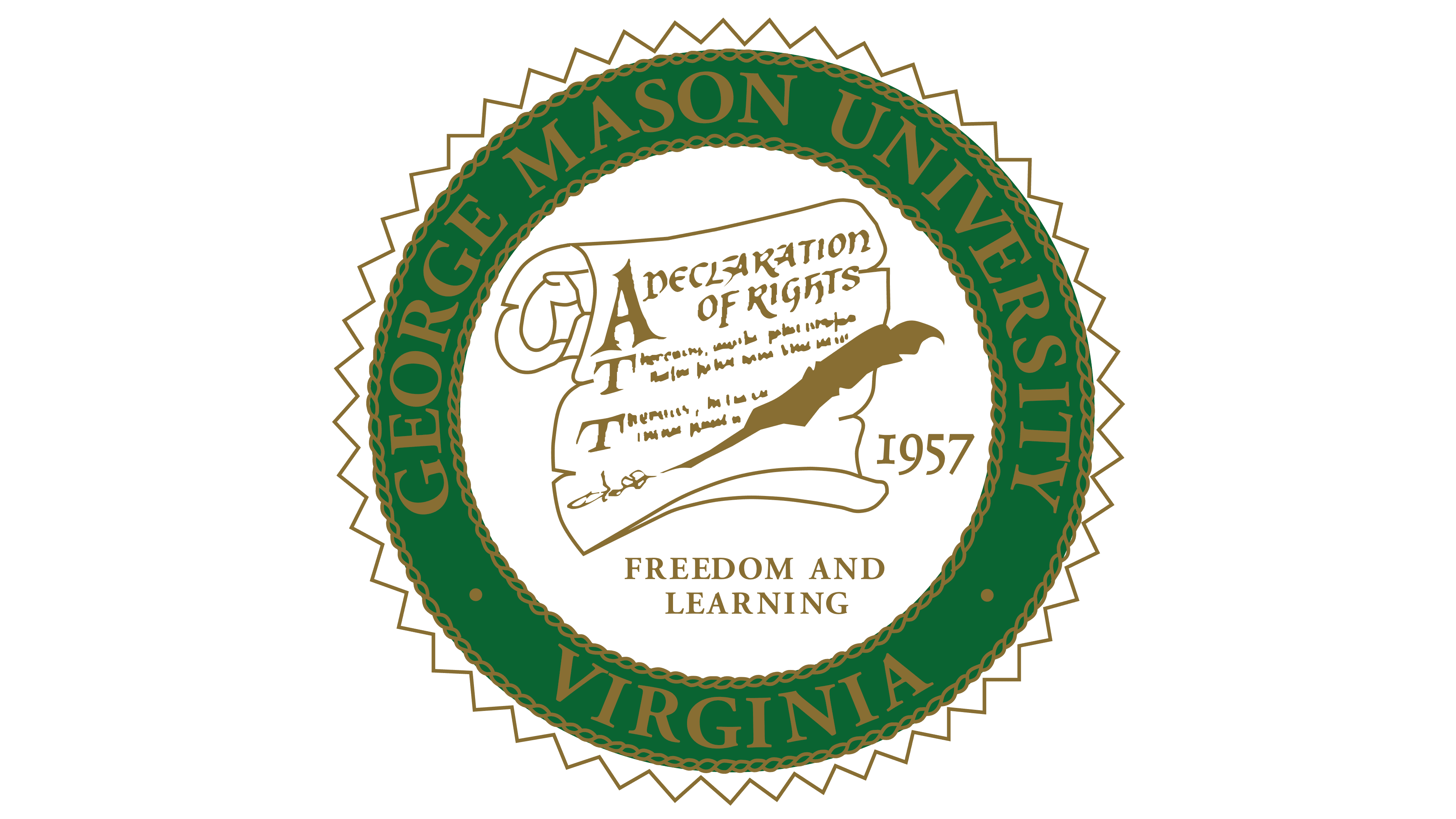
The university seal is adorned with an elegant ornament of serrated elements arranged in a circle, creating a sense of dynamism and completeness. These serrations resemble traditional elements of heraldry, emphasizing the institution’s seriousness and academic significance. Thin gold chains outline the green band, adding a sense of luxury and richness to the logo and reflecting the university’s high status.
On the green band, the institution’s name, “George Mason University,” and its location in Virginia are written in gold letters, highlighting the university’s place and history.
Inside the seal, the Bill of Rights manuscript is depicted along with a golden quill used to sign it. This image symbolizes a significant event in U.S. history, the adoption of the Bill of Rights, which laid the foundation for many of the rights and freedoms of citizens. In this context, the image connects the nation’s foundational documents with the university’s founding in 1957.
Below the manuscript, the university’s motto, “Freedom and Learning,” is inscribed. This motto reflects the institution’s core values, which aim to foster free-thinking, educated citizens prepared to contribute to society.
gmu logo