


![]() Gerflor Logo PNG
Gerflor Logo PNG
The designers have created a universal Gerflor logo that serves two functions: it identifies the company and its main product, flooring. The logo suggests that these materials are incredibly durable and reliable.
Gerflor began in 1937 in Villeurbanne, near Lyon, when a group of French industrialists started producing floor coverings. The company entered the market as PVC was only beginning to appear in construction. Its early breakthrough was homogeneous vinyl flooring, a material whose color and structure ran through the full thickness, making wear and repairs less visible.
In 1947, the Gerflor division developed Taraflex, a synthetic sports flooring brand. Through the 1950s and 1960s, the material was refined for shock absorption and athletic control. In 1976, Taraflex was used for handball, volleyball, and badminton courts at the Montreal Summer Olympics. From that year through Tokyo 2021, it appeared at every Summer Games, 13 times in a row.
The group expanded its product line in 1985, when Gerflex launched the first self-adhesive vinyl tile and became well known in France through the “Et Hop!” campaign. In 1997, Gerflor acquired Mipolam, a German pioneer in homogeneous vinyl, thereby strengthening its medical and industrial flooring operations. In 2007, the company entered the US market and, in 2012, bought Romus.
North America became more important in 2014, when Gerflor acquired Connor Sports, a long-established US maker of sports parquet floors used by the NBA and NCAA, as well as Sport Court, a modular sports-surface specialist. Later acquisitions included Gradus in 2015, DLW in 2018, Progress Profiles in 2021, Dumaplast and Dinac in 2022, and StageStep and SnapLock in 2023. Its main competitors include Forbo and Armstrong Flooring.
Meaning and History
Gerflor’s first invention was vinyl flooring. She released it in 1937, simultaneously with her debut in the building materials market. After ten years, its range included special coatings for sports fields and, later, for aeronautics. In 1985, the manufacturer developed its version of self-adhesive tiles. Over time, it improved this product and reduced the amount of adhesive in the composition because modern technology enabled it to meet sustainable building standards.
Today, Gerflor owns many innovative solutions that it implements in its brands. These include, for example, a new generation of UV-protected outdoor surfaces and anti-viral vinyl railings and floors developed as part of the fight against COVID-19. In addition, the manufacturer recently patented the Clean Corner system, which prevents floor contamination in medical facilities.
What is Gerflor?
Gerflor is a legendary French manufacturer of building materials for floors, walls, and ceilings. Under the brands Gradus, Sportcourt, Connor Sports, Tarabus, Mipolam, and Taraflex, elastic linoleum and vinyl coatings are produced.
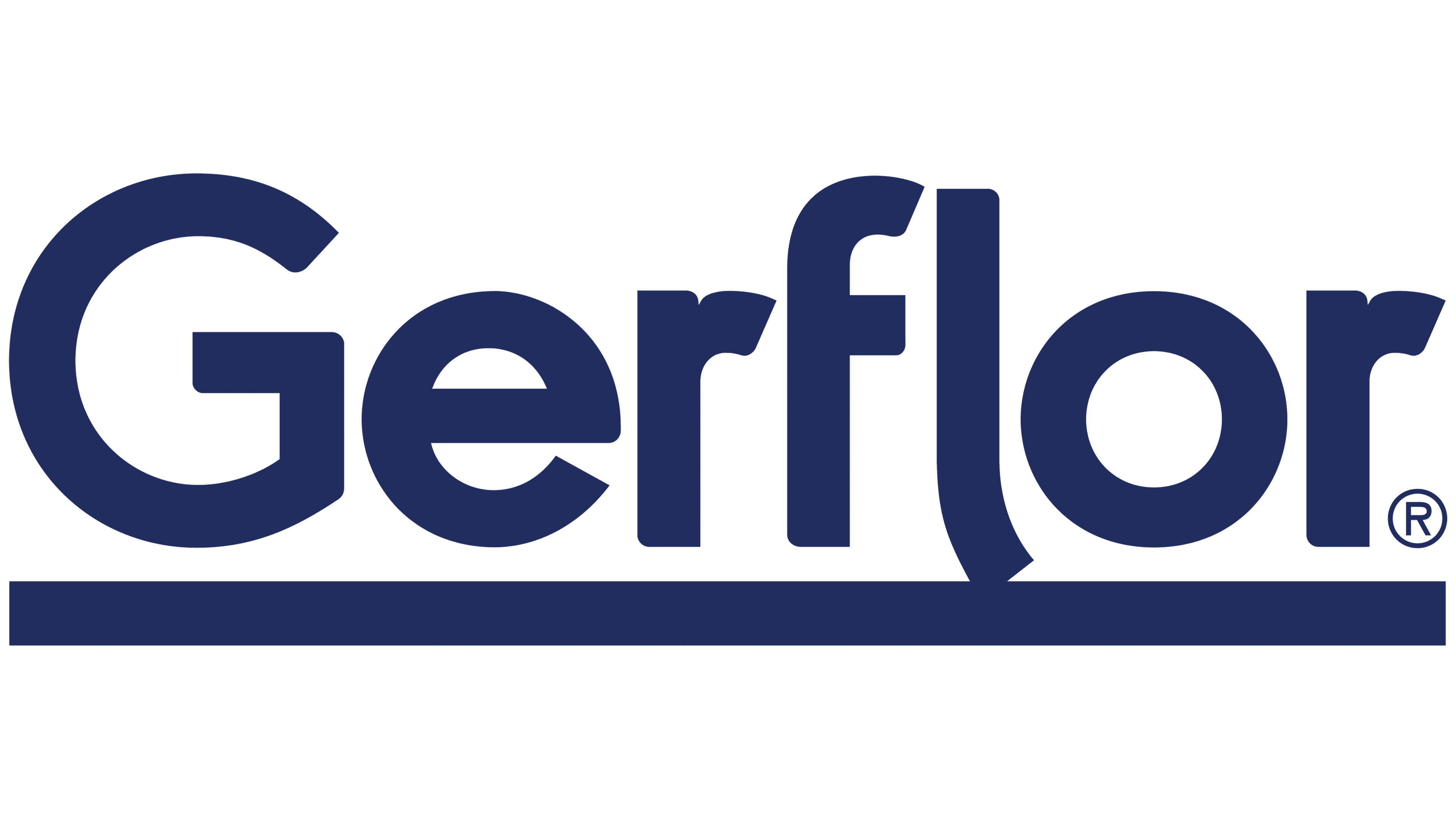
The design of Gerflor products warrants special attention, as the company offers a wide range of building materials in various colors. But its logo, by contrast, uses very restrained colors. This simple dark-blue inscription is set against a white background and spans two lines. The first part is separated from the second by a long horizontal strip shaped like an elongated rectangle.
At the top, the designers placed the company name. It is left-aligned and consists of an uppercase “G” combined with lowercase “erflor.” It is noteworthy that the leg of the “l” is curved, which is why the glyph has taken the form of a hockey stick. The entire word is underlined with a bold horizontal stripe. This line separates it from the label below, which has no spaces: “theflooringroup.” The phrase is right-aligned and contains only lowercase letters.
The stripe separating the two lines in the Gerflor logo can symbolize the company’s main product, flooring. In turn, the letter “l” represents materials for finishing walls and other vertical surfaces. And its unusual shape, with a curved leg, hints at the elasticity of innovative coatings such as linoleum and vinyl.
Font and Colors
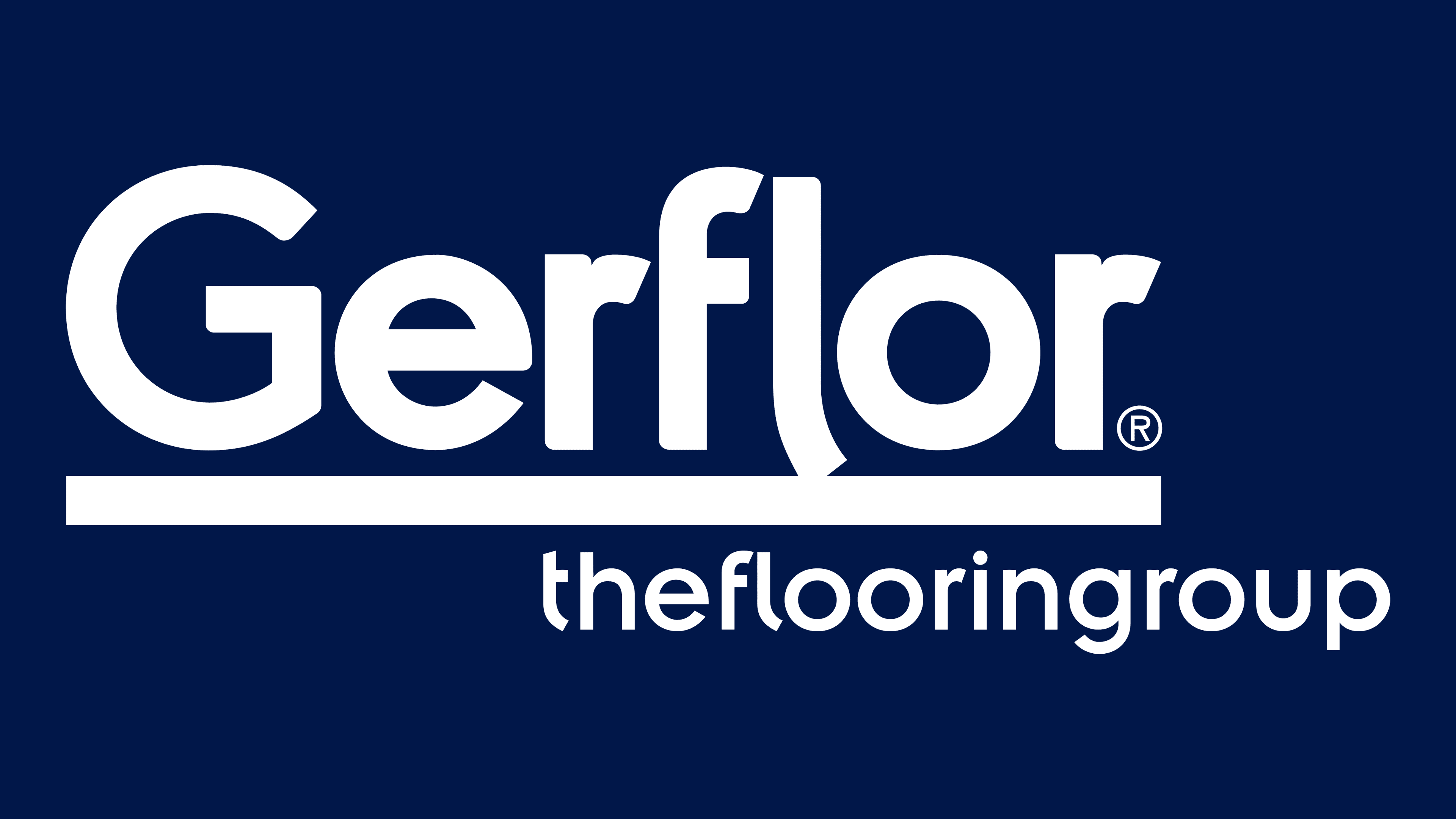
The Gerflor logo has become recognizable thanks to a specific sans-serif typeface. This is a modification of another similar typeface, OC Pajaro Extra Bold. They have a lot in common, but the wordmark’s developers slightly altered the grotesque by adding unusual curves, particularly to the “l.” And for the slogan, the designers used a font similar to Insignia Roman. As for the color, the inscription is in a single shade of dark blue (shade #1a295e). The background is white in the main version, but it can vary depending on the visual context.