The Gett logo demonstrates how fast and quiet taxis move around the city without conspicuousness. They will deliver the passenger to any point in the metropolis. It is clear from the emblem: the service works smoothly, and it is not difficult to call a car.
Gett: Brand overview
| Founded: | November 1, 2010 |
| Founder: | Dave Waiser |
| Headquarters: | London, UK |
| Website: | gett.com |
Meaning and History
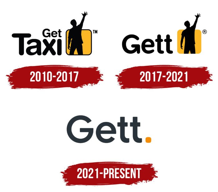
The company changed its logo twice during its operation. The company’s color palette was used in all cases, consisting of orange and black. Thus, Gett management tried to make the brand recognizable among the target audience, which needs to order a car.
What is Gett?
First of all, this is a mobile application for ordering a taxi. The company employs about 10 thousand employees who perform user support and make changes to the software.
2010 – 2017
The main element of the logo is not a verbal inscription but an emblem. It depicts the silhouette of a man who raised his hand as if attracting the attention of passing cars. It is inside an orange square with slightly rounded corners. Moreover, this person is much larger than a geometric figure. The outlines of the square are highlighted in black. The emblem on the logo should attract the attention of users. People who see only the logo, without the company’s name, will want to know about the type of activity. To the left of the image is the name Get Taxi. And visually, these two words are located one above the other. The author decided to make the word “Taxi” more voluminous. Visually, it is twice as large as “Get.” The name is written in black letters using a classic bold font with rounded edges. In addition to the elements presented, the company’s management also took care of copyright protection by adding “™” (a sign confirming the registration of a trademark) to the right of the emblem.
2017 – 2021
After several years of successfully using the original version of the logo, the company decided to change it. “Taxi” was removed from the wordmark. Thus, the brand itself became more mysterious for those users who had never interacted with the company. Only the letter “T” was preserved from this word, which was added to the end of “Get.” Moreover, this word has increased significantly compared to the previous version. It was also done in a classic bold font with rounded corners and black. Minor changes have been made to the emblem. The black contours in the square were removed, which seemed to limit the freedom of action of a person. The author also minimally changed the figure itself, making it more slender. The ™ mark has been replaced by trademark registration, namely ®.
2021 – today
The most drastic changes to the company logo took place in 2021. The author decided to remove the emblem, leaving only the verbal form. The company’s very name, “Gett,” is made in the same font as the previous versions. However, the corners in the letters are now less rounded. The vertical arrow at the bottom of the “G” has been removed. The color became brighter, closer to gray. Only an orange square remained from the original emblem, significantly reduced in size. Copyright notices have been removed.
Font and Colors
The use of a classic typeface with slightly rounded edges allows the Gett logo to be legible. The likelihood that the user will misread the name is minimized. The company’s management tried to convey a positive attitude to the user, pointing to any order’s quick and accurate execution.
For the company’s name, the authors, at various stages, used black and gray. Thus, an attempt was made not to distract potential customers with unnecessary details. A different color palette was used only for the emblem, where, in addition to the black figure, there was also an orange square.
Gett color codes
| Gunmetal | Hex color: | #29333a |
|---|---|---|
| RGB: | 41 51 58 | |
| CMYK: | 29 12 0 77 | |
| Pantone: | PMS 433 C |
| Neon Tangerine | Hex color: | #f68d06 |
|---|---|---|
| RGB: | 246 141 6 | |
| CMYK: | 0 43 98 4 | |
| Pantone: | PMS 151 C |


