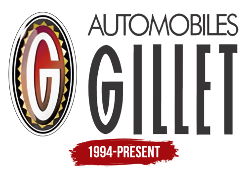
The Gillet logo is elegant and sophisticated, just like the brand’s racing cars. The emblem shows an individual approach to customers and attention to detail. Each instance is a machine with a capital letter.
Gillet: Brand overview
| Founded: | 1992 |
| Founder: | Tony Gillet |
| Headquarters: | Gembloux, Belgium |
Gillet is a young Belgian manufacturer of luxury sports cars, hand-built to order by the team of former racing driver Tony Gillet. The prototype was introduced in 1991, and by 1994 the car was ready for production. The gradual evolution of the brand includes Vertigo models: GT2, Streiff, 5, 5 GT2.
Meaning and History
The emblem represents the brand’s cars as piece goods. It conveys their exclusivity, thoughtfulness, and perfect fit of parts. The sign shows the lightness and speed of sports cars. The owner of a Gillet car feels like the owner of the road behind the wheel. Prestige is encrypted in symbols. A few copies belong to rich and noble owners.
The logo consists of the symbol and the name of the company. The visual reflection of the company is the prototype of the wheel with the letter G in the center. The figure is deployed half a turn towards the viewer and seems to be rolling forward past him.
What is Gillette?
A company that markets sports cars under the Vertigo brand, with an engine capacity of 2 to 4 liters, made of composite materials. Located in the French commune of Belgium Gembloux. Owner: Tony Gillet. The cost of the car reaches 100 thousand dollars.
Wheel decoration, bright colors, and inner teeth ornament show the style of the car. Knowing well the strengths and weaknesses of racing cars, the founder of the brand wanted to create his own sports car that would look like a work of art.
The figure looks very thin, which hints at the car’s lightweight. The mass of machines is less than 1000 kg.
The inner red oval with a white letter on it looks like a start button and represents start and speed. G – indicates the name of the company, taken from the founder’s name.
The yellow denticles on the edges of the red background are reminiscent of the sun, associated with heat. The main material of the new machines is reinforced carbon fiber. It is made by heating. The composite is also melted and poured into molds to produce individual parts of the chassis and body.
The round sign also tells about the headlights, indicating their special mobility. In the company’s models, the lamps, if necessary, are hidden, merging with the body to increase the streamlining of the sports car.
The name is written in two levels, taking up space at the wheel’s height. Above in thinner letters Automobiles, below in elongated bold elements – Gillet. The letters’ disproportion demonstrates the machines’ flattened, elongated shape. An elongated hood especially distinguishes all models of the brand.
Font and Colors
The predominant color of the logo is black. It is complemented by yellow, red, and white. Shades set accents and emphasize the features of cars.
- Black – represents strength, reliability, and safety.
- Red is the color of speed, brightness, and visual appeal. All models are exclusive and finalized for a specific owner.
- Yellow – Indicates comfort and driving pleasure.
- White – tells about the brand’s novelty, the uniqueness of cars, and a new approach to design and equipment.
The font is unique. All letters have the minimum size of additional glyphs, which shows the streamlining of sports cars and the absence of unnecessary details. The sharp end of the internal curl G, like a speedometer, hints at racing and high-speed driving. Its direction at 6 o’clock represents readiness for a start.
Gillet color codes
| Jet Black | Hex color: | #383536 |
|---|---|---|
| RGB: | 56 53 54 | |
| CMYK: | 0 5 4 78 | |
| Pantone: | PMS 412 C |


