


![]() Gillette Logo PNG
Gillette Logo PNG
The Gillette logo is a classic example of a masculine and reliable brand. Demonstrates a thorough approach to developing comfortable and effective shaving products. The emblem represents a company recognized worldwide for the quality of its products.
In 1855, King Camp Gillette was born in Wisconsin and spent years as a traveling salesman. While working at Crown Cork & Seal, inventor William Painter advised him to develop a disposable product to drive repeat purchases. In 1895, Gillette conceived the idea of a thin, double-edged steel blade cheap enough to discard after use.
After six years of development, he partnered with William Emery Nickerson and, in 1901, they founded the American Safety Razor Company, which was soon renamed the Gillette Safety Razor Company. In its first year, the company sold 51 razors and 168 blades. By 1903, sales reached 90,884 razors and 123,648 blades. In 1904, Gillette secured a patent, and Nickerson introduced a blade-grinding machine that scaled production. By 1905, the company had expanded to London and Paris, followed by expansion into Canada and European distribution in 1906.
World War I drove rapid growth. The US military required soldiers to carry shaving kits, and Gillette supplied compact sets with disposable blades. In 1917, sales reached 1.1 million razors; by 1918, 3.5 million razors and 32 million blades were distributed to troops.
After the patent expired in 1921, competition increased. Gillette introduced the New Improved model and adopted a pricing model based on low-cost handles and recurring blade sales. Later diversification included acquisitions of Braun AG in 1967, Oral-B in 1984, and Duracell in 1996.
Product development continued with Trac II in 1971, Atra in 1977, and Sensor in 1989. Competitors like Schick and Wilkinson Sword challenged its position. In 1998, Gillette launched Mach3. In 2005, Procter & Gamble acquired Gillette for $57 billion, and in 2006, it released Fusion.
Meaning and History
![]()
The company adopted its emblem almost 120 years ago, making it a classic. It consists of the company name, in honor of the creator. The logo has been revised several times to appear relevant and capture the attention of modern buyers.
What is Gillette?
Gillette is a trademark of Procter & Gamble, a multinational American corporation. It is a brand for cosmetic products for men and women, including shaving accessories. Before becoming a division of P&G, Gillette was an independent company. The period of independence lasted from 1901 to 2005.
1901 – 1964
![]()
In the debut version, Gillette is written in lowercase, except for the “G”, which is uppercase. “L” and “g” have design features; “t” is distinguished by an extraordinary presentation. Still, it was not the logo that struck first, despite the arrow piercing the letters (it denotes the sharpness of the branded blades). The emblem is placed inside the rhombus and painted gray.
1964 – 1974
![]()
All elements have undergone radical changes, except for the arrow, which symbolizes the ease of sliding razors. The letters have become larger; the lower part of the capital “G” has been brought down, and the upper part is aligned with the rest of the characters. The gray color is gone, and coal black has taken its place. Only the background part and the holes from the arrow that goes through the letters remained white.
1974 – 1989
![]()
This is a legendary period in the emblem’s history because the designers removed the arrow, and the name increased. Now it is visible and immediately apparent. The developers also added speakers, emphasizing the double “ll” and “tt”: the former are elongated and resemble solid pillars, while the latter are fused and rise above the adjacent “e.” This technique has never changed and remains relevant today. Despite the 1989 logo update, this version was used in some countries for a long time until 1992.
Although the brand’s verbal designation became much more readable, it still did not give a clear idea of the company’s products. Therefore, edits were needed to correct the oversight.
1989 – 2009
![]()
At that time, the prototype of the modern label emerged. Compared to the 1974 version, it has become much more visible and confident. The letters in the word Gillette remain in lowercase, except for the first. The space between them has disappeared, so the oblique signs are close to each other, and the “e” is linked with the previous symbols. In parallel with this version, another one was introduced with large spacing between letters.
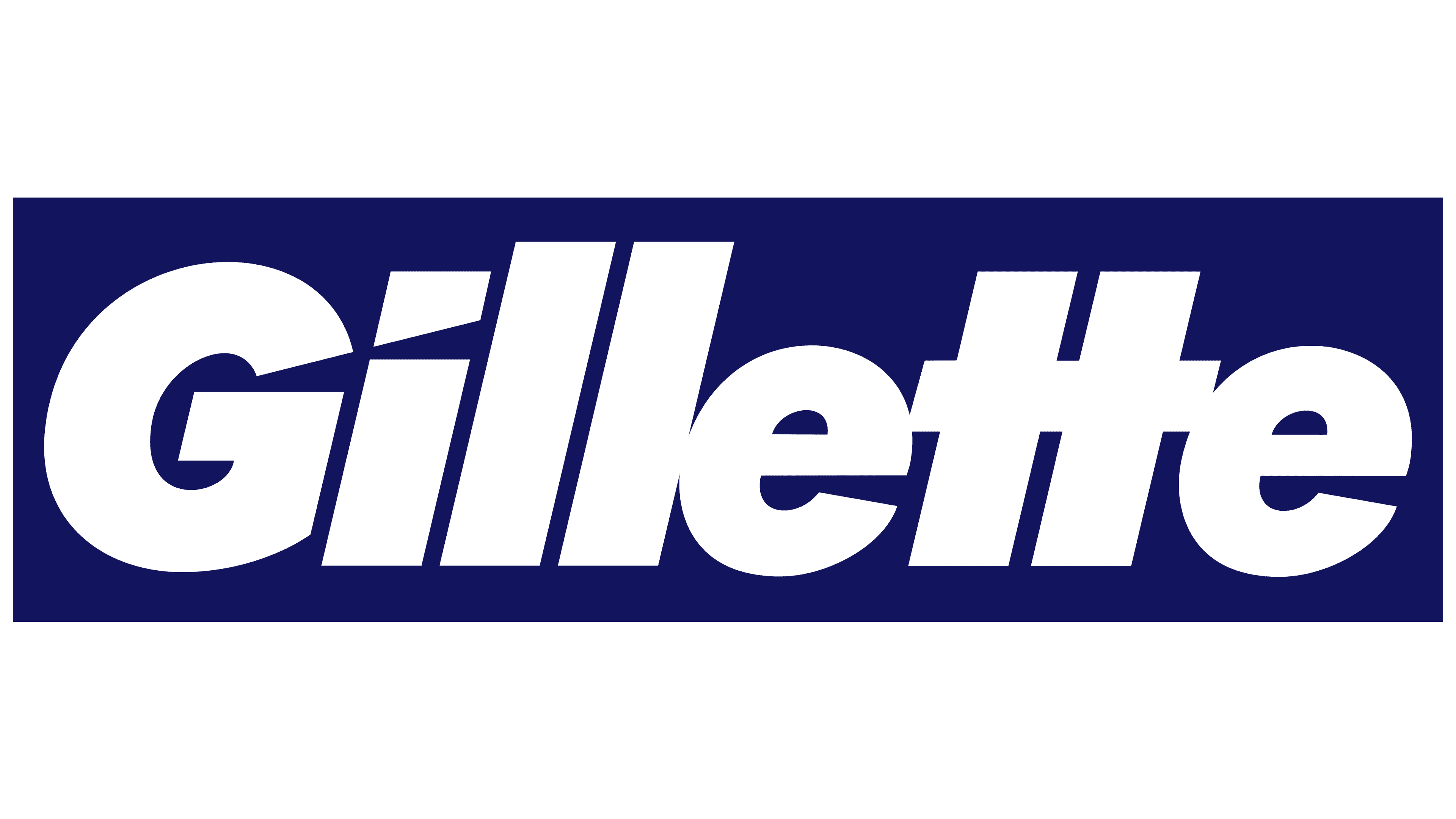
2009 – today
![]()
In this year’s logo, the developers redesigned the “i”: they removed the round dot and added an asymmetrically cut square. With a smooth cut, they emphasized the razor’s impeccable sharpness. An “accidental” notch also appeared on the letter “G”: the lower-right part seemed to have been struck by the blade. This happens when you accidentally cut your fingertip with a well-sharpened razor. The oblique spelling and fonts remain the same.
Font and Colors
The key element of the logo is a combination of text and graphic design. It demonstrates the transformation of the brand name, which began with complex shapes and reached conciseness. The inscription consists of a single word, “Gillette,” which equates the emblem with the categories of advertising and information. The letters are thick and bold. Twin “ll” is taller than “tt.” In turn, they are also unique since a common crossbar unites them. Instead of a dot above the “I,” an obliquely cut rectangle is used. The “G” has a similar cut, located at the bottom of the right leg and directed inward.
The authors chose a strict typeface, chopped, grotesque Futura Extra Black Italic, for the corporate symbol. This font was first introduced by Linotype and designed by Paul Renner. The color scheme harmoniously complements the sharpened letters. It is in monochrome, with black characters on a white background. On product labels, the word may be colored dark blue.