The Gittigidiyor logo indicates the diversity of the online store’s offerings. The emblem hints at the exciting journey through the retail pages and the joy of discovering unique and attractive products.
Gittigidiyor: Brand overview
| Founded: | 2001 |
| Founder: | eBay |
| Headquarters: | Turkey |
Meaning and History
Gittigidiyor is Turkey’s most popular online store. It offers a wide range of products – the same as that of its parent company, eBay. The range of products includes everything you need – from everyday items to collectibles.
It is a convenient platform for communication between sellers and buyers, where transactions are made in different formats every day—for example, bidding in an auction or the purchase of goods at fixed prices.
Gittigidiyor is recognizable by its visual identity system, which has changed several times since eBay became the majority shareholder. The most significant rebranding occurred at the end of 2012, allowing the largest e-shopping mall to enter 2013 with new capabilities.
What is Gittigidiyor?
Gittigidiyor is a Turkish-origin e-commerce platform. It was established in 2001 and was acquired by the American company eBay Inc. ten years later. In 2022, the owner shut down the site, putting an end to its history. On Gittigidiyor, one could find all sorts of products, from cosmetics to car parts. The catalog included 4,000 categories with hundreds of thousands of products from various sellers.
2001 – 2013
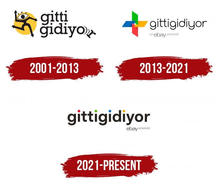
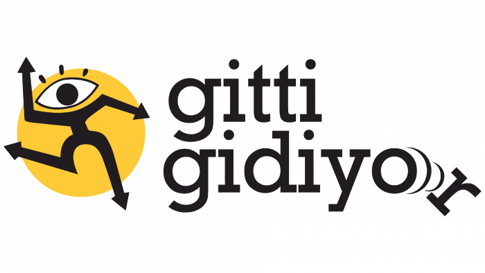
The Turkish Online Shopping Center was established in 2001 and has maintained its original corporate identity for a long time. The logo remained virtually unchanged even after Gittigidiyor took over the ownership of eBay. Its main element was a figure of a running man with a big eye instead of a head and arrows instead of arms and legs.
There was a yellow-orange circle in the background, which seemed three-dimensional due to the uneven coloration. The free space on the right was occupied by the company’s name: the first line contained the word “gitti,” and the second – “diyor.” Moreover, the last “r” fell, leaving behind two arc-shaped waves.
In 2011, when eBay became the majority shareholder of Gittigidiyor, another text element was added to the logo. The phrase “bir eBay şirketidir,” written in gray letters in Turkish, emphasized the affiliation of the trading platform of a well-known American corporation. It was located at the bottom left so that all attention was focused on the main emblem.
2013 – 2021
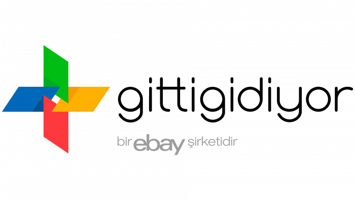
In September 2012, Gittigidiyor made another attempt to update its corporate identity. And here’s the result: the logo has become more abstract and is not like what it was before. Against the background of the black inscription, a multicolored icon stands out, which consists of four trapezoids: blue, green, yellow, and red. They are arranged in the shape of a flower and intersect at the corners to form a small white rhombus in the center.
The name of the company is now written in one line. After the redesign, the letters became thinner and more elegant but remained in the lower case. The phrase “bir eBay şirketidir,” as before, is at the bottom. Its font has not changed, and the gray has taken on a lighter shade.
2021 – today
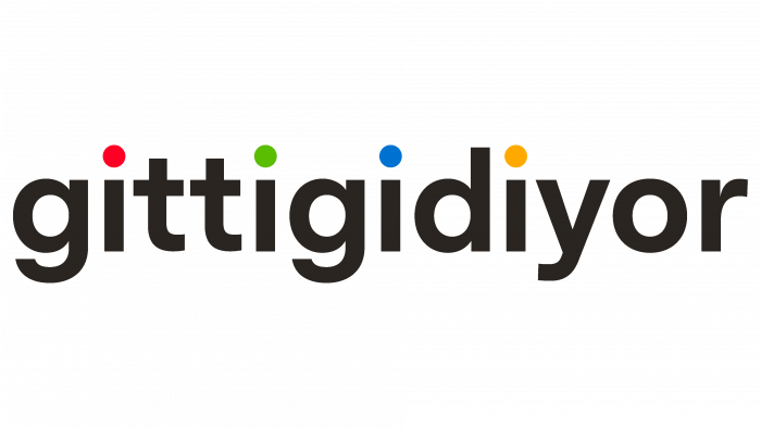
The current logo was approved on the occasion of the 20th anniversary of the company. To make it festive, the designers painted the dots above the i’s in the brand’s colors. Now they look like multicolored confetti: red, green, blue, and orange. The drawing of the four parallelograms was removed – only the inscriptions remained. The rest of the brand name has not changed.
The Gittigidiyor graphic mimics the eBay wordmark in color and is very similar in shape to the Microsoft icon. Such visual changes caused a wave of criticism, but the online store acquired a modern and minimalistic identity, not overloaded with unnecessary details. The abstract emblem does not mean anything: it is just a bright element of the image of the Turkish marketplace.
Gittigidiyor: Interesting Facts
GittiGidiyor is a leading e-commerce platform in Turkey that has significantly influenced the country’s online shopping scene. Starting in 2001, it has grown into one of Turkey’s most popular online shopping sites, offering a broad selection of products.
- Founding: GittiGidiyor was founded in 2001 by Serkan Borançılı, Burak Divanlıoğlu, and Tolga Kabataş, making it one of Turkey’s pioneering e-commerce platforms.
- eBay Connection: eBay acquired a minority stake in 2007 and then fully acquired GittiGidiyor in 2011, bringing global e-commerce expertise to the platform.
- Innovations: It introduced features like “Güvenli Alışveriş” (Safe Shopping), a secure payment system that holds payments until buyers confirm receipt of orders.
- Product Diversity: The site offers everything from electronics and fashion to home goods and collectibles, catering to a wide range of consumer needs.
- Supporting SMEs: GittiGidiyor helps small and medium-sized businesses in Turkey sell online, boosting the digital economy and expanding e-commerce.
- Community Engagement: The platform engages with its user community through forums and social media, encouraging discussions on e-commerce and consumer topics.
- Environmental Efforts: GittiGidiyor promotes eco-friendly products and packaging solutions to reduce waste and carbon footprint.
- Customer Programs: It has launched various satisfaction and loyalty programs, including guarantees, easy returns, and loyalty points for discounts on future purchases.
- Tech Investments: Continually investing in technology, GittiGidiyor has developed mobile apps and uses data analytics to personalize shopping experiences.
- Cultural Impact: GittiGidiyor has popularized online shopping in Turkey, changing consumer habits and making e-commerce a regular part of life for many.
From its start as a startup to becoming an eBay subsidiary, GittiGidiyor’s story highlights the evolution of online shopping in Turkey. It blends global insights with local expertise to serve Turkish consumers and advance the digital economy.
Font and Colors
Bold, slightly angular letters make the inscription elegant and recognizable. At the same time, their angular and austere form subconsciously inspires confidence among sellers and buyers who use the services of Gittigidiyor. The basic features of the font are clear outlines, uniform line thickness, and no serifs at the ends.
When it comes to color matching, the Turkish online store is trying to emulate American eBay. The base of the emblem palette is red (# E33137), light orange (# F4AB04), light green (# 81B316), and blue (# 0363D3). They have a slight gradient. The marketplace’s name is black, and the phrase “bir eBay şirketidir” is light gray.
Gittigidiyor color codes
| Ruddy | Hex color: | #ff0025 |
|---|---|---|
| RGB: | 255 0 37 | |
| CMYK: | 0 100 85 0 | |
| Pantone: | PMS Bright Red C |
| Kelly Green | Hex color: | #5abd00 |
|---|---|---|
| RGB: | 90 189 0 | |
| CMYK: | 52 0 100 26 | |
| Pantone: | PMS 802 C |
| French Blue | Hex color: | #0072d2 |
|---|---|---|
| RGB: | 0 114 210 | |
| CMYK: | 100 46 0 18 | |
| Pantone: | PMS 285 C |
| Chrome Yellow | Hex color: | #ffaa00 |
|---|---|---|
| RGB: | 255 170 0 | |
| CMYK: | 0 33 100 0 | |
| Pantone: | PMS 137 C |
| Gray | Hex color: | #76787b |
|---|---|---|
| RGB: | 118 120 123 | |
| CMYK: | 4 2 0 52 | |
| Pantone: | PMS Cool Gray 9 C |
| Raisin Black | Hex color: | #2a2521 |
|---|---|---|
| RGB: | 42 37 33 | |
| CMYK: | 0 12 21 84 | |
| Pantone: | PMS Black 4 C |
