The Glamour logo is soft and elegant. It represents an elegant publication that knows and understands modern women well. The emblem reflects the diversity of content and the light, pleasant style of articles.
Glamour: Brand overview
| Founded: | April 1939 |
| Founder: | Condé Nast Publications |
| Headquarters: | United States |
| Website: | glamour.com |
Glamour is a popular women’s monthly magazine of 400 pages, available in 10 languages. 57% of the audience are residents of the USA. The circulation in America was 2.4 million copies. Since 2019, it has existed only in electronic form and has reached an audience of 12 million readers. The New York publisher Condé Nast owns it.
Meaning and History
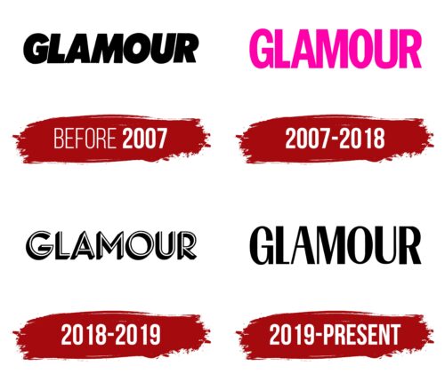
The main sign of Glamour is its name. A word emblem is characteristic of most print publications, as their main force is the word. But the emblem, like the faces of the young women it represents, could not remain static. Rebrandings showed the change in the “character” of the media, which matured and changed with its audience and their interests. At different periods in history, the logo appeared bold and confident, then flirty and elegant like the diverse images of a young woman, which she adopts according to her mood.
What is Glamour?
It’s a magazine with the latest news on the glamorous life. Articles about celebrities, fashion trends, product reviews, makeup, and health – useful and fascinating information for young women. Globally, the publication was subscribed to and bought in boutiques and kiosks by 12 million readers. With the transition to online, the number of visits remains at the same level of 11-12 million per month, with the same number of followers on social media.
before 2007
The first logo was bold black capital letters with a slight forward tilt. The magazine’s name was chosen deliberately. Its pages were planned to be filled with news about movie and pop stars, telling about their lifestyle, dress style, secrets of success, and careers. Hence, the first name of the monthly magazine was Glamour of Hollywood.
The massive letters promised rich reports and information about the best and most famous. The size of the glyphs hinted at the ambition of the young team, striving to become the number one fashion magazine.
Due to the war, aristocratic flair went out of fashion. So, in 1943, the focus shifted from celebrities to the promising audience of young women making careers. The word Hollywood was removed, adding to Glamour the subtitle: the girl with the job. The round glyphs of the logo showed the fullness of life, the ability to combine family, raising children, and career achievements.
Only 20 years after its founding, the magazine’s name was shortened to Glamour, representing publications for young women of various social statuses.
2007 – 2018
In the 2000s, Glamour publishers actively opened in other countries. The style of the international magazine was revised. To attract readers, a bright pink color was added to the logo, which is most associated with a young female audience.
The letters of the emblem are slim and hint at a healthy lifestyle, a topic that was actively discussed in the media at that time and was very popular among women.
Each letter of the name seems to stretch upwards to success, development, and self-improvement.
The visual sign of Glamour of that decade seems to announce useful, expert articles written with a full understanding of the needs and features of the female audience. The magazine’s materials teach you to be bright, attractive, stylish, and feminine. At the same time, it doesn’t forget about career, business, and personal brand-building tips.
2018 – 2019
At the beginning of 2018, the publication got a new editor – stylish and ambitious reporter and producer Samantha Barry. With her arrival, the magazine renewed its identity for the first time in the last 10 years.
The new logo consisted of 3D letters. The combination of clear elements and halftones revived the title, showing maximum proximity to readers and understanding their joys and worries. The voluminous letters conveyed the vibrant and lively style of the publications—compliance with modern style and participation in the flow of real events.
The black and white symbols hint at the light and dark stripes that make life interesting and full. White is the color of news and sensations, and black is the shade of articles about celebrities who have reached the pinnacle.
2019 – today (only internet magazine)
In January 2019, the last print edition of Glamour saw the light of day. The monthly magazine ended its long history of paper versions and switched to online releases. The magazine is geared towards young women. Therefore, it restructured to fit its lifestyle and is now actively developing its social media accounts and website.
For the internet publication’s logo, the editorial team chose an elegant inscription in capital letters. A distinctive feature of the sign is the varied thickness of the elements. This feature symbolizes the diversity of content that caters to the interests of businesswomen, housewives, young mothers, students, and single women.
The slim glyphs speak of the slimness and youthfulness of the readers, whose average age is 33 years. The full and rounded elements reflect the desire to uncover the facets of modern life fully and to show bright and interesting details.
The elegant letters demonstrate the journalists’ skill, who can catch attention and engage with their materials.
Font and Colors
Black color is primary for Glamour signs. The choice demonstrates the neutrality of the publication, which allowed for attracting a broader audience of various interests and views. Black also speaks of confidence and dominance in the market. In terms of audience reach, the magazine has far outpaced most American fashion media.
The style of the inscription echoes several popular fonts, like Romely Bold and Tonus Contrast Black, but does not have exact counterparts. The pleasant roundness of the glyphs speaks of easy, engaging reading—a clever combination of entertaining and useful content. And the sharp elements show accurate and catchy headlines and comments.
Glamour color codes
| Black | Hex color: | #000000 |
|---|---|---|
| RGB: | 0 0 0 | |
| CMYK: | 0 0 0 100 | |
| Pantone: | PMS Process Black C |


