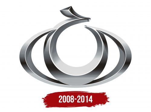
The Gleagle logo is extravagant and compact. The emblem’s sleek geometric lines reflect cost efficiency and a comfortable interior. The brand is open to new technologies and ready to transform to meet customer needs.
Gleagle: Brand overview
Established in 2009 as the budget division of Geely Automobile Holdings, the Gleagle brand was conceived by Li Shufu, chairman of Geely, to tap into the growing Chinese economy car market. The brand mainly specializes in compact sedans, hatchbacks, and sporty SUVs, with most models selling for less than 100,000 yuan, or about $15,000.
In its early days, Gleagle relied on older Geely models. However, more recent offerings share design and technological elements with modern models from parent company Geely. The brand is particularly favored by Chinese first-time car buyers looking for cost-effective transportation solutions.
From its founding until 2018, Gleagle has sold more than one million vehicles of various models exclusively in China. Although the company initially focused on domestic sales, there has been increasing speculation that the brand is considering entering emerging international markets.
Today, Gleagle remains a significant player in the affordable car sector in China, benefiting from the economies of scale and technological resources provided by its parent company, Geely.
Meaning and History
2008 – 2014
The Geely Auto brand Gleagle had a logo featuring an abstract crescent moon shape, formed by fragments of a large oval and a small circle, resembling a stylized human eye. At the top, there was a small protrusion like a hieroglyphic element. The logo had three-dimensional edges and a silver gradient.
The crescent shape and eye-like design symbolize vision and foresight. The small hieroglyphic-like protrusion adds a cultural touch. The silver gradient and three-dimensional elements give the logo a modern and sophisticated appearance.
This design communicates the brand’s forward-looking vision and insight. The hieroglyphic-like protrusion adds cultural depth, suggesting a connection to heritage. The silver gradient enhances visual appeal and signifies sophistication and cutting-edge technology.
The three-dimensional aspects create depth and realism, making the emblem stand out. This modern design approach reflects the brand’s commitment to innovation and quality. The combination of these elements results in a logo that is visually striking and rich in meaning.
The Gleagle logo, with its abstract crescent moon and eye design, symbolized vision and foresight. The hieroglyphic-like element added cultural depth, while the silver gradient and three-dimensionality provided a modern and sophisticated look.


