Globe Telecom: Brand overview
Founded in 1935 under the name Globe Wireless Limited, the company was originally engaged in providing wireless long-distance services in the Philippines. The 1960s saw significant changes as Globe Wireless Limited merged with other telecommunications companies, leading to the creation of Globe-Mackay Cable and Radio Corporation and the expansion of its services.
The early 1990s was a turning point for the organization. In 1992, the company was renamed Globe Telecom to reflect the evolving range of services better. In the same year, Singapore Telecom joined the company and became its overseas partner. Twelve years later, in 2004, Globe Telecom pioneered the introduction of wireless broadband and 3G services in the Philippines, cementing its innovative reputation in the industry.
In 2008, the company further diversified its portfolio with the launch of its GCash mobile money service. GCash has since evolved into the leading digital payment solution in the country. Globe Telecom continued to strengthen its market presence, and in 2013, it acquired Bayan Telecommunications, solidifying its position as the second-largest telecom operator in the Philippines.
Globe Telecom currently serves a large customer base of over 80 million people nationwide. While its core businesses remain mobile, broadband, and digital services, the company has been successful in related sectors such as financial services, healthcare, and entertainment, among others.
Meaning and History
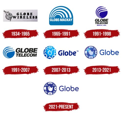
1934 – 1965
1965 – 1991
1991 – 1998
1991 – 2007
1994 – 1996
1996 – 2007
2007 – 2013
2013 – 2021
2021 – today
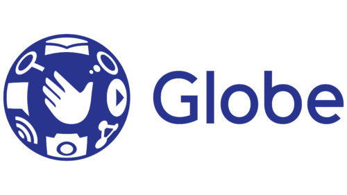
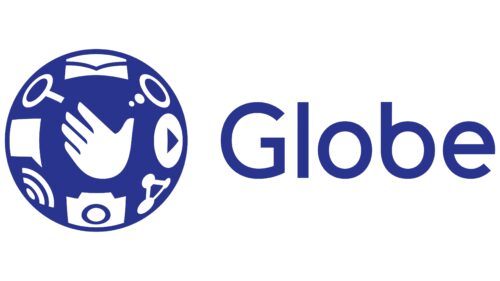
The logo of the Philippine telecom operator demonstrates the range of its services as it also deals with money transfers and media. This is reflected in the logo, which shows communication signals, a camera, two different types of dialog bubbles, a play button, an envelope, and a magnifying glass. In the center of the cobalt circle is a friendly waving hand. Next to it is the company name. It is typed in a smooth font with mostly rounded lettering, except for the angular letter “l.”
The cobalt circle resembles the night sky, calm but full of possibilities. The friendly waving hand seems to say, “Hi! We’re here to help!”. The combination of icons, such as the camera and magnifying glass, is like a mini treasure hunt, showing everything they can do. It’s as if each icon is a chapter in a storybook, telling the story of the company. The lone angular “l” in the name stands out as the one unique thing that makes everything else special.
Globe Telecom color codes
| Cosmic Cobalt | Hex color: | #29348f |
|---|---|---|
| RGB: | 41 52 143 | |
| CMYK: | 71 64 0 44 | |
| Pantone: | PMS 661 C |
