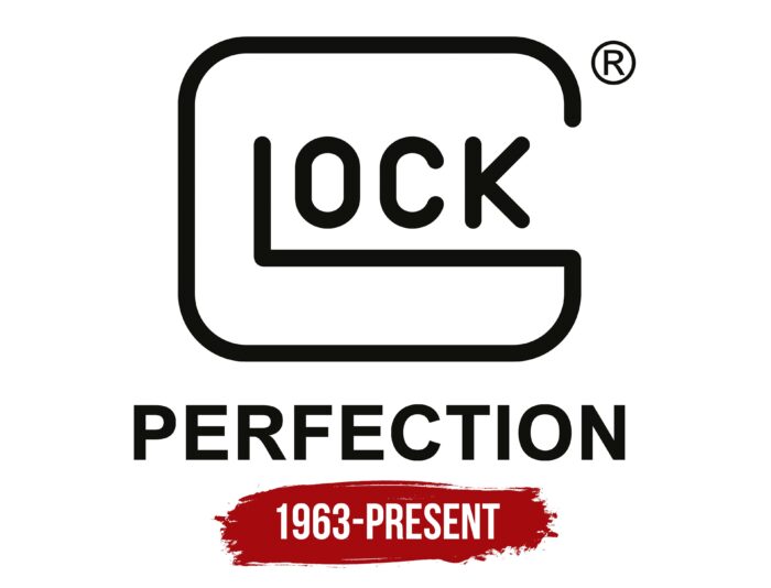
The Glock logo has the same slim shape as the company’s gun. And it also symbolizes marksmanship and speed because the bullet has to fly fast and hit the target precisely. The designers depicted the complex mechanism as a simple abstraction.
Glock: Brand overview
| Founded: | 1963 |
| Founder: | Gaston Glock |
| Headquarters: | Deutsch-Wagram, Lower Austria, Austria |
| Website: | glock.com |
Meaning and History
Brand awareness is at its highest level. Perhaps Glock is now the most sought-after arms company in the world. At the same time, the company’s visual identity is made in a strict style, which directly indicates the nature and authority of the organization.
The logo was based on a verbal inscription with the brand’s name. This is black lettering on a white background. The black and white color palette, although it looks monotonous, stands out from the competition.
What is Glock?
It is one of the most popular arms companies in the world, with over 55 years of experience. The brand’s products are actively used in various films and video games. Also, relatively recently, Glock began to produce knives, a form ideal for organizations that decide to use the company’s weapons.
The company name used a modern and elegant sans-serif font with rounded corners. The unique style for the first two letters, “G” and “L,” makes the logo unique and inimitable. They are much larger than subsequent characters and together create a kind of frame with significant rounding of the corners. There are associations with the lock, which is a symbol of security and reliability.
The choice of black and white colors for the logo indicates the brand’s principled and serious approach to the production of weapons. It is through the Glock logo that you can see its values. This choice seems ideal, given the industry in which the organization operates. Moreover, given the fact that armed formations around the world use the company’s products, we can say that such a laconic but same time the catchy logo was not developed in vain.
Font and Colors
The wordmark used an elegant sans-serif typeface with rounded corners. If we talk about the last three letters in the name, then they do not stand out against the background of the emblems of the organization’s competitors. However, the padlock styled “G” and “L” makes the Glock logo more visible and unique. At the same time, the inscription is easy to read. The font itself is visually reminiscent of FF DIN Round Pro Bold but with a slightly changed style in writing letters.
Glock chose the black and white color palette for a reason. It conveys the rigor and professionalism that are the backbone of a major weapons organization known worldwide. Moreover, in this format, the logo will look great on any surface, which adds to its attractiveness in the eyes of customers and gun lovers.
Glock color codes
| Smoky Black | Hex color: | #10100d |
|---|---|---|
| RGB: | 16 16 13 | |
| CMYK: | 0 0 19 94 | |
| Pantone: | PMS Black 6 C |


