The GMC logo says large cars can also be stylish and modern. The emblem shows the beauty of metal and pays tribute to the speed and power of automotive giants. The sign attracts admiring glances and the appearance of brand cars on the track.
GMC: Brand overview
Meaning and History
GMC had a predecessor, the Rapid Motor Vehicle Company. It appeared in 1901, and 8 years later, it became part of General Motors and received a new name. The current brand was formed in 1911 when it was merged with the Reliance Motor Company. Then, he began to use his first logo, which bears little resemblance to the modern version. The identity underwent several stages of evolution until the emblem became a simple red “GMC” lettering. It is one of the most recognizable brand names in the United States.
What is GMC?
GMC is the brand’s official name, formerly known as the GMC Truck & Coach Division. It is a subsidiary of General Motors, specializing in producing premium trucks, vans, pickups, and SUVs. This organization was founded in 1900 by the two Grabowsky brothers and became part of GM in 1909. Many GMC vehicles use the Chevrolet platform.
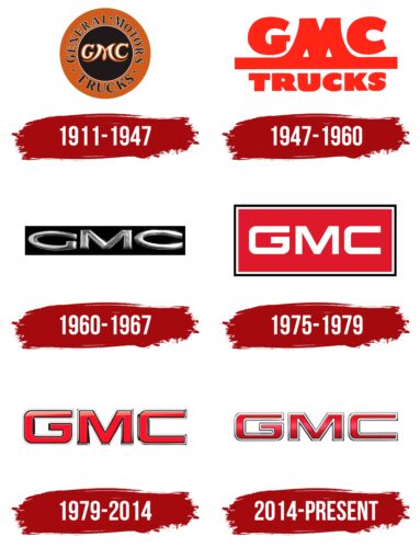
1911 – 1947
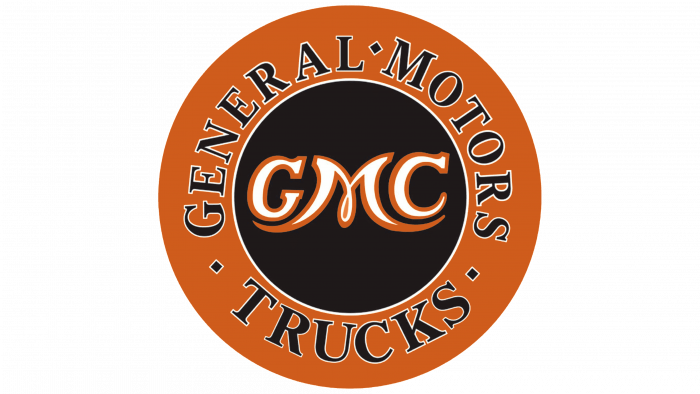
The debut logo looks like a round stamp or rondel. Inside is a black circle with the stylized abbreviation “GMC.” The legs of the letter “M” are long and slightly curved upward, going under the “G” and “C.” All symbols are white with an orange outline. The outer ring that frames the circle is also orange. It contains three black words with dots in between: “GENERAL,” “MOTORS,” and “TRUCKS.” These letterings are in a short serif typeface and are outlined in thin white lines.
1947 – 1960
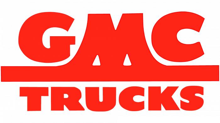
In 1947, a logo appeared with a decorative inscription. The designers made it completely red and removed all geometric shapes. The abbreviation “GMC” is now located at the top. The stylized letter “M” merges with the horizontal line that is drawn under the “G” and “C.” A stripe separates the abbreviated brand name from the word “TRUCKS.” It is written in bold, round typeface.
1960 – 1967
The time for minimalism came in the middle of the 20th century. The logo has been shortened to three letters: “GMC.” The developers made them gray and placed them inside a black rectangle. The font will be slightly flattened, negatively affecting the abbreviation’s readability.
1975 – 1979
Simple shapes and lines characterize the GMC logo of this period. The designers greatly increased the rectangular background, providing enough space for the inscription not to look sparse. At the same time, they removed the noble silver tint from the letters and made them plain white. In addition, the authors added a double border to the rectangle and painted it red.
1979 – 2014
The most famous GMC logo was created in 1966. It is simple red lettering with a gradient, thin black outlines, and silver-gray edging. The letters have clear geometry and are composed of lines of equal thickness. The corners at the ends are slightly rounded. This version is still used on par with the new one.
2014 – today
Another version of the logo appeared in 2014. It differs from the previous one in the width of the lines: the vertical parts of the capital “G,” “M,” and “C” are thicker than the horizontal and diagonal ones. The colors are the same but in different shades, and the linear gradient is below the middle.
The GMC graphic mark is simple and versatile. It is used on various vehicle models, from pickup trucks to SUVs. The emblem has the form of a three-letter inscription, which is associated with brutal practicality. She looks powerful and imposing, personifying the power of freight transport. The two versions of the logo differ only in details, such as the palette and the shape of the letters. In general terms, they are similar. The developers deliberately made them the same to avoid violating the integrity of the visual identity.
GMC: Interesting Facts
GMC, originally called the General Motors Truck Company, is an American brand that makes trucks and utility vehicles. It’s part of General Motors (GM) and is known for making durable and useful vehicles.
- Beginning: In 1911, GM bought the Rapid Motor Vehicle Company, starting its journey into truck manufacturing.
- World War II: GMC made over 600,000 trucks for the U.S. military during the war. The GMC CCKW 6×6 truck was especially important for moving troops and supplies.
- Early Electric Truck: In 1913, GMC made an electric truck, one of the first electric vehicles, ideal for quiet and emission-free city deliveries.
- Utility Vehicle Pioneer: In 1937, GMC introduced the Suburban, one of the first SUVs, offering more space and capability than regular cars.
- Professional Grade: GMC’s slogan, “Professional Grade,” emphasizes their vehicles’ quality, durability, and advanced features, differentiating them from other GM products.
- Denali Luxury Line: Since 1999, the Denali line has represented GMC’s luxury models, featuring advanced tech, luxurious interiors, and strong performance.
- GMC Hummer EV: In 2020, GMC announced an all-electric Hummer with 1,000 horsepower and fast acceleration, highlighting a move towards electric vehicles.
- Space Exploration: GMC vans, known as the Astrovan, carried Apollo astronauts to the launch pad, showing GMC’s role in important historical events.
- Tailgate Innovation: With six functions, the GMC Sierra’s MultiPro Tailgate showcases GMC’s focus on practical and innovative vehicle design.
- Global Presence: In addition to being big in North America, GMC sells vehicles in the Middle East and other places, adapting to different markets.
GMC’s history of making reliable trucks and utility vehicles, plus its move into electric vehicles, shows its dedication to innovation and meeting customer needs.
Font and Colors
The abbreviation font is the same as Nokianvirallinenkirjasin Regular, although the designers flattened the letters slightly in the second version. Some corners are rounded, and some are preserved in their original form.
A well-chosen palette creates the effect of “metallic” lettering. The logo’s authors used red with a pale gradient for the division’s name and surrounded the signs with silver edging. The 2014 version is dominated by a red-pink hue (# 9B1922). This color scheme gave the brand the unofficial nickname Big Red. It is worth noting that after the iconic Chevrolet emblem became available in black, GMC also began to put dark gray versions of the logo on its cars.
FAQ
What is the GMC font?
The brand uses Stratum 2, a geometric sans-serif font. It matches the look and feel of the brand icon, creating a consistent visual identity across all materials. Stratum 2 focuses on precision and engineering, key aspects of the brand’s character.
Stratum 2’s geometric style complements the brand’s modern and sophisticated atmosphere, helping the company stand out in the competitive automobile market.
How to install a black GMC emblem?
Adding a black emblem to your car can freshen up its appearance:
- Prepare the area: First, clean where you will place the emblem.
- Remove the old emblem: Use a tool to remove the old emblem carefully.
- Clean up leftovers: Ensure all adhesive residues are cleaned off.
- Check the installation of the new emblem: Make sure the new emblem fits correctly.
- Attach the new logo: Apply adhesive to the back of the new emblem.
- Attach the emblem: Place the emblem onto the prepared area.
- Final checks: Pull the emblem slightly to ensure it is securely attached.
What does the GMC symbol mean?
The logo is clear and striking, consisting of the letters “G,” “M,” and “C” to represent the brand name. It uses a simple sans-serif font to give it a clean and modern look. The logo has minimal decoration, featuring only silver outlines and a red gradient. These features show the strength, practicality, and reliability of the cars. The red and silver colors enhance the logo’s visibility and give it a sophisticated, energetic look, emphasizing the brand’s image as a trusted automotive manufacturer.
Which car logo is GMC?
The GMC logo can be seen on various vehicles, including buses, vans, SUVs, heavy and light trucks, and electric pickup trucks. This logo with initials symbolizes the brand’s reputation for creating durable and reliable cars. The brand is trusted whether it appears on a family SUV, a heavy-duty work truck, or a new electric vehicle.
How big is the GMC emblem?
The outdoor emblem available from the official accessories store is 14.947 inches long, 3.286 inches wide, and 0.256 inches thick. This emblem is designed to stand out on vehicles, making it easily visible and recognizable. Its size ensures that it is a prominent feature, reflecting the brand’s focus on bold and durable design elements.
Why is the GMC logo red?
Red was first introduced in 1966 and has become a staple of the GMC logo. The shade of red has undergone some changes over the years, such as adding a gradient in 2014 and a silver border around the letters, but the base color remains the same. Red was chosen for the logo because it symbolizes life, confidence, strength, passion, energy, and excitement. These qualities reflect a dynamic and strong brand image, demonstrating the creation of durable and reliable vehicles.
