The theme of birth is made in the emblem of the main. As chicks hatch from eggs, new domain names are born, thanks to the registrar. The GoDaddy logo shows: the process is very delicate and neat. With a dash of love added.
GoDaddy: Brand overview
| Founded: | 1997 |
| Founder: | Bob Parsons |
| Headquarters: | Tempe, Arizona, U.S. |
| Website: | godaddy.com |
Meaning and History
Brand awareness, in terms of domain registrar logos, has undergone significant changes at various stages of the company’s development. It’s not just about the color scheme of the GoDaddy name but also about adding additional elements.
What is GoDaddy?
First and foremost, it is a private company with a net profit of over $150 million. Four thousand highly qualified employees are engaged in round-the-clock support of sites, thereby promoting GoDaddy in the online market segment.
1997 – 2016
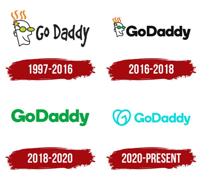
The first version of the logo was presented immediately after the company’s creation. The main title was made in a non-standard style. The “GoDaddy” characters were handwritten, with significant spacing between the letters. The author decided to use black for symbols, thus not distracting the potential client of the resource from the name. At the same time, the key elements of the logo are not the verbal part but the emblem. It depicts a man in green glasses with orange hair. In addition to these elements, there is also a yellow star in the skull region. Perhaps this is a sarcastic image of the site owner at that time. In addition, the company placed a ® mark on the logo, confirming the registration of the trademark and protecting the copyright of “GoDaddy” on all visual tools.
2016 – 2018
Lishu, after 19 years, the company decided to make changes to the original version of the logo. Moreover, we are talking about minimal updates. Firstly, the size of the head became commensurate with the verbal inscription. Thus, both elements had approximately the same influence on potential customers. Visually, the GoDaddy logo has not been changed. The company name was no longer handwritten but in classic bold type with rounded corners.
On the one hand, the word GoDaddy has become more legible, but at the same time, the highlight of the logo has been removed. Also, many users and experts felt that the first version of the name more organically suited the unique emblem. Copyright marks have been removed from the logo.
2018 – 2020
In 2018, the company decided to abandon the emblem on the logo. Thus, the image of a comical man with glasses, familiar to millions of users, was removed. The writing style of the main title remained identical to the previous version. A classic bold sans-serif font was used. At the same time, the author chose a bright color for the word inscription for the first time. Green was preferred. Thus, a reference was made to the green glasses on the emblem.
2020 – today
In 2020, the company decided to make the logo more modern. Thus, she tried to demonstrate to clients the development strategy and the prospects that she has. The writing style of the company name remained unchanged, but the color palette was changed again. The author decided to change the green color to blue, thus saying goodbye to the emblem. All letters in the title are drawn using clear lines. The emblem is located to the left of the verbal inscription. Visually, it consists of elements of two characters, namely “G” and “O.” Both symbols are oval in shape. The creators of the logo superimposed one element on top of another, thereby creating an abstract figure that visually resembles a heart.
Font and Colors
The name of the company on the logo is closest to the classic Times New Roman. Bold sans-serif letters are used.
The color palette in the GoDaddy logo has undergone significant changes. If the authors used black for the word inscription in the first two variations, then in the subsequent versions, brighter green and blue colors were chosen. Thus, there is a feeling that, over time, the company has become more friendly to the target audience, even though the classic element has been removed from the logo. The man’s face had a minimal gamut of colors, namely orange, yellow and green.
GoDaddy color codes
| Dark Turquoise | Hex color: | #00ddde |
|---|---|---|
| RGB: | 0 221 222 | |
| CMYK: | 100 0 0 13 | |
| Pantone: | PMS 3262 C |


