


![]() Gofood Logo PNG
Gofood Logo PNG
“Do you need to have lunch? asks the Gofood logo. “So you’re here.” Attentive service and fast delivery are reflected in the emblem’s elements. Everything on the service pages is clear, understandable, and simple. Designed and pressed the button and received fresh dishes.
GoFood was launched in 2015 as part of Gojek, the Indonesian technology company founded by Nadiem Makarim in 2010. Gojek began as a motorcycle taxi service operated through a call center, then moved into a mobile app model. GoFood became one of its main services, focused on food delivery and grocery orders for users in Indonesia.
The service first appeared in Jakarta with a limited number of partner merchants. Its early difference was its focus on street vendors and small local food businesses, not just large restaurant chains. This gave users access to everyday Indonesian dishes and provided smaller sellers with a new digital sales channel within the Gojek ecosystem.
In 2016, GoFood expanded to major Indonesian cities, including Medan, Surabaya, and Bandung. The company added more restaurant partners and used discounts and promotions to increase activity. In 2017, the service moved into other Southeast Asian markets, including Vietnam and Thailand, after adapting to local food habits. It also began working with larger restaurant chains in Indonesia.
In 2018, GoFood launched the GoFood Festival, a series of offline events where customers could sample food from various partners. The same year, the company began using artificial intelligence for recommendations and delivery optimization. In 2019, it introduced GoFood Pickup, allowing users to order in-app and collect meals from restaurants. During 2020-2021, GoFood added contactless delivery and support programs for small businesses. In 2022, Gojek strengthened its broader ecosystem by introducing GoMart. By 2023, GoFood had become one of the main food delivery services in Southeast Asia.
Meaning and History
![]()
This service has changed its logo only once, for a short period. At the same time, both options are stylish and modern. Immediately after becoming familiar with the logo, the user planning the application will understand exactly what GoFood does. The author used a red-and-black palette without overloading the logo with unnecessary elements. The way the application’s name and the service’s logo are presented allows us to associate GoFood with a modern, progressive project that perfectly combines youth with experience and a desire for development.
What is Gofood?
First of all, this application is in one of the most sought-after niches on the market. Using the program’s functionality, you can place an order from many popular establishments.
2016 – 2019
![]()
The first variation of the Gofood logo was introduced in 2016. The main inscription is in bold black type. All characters in the title are in capital letters. Moreover, “Go” and “Food” are separated by the application’s logo, which is done in red. It depicts a fork and a spoon placed parallel to each other (vertically). Thus, conciseness and minimalism did not prevent the author from clearly demonstrating exactly what the service specializes in.
2019 – 2022
![]()
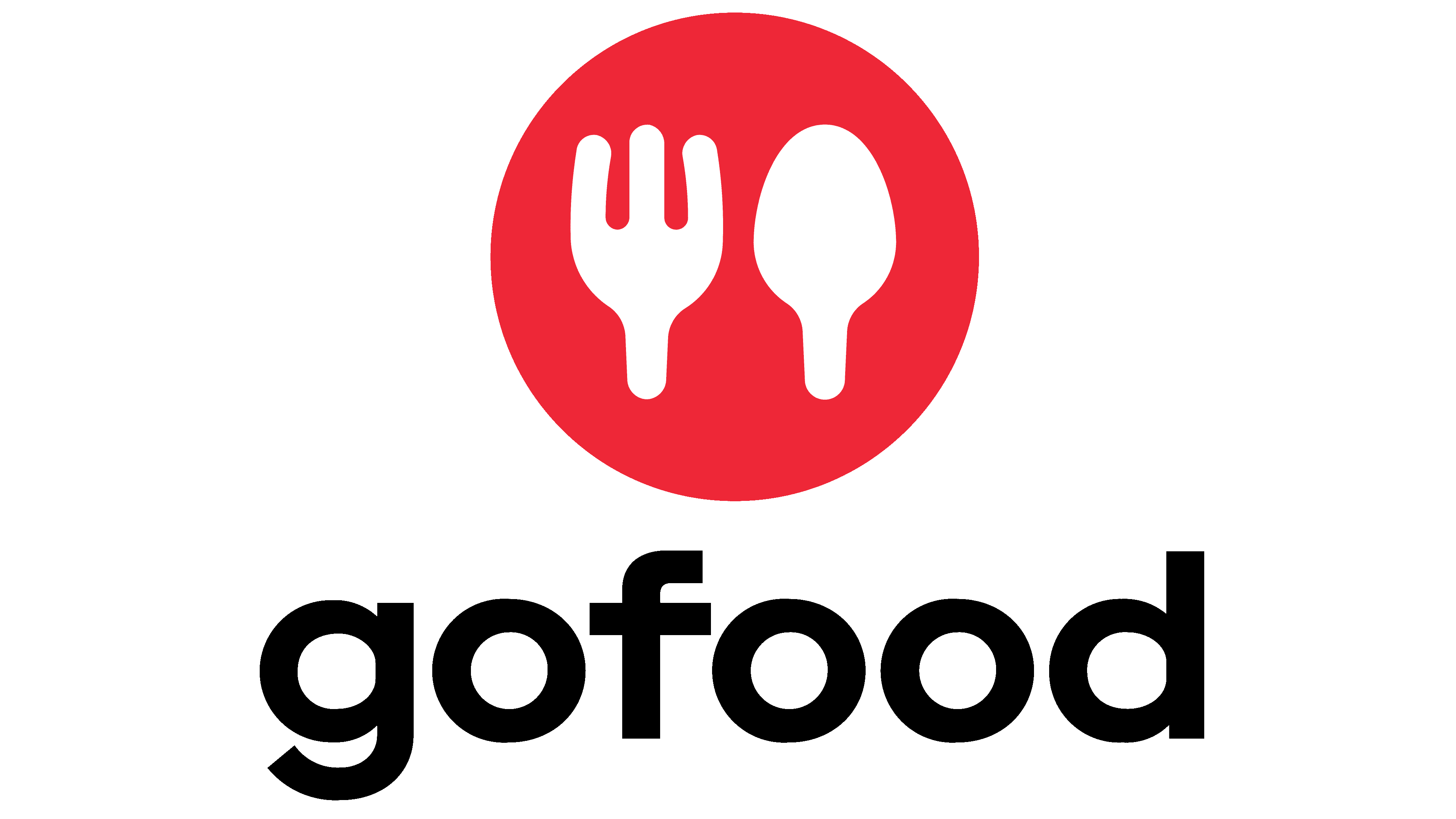
The new GoFood logo differs from the previous one in its more minimalist approach and smoother lines, making it visually simpler and easier to understand. The fork and spoon remain in the symbol but are now incorporated into a red circle, easily perceived as a plate. This circular element gives the emblem a more streamlined look and symbolizes the main theme of food and delivery.
All the letters in the “gofood” name are now lowercase, making the brand name less aggressive and easier on the eye. Previously, the capital letters gave it a more formal tone, but now everything looks more “homey,” possibly reflecting the company’s desire to be closer to its audience. The font remains sans-serif, maintaining a modern and clean style.
The placement of the symbol has changed; it is now positioned to the left of the text rather than between the words, creating a more familiar and user-friendly perception. This choice makes the logo more structured and easier to remember.
The red circle remains the main highlight, symbolizing energy, activity, and the desire to act quickly. This is perfect for a food delivery service aiming to promptly meet customer needs. The white color of the symbols (fork and spoon) contrasts with the background, emphasizing food as the brand’s core element.
The changes in the emblem reflect the company’s desire to be more accessible to a broad audience, making it friendlier and more modern. This rebranding is a logical step to strengthen the user connection and improve their experience.
2022 – today
![]()
In 2022, GoFood rebranded as part of Gojek’s new strategy. The main goal of the rebranding was to showcase the company’s commitment to innovation and improving the user experience. Updating the logo was a logical step toward creating a more minimalist and modern image that reflects the service’s dynamism and mobility.
The new GoFood logo represents a step forward compared to previous versions. Previously, the symbol featured a fork and spoon, directly indicating its connection to food delivery, but now the symbol has become more abstract. It looks like a circle with a break at the bottom and an additional element inside that resembles a head-and-shoulders, or even a figure, possibly symbolizing customer service and closeness to the consumer. This minimalist design makes the emblem more versatile and easier to recognize.
The red circle is kept as the primary color element, symbolizing energy, activity, and movement, perfectly reflecting the essence of a food delivery service. Red is always associated with dynamism, effectively conveying speed and efficiency, which are essential for a delivery service.
The font remains sans-serif, giving it a modern and concise appearance. However, the letter “f” in the text has been altered, with the top part appearing slightly cut off. This adds an interesting detail to the simple font, creating a sense of uniqueness among similar brands. The change may be linked to the company’s overall aim of appearing fresh and modern, standing out among competitors.
The new logo is more symbolic and versatile than previous versions. It reflects the company’s readiness to deliver food and grow, offering customers new services and opportunities.
Font and Colors
If you look at the 2019 logo, its font is as close as possible to Carmen Sans Extra Bold and Galano Grotesque Semi Bold. All characters in the title are in bold sans-serif.
The author chose a red-and-black color scheme, with the Gofood service name in black and the emblem and cutlery depicted in red. It is with their help that users should have associations with ordering food. Different shades of color for the logo elements made them easy to distinguish, thereby clearly conveying the promise of online food orders in today’s reality.