


![]() Goldwell Logo PNG
Goldwell Logo PNG
The emblem conveys the brand’s identity as the best cosmetics manufacturer. You can stop searching and stop. The Goldwell logo promises that after using the brand’s products, life will sparkle with new colors and hair will gain strength and youth.
Goldwell was founded in 1948 in Darmstadt by Hans Erich Dotter. Without a hairdressing background, he identified a gap in postwar Germany, where demand for professional salon chemistry exceeded supply. The name, derived from “Goldwelle”, framed the brand away from clinical associations.
The first product was a cold perm based on thioglycolic acid, allowing treatments at room temperature. It replaced hot methods and was rapidly adopted in salons. From the outset, Goldwell sold exclusively through professional channels, avoiding retail.
In the early 1950s, the company introduced a salon shampoo with a dosing system. In 1956, Sprühgold, an aerosol hairspray, entered the market and remains a leading professional product in Germany.
International expansion began in 1958 with the UK. In the 1960s, Goldwell entered the hair color market. The Topchic line, launched in 1971, became its core oxidation-based dye system, competing directly with Schwarzkopf Professional.
In 1970, the company patented Oxycur Platin, a dust-free lightening powder addressing health issues in salons. By the 1980s, Goldwell had entered Canada, the US, and Australia.
In 1989, Kao Corporation acquired a majority stake, completing full ownership by 1994. Under Kao, Goldwell launched Elumen in 1995, a non-oxidative color system without ammonia, setting it apart from Wella, Schwarzkopf, and L’Oréal Professionnel.
In 2003, operations were reorganized under KPSS. In 2014, the brand introduced the “We Think Stylists” concept, maintaining its long-standing focus on professional users.
Meaning and History
![]()
Despite the transition to another company’s leadership, the brand still retained its individuality. There was one logo in his career that informally represents him in the fan market.
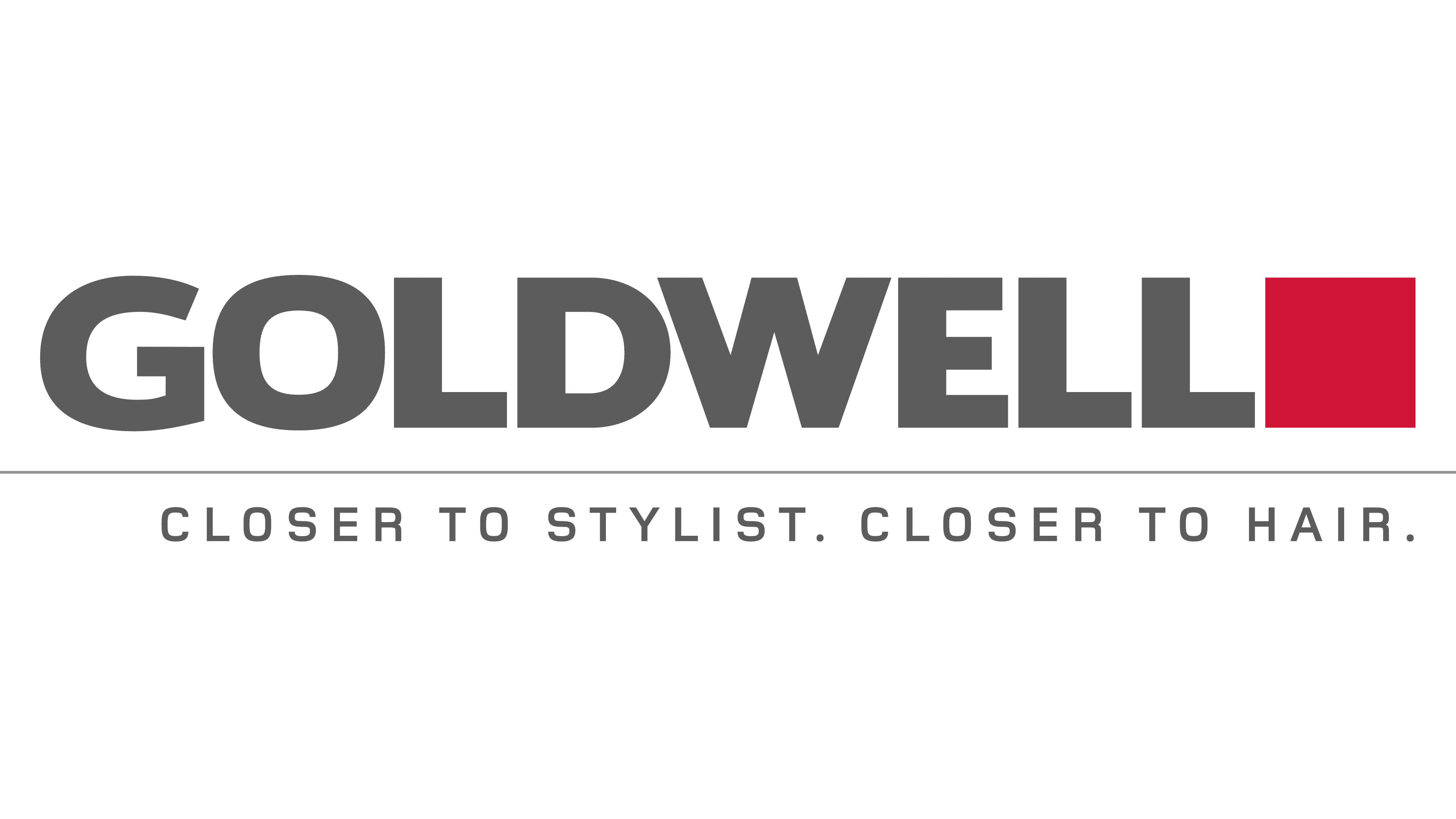
Personal trademark symbols are a harmonious combination of graphics and text. The logo represents its meaning: it consists of the company’s name, a colored square, and a slogan. In the top row, the large word “GOLDWELL” is followed by a geometrically precise square. It denotes the brand’s direct direction: a classic advertising sign indicating the color of hair dye. Below, there is a thin line separating the second row of text – the company’s motto. At the bottom, it is written in small, thin letters, “Closer to stylist. Closer to hair.” which conveys the manufacturer’s concept.
What is Goldwell?
Goldwell is a German brand of hair care and styling products. It offers a wide range of signature products, such as creams, sprays, hair dyes, mousses, conditioners, shampoos, and masks. The brand was founded by Hans Erich Dotter in 1948 and is now owned by Kao Corporation.
1966 – 2005
![]()
Initially, the Goldwell logo was sinuous. To do this, the designers extended the letters in breadth, connected them, and placed them at different heights to create a wavy effect. At the same time, the glyphs remained geometric – traditionally printed, with a minimum of rounding. The font was in uppercase and black, which favorably distinguished the company name against a white background.
2005 – today
![]()
Now, a non-curvy emblem is used. The writing is clear and even. The developers stretched the letters and set them to the same height, making them straight with precise borders. In addition, the designers painted the word “Goldwell” in smoky gray and added a burgundy square. The geometric figure is at the end of the line.
Font and Colors
![]()
The logo uses two typefaces from the Sans Serif category: wide lines (upper word) and thin stripes (lower inscription). In the first case, the letters are close together, and in the second, they are widely spaced. All elements are fully colored: text in dark ash, square in red.