The Google Adsense logo conveys the fine-tuning of the advertising campaign. The service helps businesses find their target audience and attract attention. The emblem indicates that the main thing is correctly setting the indicators in the account.
Google Adsense: Brand overview
| Founded: | June 18, 2003 |
| Founder: | |
| Headquarters: | United States |
| Website: | google.com |
Meaning and History
During Adsense’s short existence, its logo has changed several times. The service’s name complemented the world-famous “Google” branding in its corporate colors. Conciseness and minimalism in creating a logo at all project development stages were not chosen by chance. Thus, the company tried to show that this service is relevant for any needs and goals; it is timeless.
What is Google Adsense?
Globally speaking, this is one of the most successful projects launched by Google. Approximately 25% of the corporation’s total income falls on the work of the presented service.
2003 – 2015
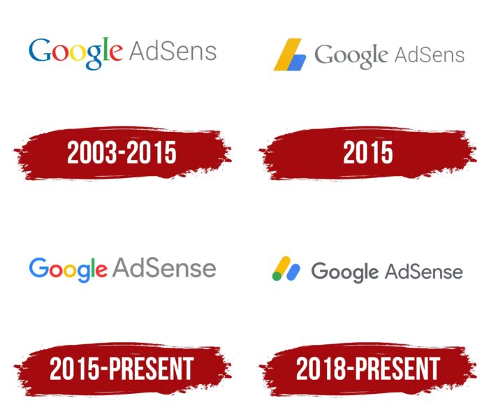
The first variation of the Google Adsense logo lasted 12 years. On the left, the author placed the corporation’s name directly without changing anything in its logo. The user could observe the corporate color palette, which includes blue, red, orange, yellow, and green. Bright shades of various colors demonstrate Google’s versatility, which also applies to its projects. On the right is the name of the service. All characters are black; only “A” and “S” are capital letters. Visually, when analyzing the logo, it seems that the two words are unrelated; they are independent.
2015
More than a decade after the launch of Google Adsense, the company changed its logo. The author brought the name of the service to a single style. All letters were done in black. A classic font was used to create the inscription, while the characters in Google have bolder lines. In addition to changing the name, the author added an icon on the left. It consisted of two rectangular blocks turned at an angle to the right. On the left was an orange block pressed against a smaller blue block. This version of the logo did not last long. However, the icon in various variations was used separately until 2018.
2015 – today
At this stage, Google has decided to return to the original version with minor visual changes. The letters in the Adsense name have become lighter, while the author used a bold font to write them. In turn, the word “Google” has become less voluminous. Thus, the logo creators have equalized the importance of both elements. Unlike the previous version, the classic color scheme for the corporation’s name was again added. On some resources, this version of the logo will be used in 2022.
2018 – today
The current logo is close to the 2015 logo. The difference in the title block is that all letters are in bold black. Also, an emblem has been added to the top. It also consists of two rectangular blocks with slightly rounded corners. However, in this case, the orange and blue blocks are not pressed against each other but are at a distance. What’s more, the orange block includes the ball at the bottom.
Font and Colors
In almost all variations of the Google Adsense logo, the author used the classic Times New Roman sans-serif font. At the same time, bold type is sometimes used to emphasize the importance of a particular element depending on the period. The author tried to make the logo concise but, at the same time, convey the corporation’s modernity and the services it promotes on the market.
The service name in the logo was presented in black at any stage. At the same time, the corporation’s name contained the classic palette of colors for it, including blue, green, red, yellow, and orange. Thus, the author tried to evoke positive emotions in users, demonstrating that the company is ready to help them with tasks unrelated to contextual advertising.
