


![]() GoPro Logo PNG
GoPro Logo PNG
High-tech cameras for capturing active action from professional angles are recognizable to many thanks to visual identification. The GoPro logo symbolizes extreme entertainment on land, in the air, and on water, as confirmed by its motto, “Be a Hero.”
GoPro began in 2002 after Nick Woodman’s failed projects EmpowerAll.com and Funbug. During a surfing trip in Australia and Indonesia, he tried to film himself and improvised a wrist-mounted 35mm camera. The idea focused on capturing action from a first-person view.
Funding came from family support, including $200,000 from his father and $35,000 from his mother. Woodman sold handmade goods to raise additional cash. The company operated as Woodman Labs.
In September 2004, the first GoPro HERO was introduced at a trade show in San Diego. It was a 35mm camera in a waterproof case, produced with Hotax. First-year revenue reached $150,000, helped by early bulk orders.
In 2006, Digital Hero marked the shift to digital, and YouTube’s rapid growth after 2005 followed. By 2009, GoPro had released a Full HD camera capable of 1080p video.
By 2012, sales reached 2.3 million units. Foxconn invested $200 million, valuing the company at $2.25 billion. GoPro went public on June 26, 2014, with shares rising from $24 to nearly $100 within months.
The company then pursued a media strategy and launched the Karma drone in 2016, but technical issues led to a recall and losses against DJI. Layoffs followed in 2017–2018.
In 2018, HERO7 introduced HyperSmooth stabilization, renewing demand. In 2019, GoPro launched a subscription service with cloud storage and editing tools.
Meaning and History
![]()
GoPro’s products are adorned with stylish branding. The first camera appeared in 2002 and was in demand until the early 2010s. In 2010, designers developed a second logo. Initially, it was used only to designate accompanying accessories, but in 2013, it was transferred to the cameras. Thus, it became the manufacturer’s sole official symbol.
What is GoPro?
GoPro is an American company operating in the field of computer technology. It produces action cameras with proprietary software, manufactures digital video equipment, and provides mobile applications and editing software. The brand was founded in 2002 by Nick Woodman. The company’s headquarters is in San Mateo, California.
2002 – 2010
![]()
The logo has a dark background and light lettering arranged in two tiers. At the top is the brand name “GoPro,” and at the bottom is its slogan “Hero Camera.” A strict style is maintained so that both parts complement each other harmoniously. The only distinction between them is the color. The first word is in white, the second in mustard-yellow.
2010 – today
![]()
In the updated version, the designers changed almost everything. They altered the text layout, used a different font, added several elements, and wrote a new company slogan. As a result, the word “GoPro” occupies almost all the space of the rectangle, with the motto “Be a Hero” and four multicolored squares below it. Moreover, there is a geometrically precise separation: “Go” is located above the slogan, and “Pro” is above the squares.
Font and Colors
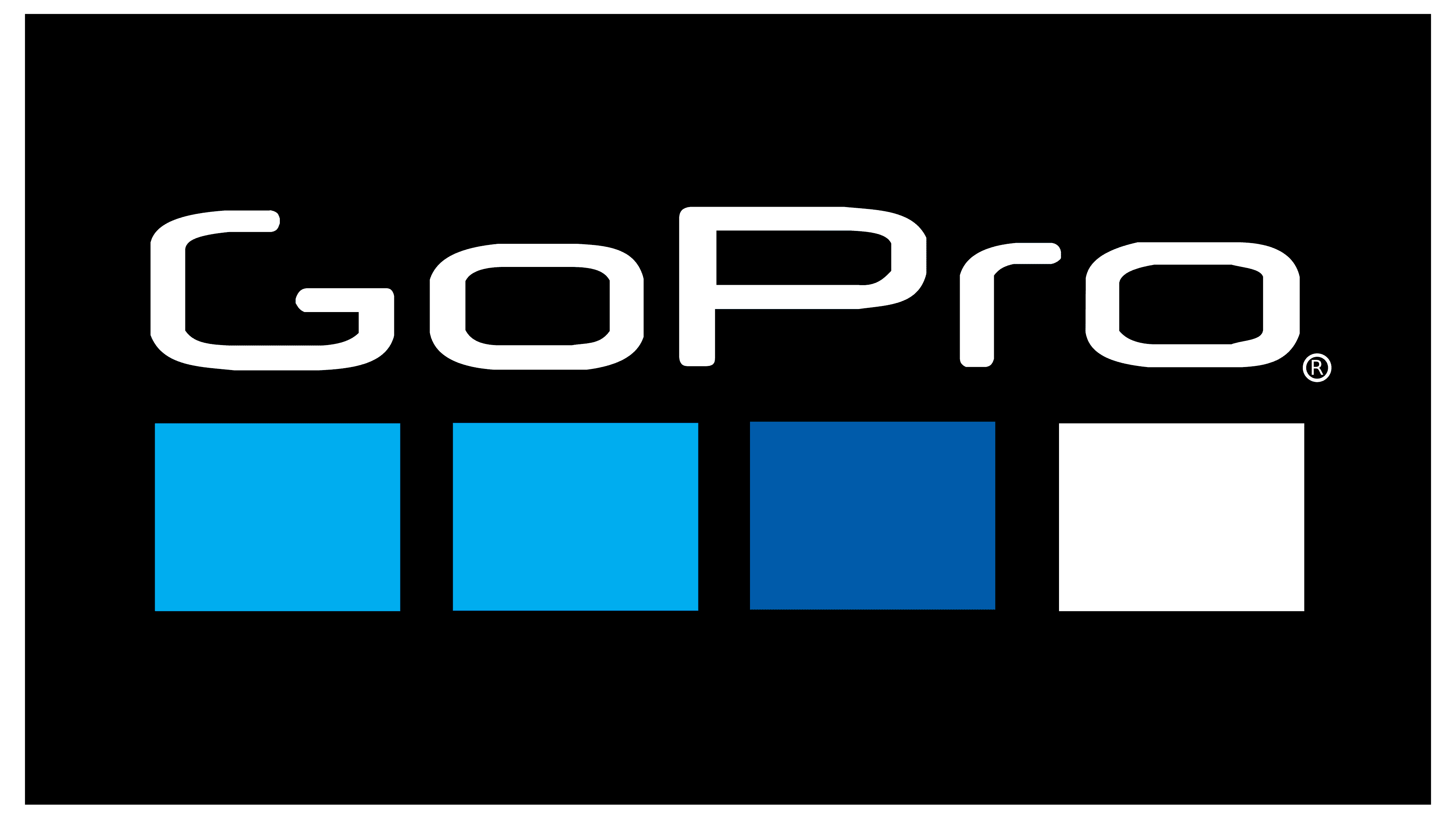
The current GoPro logo is a large black rectangle with the company’s name, the inspiring slogan “Be a HERO,” and four multicolored squares. The previous version contained different inscriptions: “GoPro Hero Camera” or simply “GP Hero.”
The logo adopted in 2010 consists of several symbolic elements. These are four mini-squares inside a large black rectangle. The far left represents cycling, skiing, motocross, and other terrestrial extreme sports. It is light blue, like the sky. The second square is dedicated to windsurfing, wakeboarding, and other water sports. It’s the same color as the surf. The third, dark blue, symbolizes diving. The fourth geometric figure is white, like snow. It is a graphic representation of winter sports.
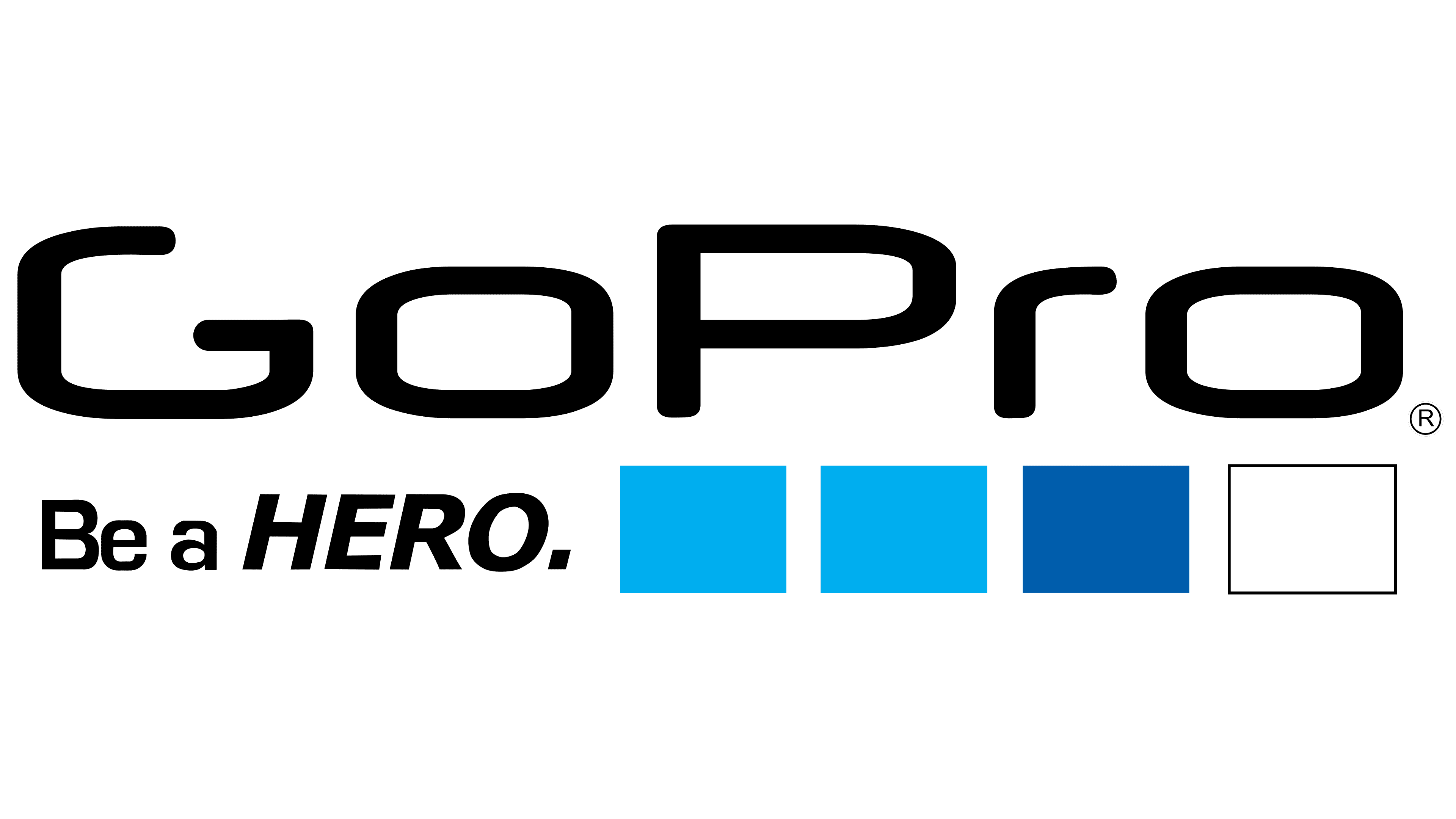
The font for the word “GoPro” resembles Neuropol, but with a modified letter “G.” The slogan uses two fonts: “Be a” is in Eurostile Bold, and “HERO” is in Verdana Bold Italic. The palette includes four colors: white, black, medium Persian blue (#005DAC), and bright cerulean blue (#00AEEF).