The Gordon Biersch logo reflects the duality of the name. The emblem invites you to visit a restaurant with excellent pastries and try the malt alcoholic drink of the same name. The combination of delicious food and beer creates a wonderful tandem.
Gordon Biersch: Brand overview
| Founded: | July 1988 |
| Founder: | Dan Gordon and Dean Biersch |
| Headquarters: | United States |
| Website: | gordonbiersch.com |
Meaning and History
The brand’s history began with German beer, which two friends decided to produce for their restaurants. Therefore, everything appeared in the complex. However, the owners later wanted to get rid of the catering business to focus on producing beer products. As a result, the network was transferred to another company, and they still had a brewery, which they began to develop actively.
The co-founders and their original investors decided to accept money from an outsider, the Fertitta family, who live in Las Vegas to expand the venture. In 1995, it invested $11.2 million in the company, so Lorenzo Fertitta is the controlling owner of the brewery. All this left a serious mark on the business but did not affect the brand’s identity.
In 2014, Dean Biersch produced beer under contract for two US retail chains, Trader Joe’s and Costco. He is also famous because, in 2016, he made a personalized alcoholic drink in honor of the San Jose Sharks hockey team. It was Chum red ale. In addition, Gordon Biersch Brewing Company has received numerous top industry awards for its beers.
The brewery and restaurant logos almost match. And it cannot be otherwise because they have common roots: the same year of appearance and the same founders, who later decided to separate the two business areas. Therefore, today the brand Gordon Biersch Brewing, abbreviated by the names of the founders of Gordon Biersch, is mainly engaged in brewing. And the restaurant chain received a different owner and a different name – CraftWorks Restaurants & Breweries.
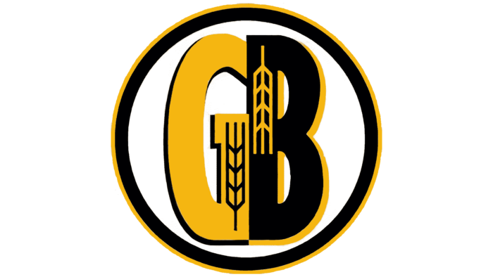
The brewery logo shows a circle with a double ring on the edge: one yellow and one black. They surround two large letters – “G” and “B.” These are the first characters from the names of the founders of the company – Gordon, and Biersch. The signs are massive, bold, and located close to each other, so their outlines almost coincide. They have the same sloping sides, smooth lines, identical height, and width. The designers used a color difference trick to add contrast: they painted the “G” yellow with a thin black border, while the “B” was black with a yellow stripe. Each letter depicts an ear.
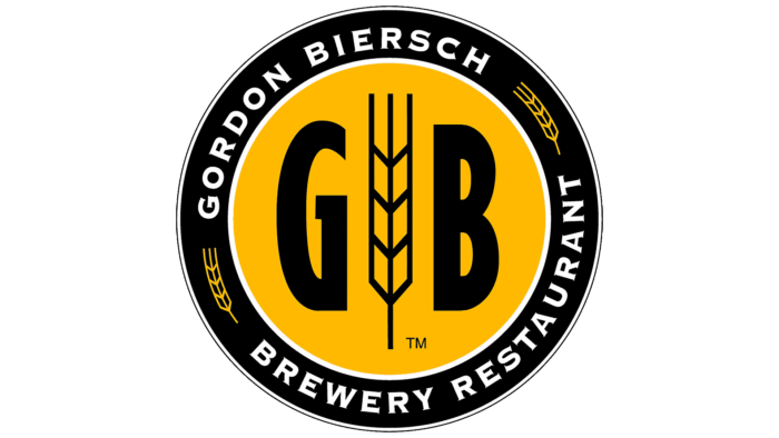
The emblem of the restaurant chain consists of similar elements but is grouped in a completely different way. Along the edge of the round logo is a wide black line with a white name. Above is its first part – “Gordon Biersch,” below is the second – “Brewery Restaurant.” Lateral spikelets separate both phrases. In the center on a yellow background are black “G” and “B.” But they are not connected, as in the first case: a large ear is depicted between them. The writing style of the letters is identical to the characters from the brewery logo.
Font and Colors
The original emblems use a grotesque with smooth lines and curves. Only the “G” on the beveled top has a sharp element. Manufacturers deliberately avoid excessive precision and geometric signs: they want to emphasize the authenticity of products with smoothness since beer with a purely German taste is made in the USA. Therefore, the letters are bold and strict but without German rigidity.
The color scheme of the logos is completely identical: both the first and the second are dominated by a yellow-black palette. It also has a professional approach because yellow and gold are beer shades.
Gordon Biersch color codes
| Selective Yellow | Hex color: | #ffb900 |
|---|---|---|
| RGB: | 255 185 0 | |
| CMYK: | 0 27 100 0 | |
| Pantone: | PMS 7549 C |
| Black | Hex color: | #000000 |
|---|---|---|
| RGB: | 0 0 0 | |
| CMYK: | 0 0 0 100 | |
| Pantone: | PMS Process Black C |
