![]() Gorillaz Logo PNG
Gorillaz Logo PNG
For a musical group, the Gorillaz logo does not differ in creative flight. It consists of an inscription with the band’s name and expresses the inner state of their songs: art-pop, postmodernism, alternative rock, hip-hop, punk, electronic music, and more. The letters are varied and jumpy as if sprayed onto a concrete wall with a paint can.
Gorillaz is a unique phenomenon in the world of music, unrivaled and recognized by the Guinness Book of World Records as the best and most successful virtual band. They don’t exist in reality; this is a project by Damon Albarn (permanent co-author) and Jamie Hewlett (comic artist). They “settled” the band members in London and supposedly kept them hidden from the public eye. The program was launched in 1998. The animated group includes:
- Russel Hobbs (drummer).
- Noodle (keyboardist, guitarist, vocalist).
- Murdoc Niccals (bass guitarist).
- 2-D (vocalist, keyboardist).
Meaning and History
![]()
The virtual band started with an obsession with MTV. Damon Albarn and Jamie Hewlett watched a lot of it, which eventually seemed hellishly monotonous and boring to them, lacking any twist. So they teamed up and decided to create animated musicians. It is believed that they based their visual style on The 16s, a comic that had failed in its time. Hewlett came up with the idea along with co-author Alan Martin. The first recorded song by the fictional band was “Ghost Train.” In reality, the graphic members are replaced by real musicians, although the lineup may change occasionally.
Of course, the manner and atmosphere borrowed from the rejected comic are reflected in Gorillaz’s emblem. Its DNA is a mixture of many styles. However, the prevailing feature is its dissimilarity to any other signs. The logo is characterized by blurriness, streaks, aesthetic incompleteness, negligence, and varying letter sizes. However, there are also strict versions with geometrically accurate glyphs and lines, as on the 2005 album cover. The band uses a single general emblem, but each collection also has its own symbol.
What is Gorillaz?
Gorillaz is a virtual animated band that plays music in various alternative styles. These include art-pop, postmodernism, rock, hip-hop, punk, electro, and many other directions. Its creators are Damon Albarn (a constant co-author) and Jamie Hewlett (artist). The unconventional collective appeared in 1998. The presumed location is London.
1998
![]()
The logo was initially text-based and resembled an inscription left on the wall of a house, like graffiti. However, it initially featured the word “Gorilla” without the letter “z.” The “z” was absent in the prototype and appeared in the project’s name much later. The glyphs were uneven and at different heights. Moreover, they had streaks, as if the paint they were applying were fresh and flowed in long drops. Due to the difference in lettering, it seemed that several people did them: one drew one symbol, another another, and so on. The logo was monochrome.
1998 – today
![]()
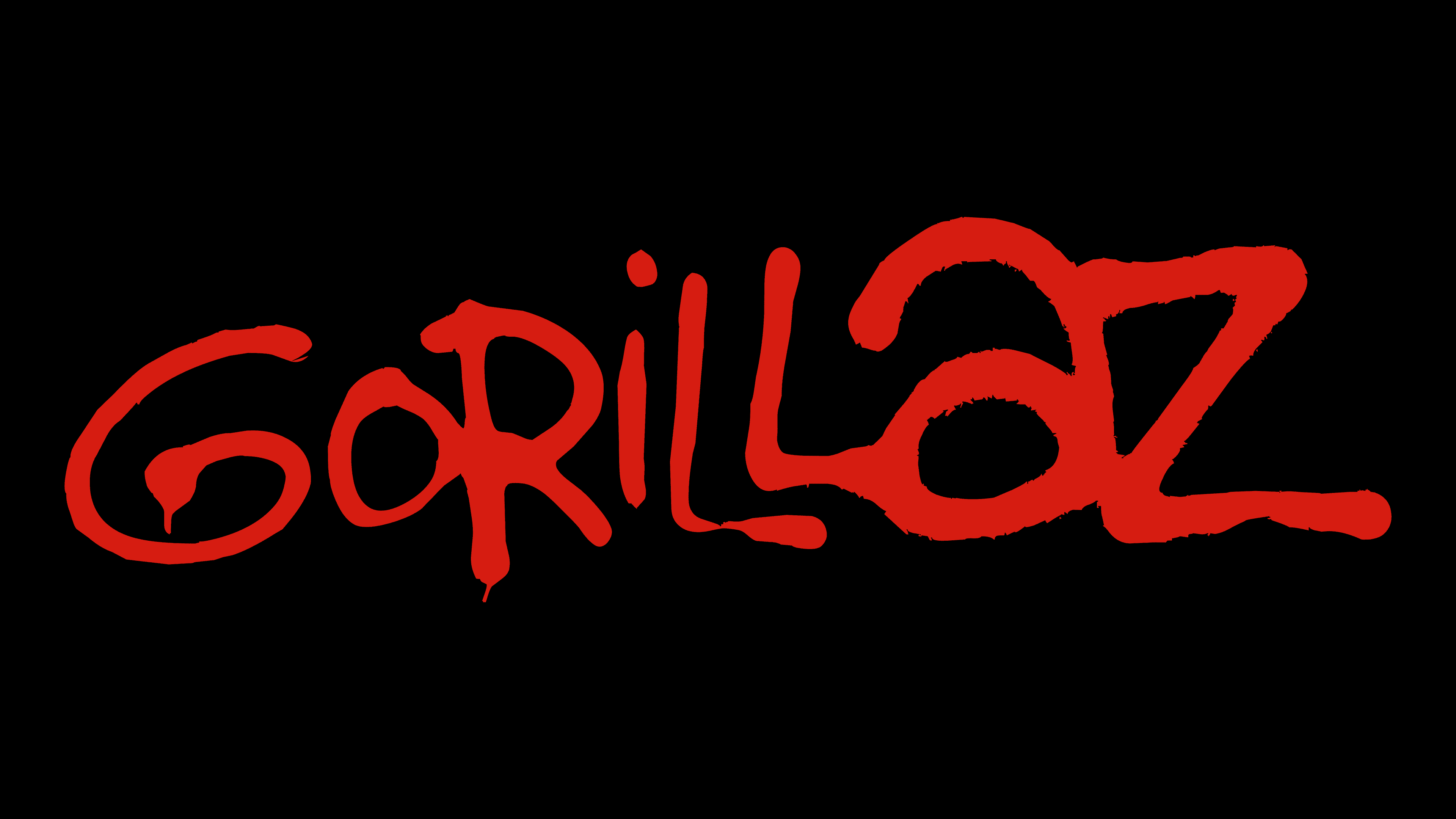
Then a permanent emblem appeared. Although it also represents an inscription, its style is entirely different. For example, the last two letters are much larger than the first, and the double “L” is arranged in a ladder-like fashion, as if they were connected like chairs. The text is red and rises slightly. The glyphs also have uneven lines and droplet-like streaks, but they are not as evident as in the prototype.
2005
![]()
Gorillaz chose a straightforward logo for the Demon Days cover with virtually nothing remarkable. The font is uppercase, thin, and angular, with sharpened outer corners. The letters are evenly spaced and stand slightly apart from each other. The inscription is black, and the background is light.
2010
![]()
The album Plastic Beach has a completely different style: playful, unconventional, and provocative. This can be seen in the letters that make up the band’s name. The glyphs are again at different levels and vary in size: they do not match in width or height. However, most of the signs are grotesque and bold. The largest is “G,” “a,” and “Z,” as in the 1998 version.
2010
![]()
In the same year, another collection, The Fall, was released. Its cover is adorned with a caption set in a very bold sans-serif font with capital letters. However, they are not as tall as before; rather, they are squat, wide, and even flattened. Notably, the glyphs are jumpy, meaning they are arranged unevenly in a row. However, this is not so apparent due to their boldness. The lowercase “A” is now uppercase, and “G” and “Z” are larger than the other signs.
2018
![]()
In the recent album The Now Now-Cracker Island, the musicians used their most unusual font of all. It resembles the red version of the 1998 logo; that is, it is adapted to the general design that is still in use. The inscription is made as if with black paint on a concrete wall, so the lines are uneven and periodically disappear. The letter “a” is again in lowercase, while the others are in uppercase.
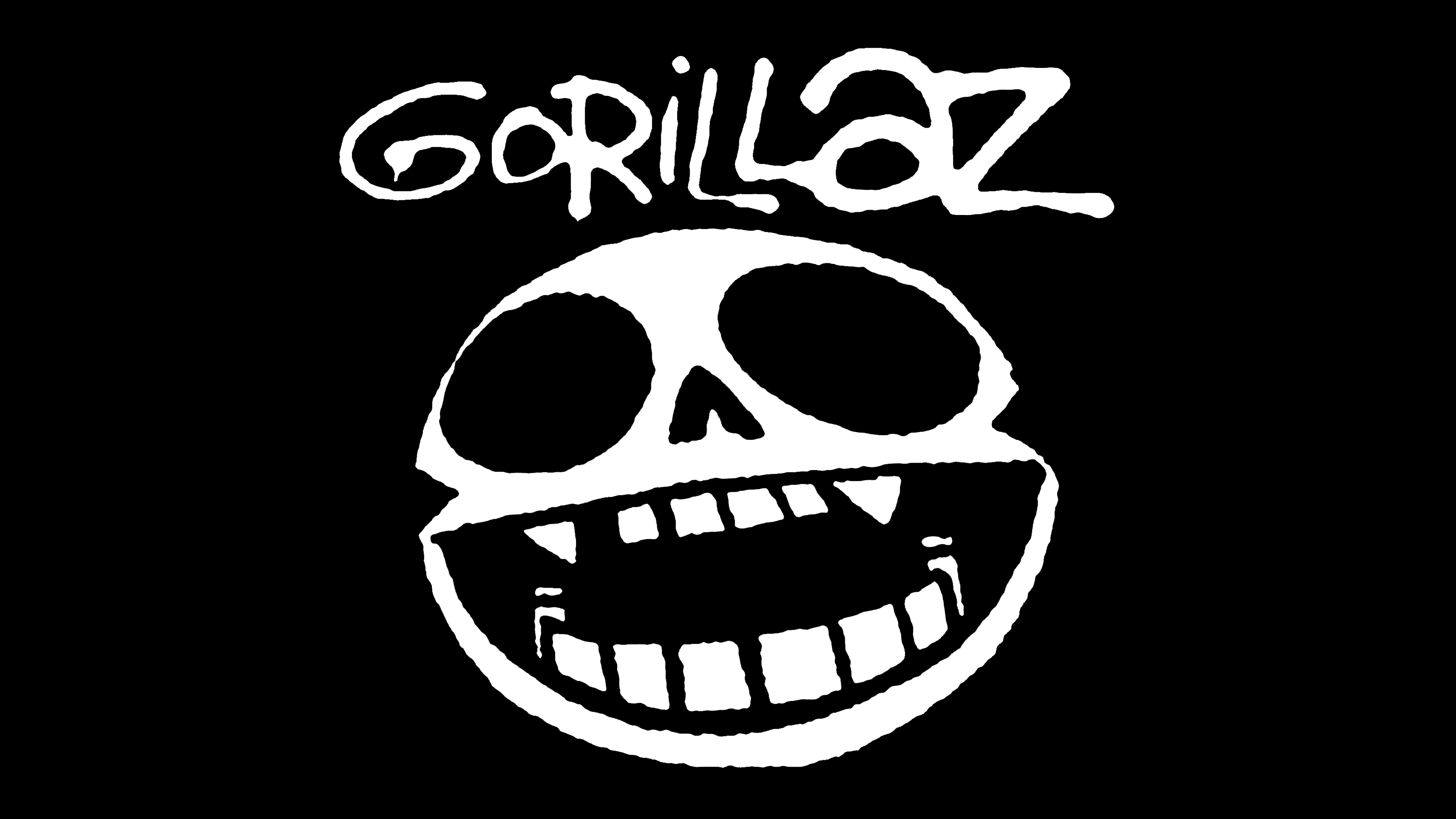
The animated band Gorillaz’s name, reflected in the logo, was chosen because its founders, Damon Albarn and Jamie Hewlett, were born in the Year of the Monkey. The inscription is often accompanied by an image of a skull with very large eye sockets and a large mouth showing white teeth. Sometimes, it is supplemented with silhouettes of animated characters.
Font and Colors
Their signature font is called Gorillaz 1. Kasper van de Laar designed it and is freely distributed. Another version, Plastic Beach, was created by Nikolai Rebel 2. Other fonts resemble Limerick Serial Regular by SoftMaker, Chantilly UltraBold, created by FontSite Inc., or Humanist 521 Ultra Bold by ParaType. The color palette is simple and unpretentious: either red or black on a white background.