The Graco logo reflects the name of this company, a well-known manufacturer of products for children. It became a quality mark because parents can be confident in the reliability of children’s car seats, strollers, swings, and other products with a recognizable logo.
Graco: Brand overview
| Founded: | 1942 |
| Founder: | Russell Gray, Robert Cone |
| Headquarters: | Philadelphia, Pennsylvania, United States |
| Website: | gracobaby.com |
Meaning and History
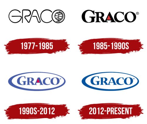
Visual recognition of the brand is at the highest level. This is possible thanks to the millions of parents who wish to purchase the highest quality products for their children. Since the company’s inception, the target audience has been presented with three versions of the logo. Each new redesign introduced changes to the emblem, making it more modern and progressive.
What is Graco?
It is one of the world’s most demanded manufacturers of children’s goods. The company’s products are available to customers from more than 100 countries. Every year, more than 20 million people buy strollers made by Graco.
1977 – 1985
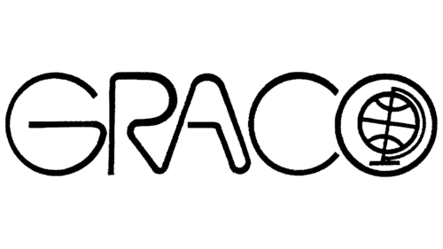
In this logo, the brand name is written in thin lines, creating the illusion of fluid movement. The letters have no sharp corners because the soft outlines embody safety – the main quality of children’s products. Notably, “R” and “A” consist of one long strip with bizarre bends.
Inside the “O” is a minimalist globe. On the one hand, it reflects Graco’s mission to expand its business outside of the US. On the other hand, the globe symbolizes the prospects that open up: parents can travel with their children because they have comfortable strollers and portable automatic swings.
1985 – the 1990s
The first version of the logo was introduced in 1985. It was black wording on a white background. The brand name used a bold, elegant serif typeface. All letters were in upper case. Despite this, the first “G” had a slightly larger size. They had features in the style of writing and other symbols. For example, the letter “R” had a slightly elongated and curved tail. The rest of the symbols look classic, although they have serifs.
The Graco logo stands out for its brevity and minimalism. Interestingly, the central part of the letter “A” is painted with a red triangle, making this element stand out from the others.
the 1990s – 2012
The first logo redesign took place in the 1990s. As a result, several changes have been made to Greco’s visual identity. For example, a brighter color palette has been used. Black and white have been replaced with blue and red. Thus, the brand logo has become more friendly and attractive.
A frame has also appeared: a white oval with a blue outline. Its peculiarity was that the thickness of the contour differed in different places.
The font has also been changed. Pointed serifs appeared, which made the inscription more modern and cool.
2012 – today
The last redesign to date took place in 2012. At this stage, it was decided to simplify the logo somewhat. As a result, the red triangle in the “A” has been removed. Overall, it was a bold, smooth sans-serif typeface. Visually, the inscription is similar to the one presented in the previous version. The white oval with a blue outline remained unchanged.
Also, at this stage, an emblem appeared in the form of a stylized letter “G,” which was located above the main verbal inscription. It is made with straight lines with sharp corners.
Globally speaking, the logo looks confident and modern. A minimalistic color palette gives strength and confidence to the image, making it more appealing to potential buyers.
Font and Colors
The Graco logo is based on an elegant serif typeface. The inscription is easy to read and stands out from the competition. Moreover, the style of writing letters has not changed much over the entire existence of the brand.
The blue and white color palette looks modern and attractive. It evokes positive emotions in potential buyers, motivating them to purchase Graco products. Immediately there are associations with children’s goods.
Graco color codes
| Medium Electric Blue | Hex color: | #00539f |
|---|---|---|
| RGB: | 0 83 159 | |
| CMYK: | 100 48 0 38 | |
| Pantone: | PMS 29456 C |
