Despite its abstract elements, the Grameenphone logo makes perfect sense. It represents communication, which is the basis of telecommunications services. The symbol also shows the uniqueness and versatility of the brand to attract potential customers.
Grameenphone: Brand overview
| Founded: | 1997 |
| Founder: | Iqbal Quadir, Muhammad Yunus |
| Headquarters: | Dhaka, Bangladesh |
| Website: | grameenphone.com |
Meaning and History
Among Bangladeshis, visual brand awareness is at its highest. During the entire existence of the company, only two versions of the logo were presented. They were decorated in different styles, but at the same time, they convey the features of Grameenphone’s work and the company’s focus on local customers.
What is Grameenphone?
It is the largest mobile operator in Bangladesh regarding the number of connected users. The company offers services related to the Internet, mobile communications, etc. The number of subscribers is growing every year.
1997 – 2006
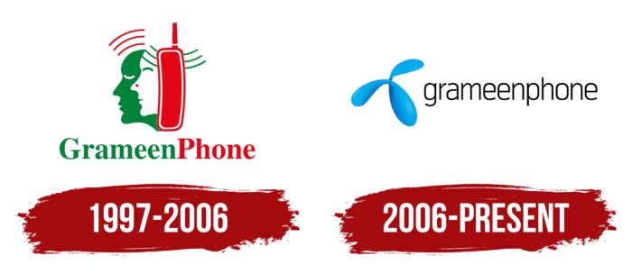
The first version of the logo was introduced in 1997. It consisted of a verbal inscription, as well as an emblem located on top. If we talk about the brand name, then this word was made in two colors: green and red. Hence, there are associations with the flag of Bangladesh. All letters except for “G” and “P” were presented in lower case.
Above is the emblem. These are two figures of people’s faces, namely women and men, which have been superimposed on each other. At the top near the ear is a red telephone receiver. Also, wavy lines emanate from each figure associated with the conversation. Thus, the company transmits the conversation of people schematically.
2006 – today
The only redesign was introduced on November 14, 2006. Interestingly, a translation into Bengali is also used in addition to the classic version of the logo.
The image itself has been completely redesigned. Now the name Grameenphone was done in black letters with thin lines. All characters are written in lower case. The verbal inscription looks concise.
The emblem, located on the left, is made in the form of an abstract blue figure. She looks friendly and attracts the attention of potential customers of the operator. Therefore, there are no references to the classic color palette on the new logo. This is a completely new option that deserves the right to life. Moreover, both elements successfully contrast and look quite harmonious.
Font and Colors
At different stages of the development of the Grameenphone company, different fonts were used for word inscription. It was originally a bold sans-serif typeface with two distinct elements conventionally separated by capital letters. However, the current version is made in a more concise style. Thin lines in lowercase letters demonstrate the company’s friendly attitude towards its customers, making them more loyal.
If we talk about the color palette, then the original version of the logo was made in the colors of the national flag of Bangladesh: green and red. Subsequently, the company abandoned this option. Now black and blue are used, which looks modern and stylish. It can be placed on absolutely any surface. The mysterious blue emblem increases the interest of the target audience.
Grameenphone color codes
| Picton Blue | Hex color: | #12acf8 |
|---|---|---|
| RGB: | 18 172 248 | |
| CMYK: | 93 31 0 3 | |
| Pantone: | PMS 2995 C |


