


![]() Green Bay Packers Logo PNG
Green Bay Packers Logo PNG
The newest emblem features a modern design, style, and conciseness. The Green Bay Packers logo symbolizes professional affiliation, self-control, strength, intuition, and confidence in victory.
The Green Bay Packers are an NFC North Division team and a non-profit professional sports team in the top league. The team is based in Green Bay, Wisconsin.
The club is considered unique, having 360,584 shareholders (as of 2015), making it publicly owned. Additionally, 4% of the franchise is in free circulation. Thus, it is a non-profit organization supported by ordinary people for an entire century. The team has no undisclosed owners, and its public ownership helps the franchise financially.
It all started with the unexpected decision of two rival football fans, Earl “Curly” Lambeau and George Whitney Calhoun. Lambeau approached his employer, a local packing company, asking for funds to purchase uniforms. He was given $500 in cash for the uniforms and equipment because the team would be named after its sponsor. This condition was met.
As a result, from 1919 to 1922, the team was led by George W. Calhoun, J.E. Clair, and Earl Lambeau. In the second half of 1922, the list of owners expanded to include Gerald Clifford, Leland Joannes, Webber Kelly, and Andrew Turnbull, in addition to Lambeau. The franchise remained in this status until 1935. Then, all rights were transferred to a similarly named company, and the franchise was fully transferred to public ownership.
The corporation declined, was renamed Acme Packing, went bankrupt again, and never fully recovered. But all this time, the “Green Bay Packers” rejoiced, carrying the name of their sponsor and founder.
Meaning and History
![]()
Tracking the Green Bay Packers’ team logos allows one to trace their development. It all started with a simple emblem in the form of a rectangle with rounded corners and several words: “YOU WANT IT, WELL PACK IT,” “AP,” “ACME PACKERS,” “Green Bay, WI,” “1921 FOOTBALL.” Judging by the text, the main emphasis was on the club’s sponsor, name, and motto.
In late 1951, the franchise received a logo that matched the sports theme. The logo “Packers” took center stage, with an American football in the background. In 1956, the developers removed the inscription and brought the ball to the foreground.
The Packers own the trademark on the “G” logo and have granted limited permission to use logos similar to those of other organizations, such as the University of Georgia and Grambling State University.
What is Green Bay Packers?
The Green Bay Packers are one of the oldest NFL franchises. It was founded in 1919 in Green Bay, Wisconsin, and remains there, using Lambeau Field as its home stadium. The team has won 13 league championships, including 4 Super Bowls and 20 division championships.
1921
![]()
The Green Bay Packers’ debut logo is not sophisticated. It is simple, consisting of standard names on a white background in various fonts. This is associated with the company’s name change to Acme Packing, depicted on the logo. It looks like a chevron, a brand patch on a piece of clothing. It is shaped like an elongated rectangle with rounded edges. It is outlined by two black stripes with white space in the middle.
In the center of the logo are the intersecting letters “A” and “P,” along with their definition, the name of the sponsoring corporation. All these elements are in one color: the capital letters are dark blue with a golden outline, and the word sign “Acme Packing” is golden. Below are the city’s name, state, and the year 1921. In the top-right corner of the logo is the slogan “You want it, we’ll pack it.”
1951 – 1955
![]()
This period’s Green Bay Packers logo acquired its signature color, green. It features an orange football with a yellow outline between two orange goalposts, which, according to the developers, signifies strength, superiority, the pursuit of victory, and perseverance. The word “Packers” is also present, typed in a large font with a capital “P” at the beginning. The background is a large, detailed football with two white stripes and lacing. There are no borders or other outlines, only white, hinting at free space for activity.
1956 – 1961
![]()
In 1956, the logo featured a quarterback with the number 41 and a yellow football. He is in a throwing pose and ready to throw the ball. In the background is the state of Wisconsin, represented in green, with a white circle containing a green star (the city of Green Bay).
The player’s helmet, leggings, and jersey number are white, and his uniform is yellow, like the football. In addition, another football is depicted on the logo, larger and with two characteristic thin lines. Designers placed key elements on it to demonstrate the importance of American football to Wisconsin residents.
1961 – 1979
![]()
This Green Bay Packers logo design is given a radical revamp. The logo features an oval “G” in the English alphabet, resembling a football. This element was added when Lombardi asked the “Packers” equipment manager, Gerald “Dad” Braisher, to design a logo. Braisher entrusted this to his assistant, John Gordon, a student at St. Norbert College. Satisfied with the white letter “G” on a green football, the pair presented it to Lombardi, who approved the addition.
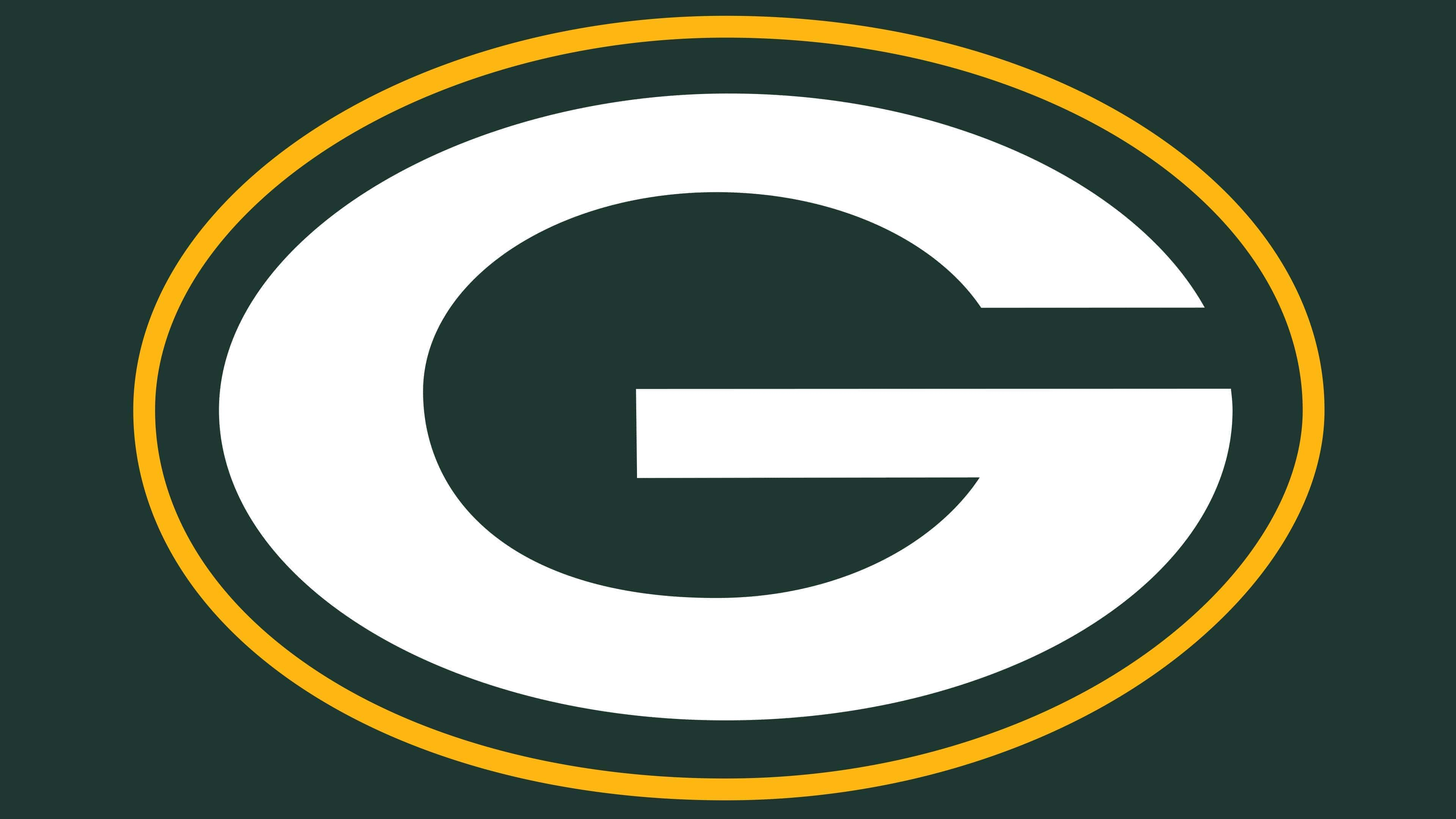
1980 – today
![]()
The Green Bay Packers’ last trademark was introduced in 1980. However, the actual year of its creation is 1961, when the emblem with a white “G” on a dark oval background was introduced. After 19 years, artists outlined the oval with a wide yellow line, bringing the redesign to an end.
The original logo was designed by Gerald “Dad” Braisher and his assistant, John Gordon, a student at St. Norbert College. They conceived the famous letter “G,” giving it shape, and meticulously sketched the small details.
Font and Colors
In 1955, the team adopted a new name; in the second half of the 1950s, its approach to identity changed. In 1956, artists focused on depicting a football, which changed several times before being stylized into a letter G. Initially, it looked quite realistic. On the side was depicted the state of Wisconsin and a player in a jersey numbered 41.
The emblem is completely different now. The ball remains, but now it is depicted in an abstract style: it can be recognized by the inverted, dark-green oval outlined in yellow. The letter “G” inside is also oval.
The developers of the new logo decided not to use standard fonts, so they independently designed the letter “G.” True, not from scratch: they took a chopped font as a sample and gave the letter the right proportions.
Color plays an important role in logo design. The palette is chosen so that each shade complements the others. White smoothly transitions into dark green, creating the necessary contrast. The bright accent is the yellow stripe, which appeared in 1980.