


![]() Green Day Logo PNG
Green Day Logo PNG
In 1986, the American music Olympus was joined by the band Sweet Children, playing punk rock. The band members’ fascination with cannabis led to a name change and a complete style overhaul. The Green Day logo originates from a slang phrase from the group’s hometown, reflecting their performance style.
Green Day began in the mid-1980s in Crockett, California, where Billie Joe Armstrong and Mike Dirnt met in school and bonded over music. After early covers of Ozzy Osbourne and Van Halen, they shifted toward punk, influenced by the Ramones and Dead Kennedys.
On October 17, 1987, their first show as Sweet Children took place at Rod’s Hickory Pit in Vallejo. By 1988, the core formed with Armstrong, Dirnt on bass, and drummer John Kiffmeyer. The scene around 924 Gilman Street in Berkeley shaped their development, alongside bands like Operation Ivy and Rancid.
In 1989, they released an EP and changed the name to Green Day. The debut album, 39/Smooth, followed in 1990. That year, Tre Cool replaced Kiffmeyer, completing the lineup that remains active.
In 1991, Kerplunk sold about 500,000 copies on Lookout! Records. The group then signed with Reprise Records, leading to the loss of access to 924 Gilman Street.
In 1994, Dookie became a breakthrough, selling over 20 million copies and winning a Grammy. Singles like “Basket Case” and “Longview” reached wide audiences, alongside acts like The Offspring.
Later albums, Insomniac in 1995 and Nimrod in 1997, sustained commercial success. The band’s results were weaker in 2000, and by 2003, its relevance had declined.
In September 2004, American Idiot regained its position, with “Boulevard of Broken Dreams” topping the charts and winning a Grammy. A stage adaptation opened in 2009. In 2015, Green Day was inducted into the Rock and Roll Hall of Fame, and in 2024, Dookie was added to the National Recording Registry.
Meaning and History
![]()
Different logos are used in the band’s various albums.
What is Green Day?
Green Day is one of the most successful American punk rock bands. It started as a club band at 924 Gilman Street but gradually gained a distinct identity and wide recognition. This happened in 1986.
1989
![]()
On the debut album Extended Play (1,000 Hours, 1989), the band’s name was written in angular dark green letters.
1990 – 1992
![]()
The cover of the first full-length song collection (39 / Smooth, 1990) featured a light green “GreeN DaY” inscription with black outlines and blurred white contours.
1992 – 1994
![]()
The second collection (Kerplunk, 1992) used the 1989 logo.
1994 – 1995
![]()
The cover of the third album, Dookie (1994), featured a green-yellow “GREEN DAY” inscription with a 3D effect. In the background, an explosion resembled a white cloud.
1995 – 1997
![]()
In the fourth volume (Insomniac, 1995), the emblem adopted a serif font. The white phrase was inside a shapeless black spot.
1997 – 2000
![]()
The fifth record collection (Nimrod, 1997) featured an italic “Green Day” logo.
2000 – 2004
![]()
With the release of the sixth album (Warning, 2000), the rock band’s symbol turned green for the first time, using a bold sans serif font.
2004 – 2009
![]()
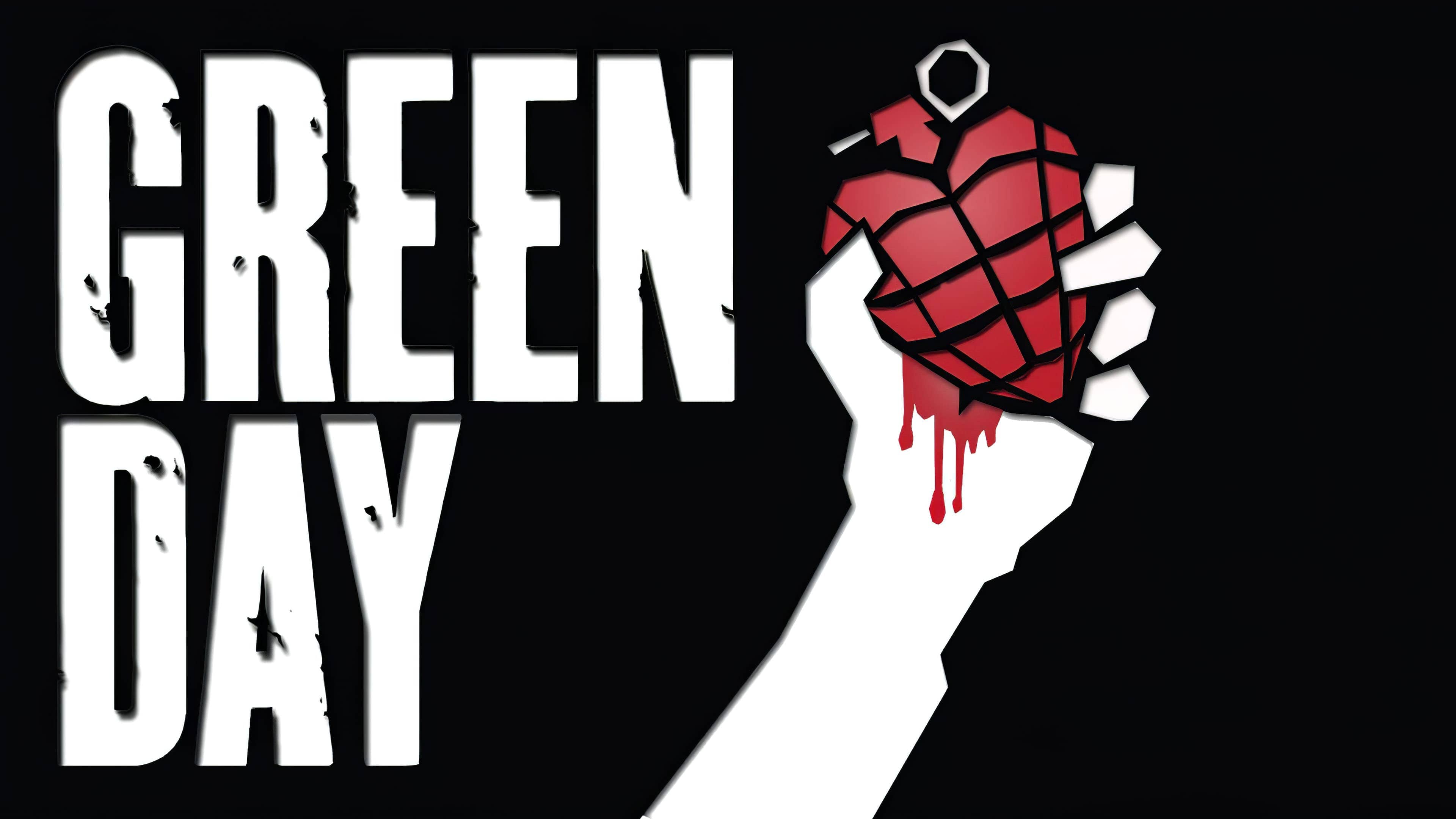
The logo on the cover of the seventh music collection, American Idiot (2004), consisted of two parts. The first is an elongated black inscription, “GREEN DAY,” and the second is an image of a hand holding a heart-shaped grenade.
2009 – 2012
![]()
The release of the eighth album, 21st Century Breakdown (2009), coincided with the introduction of a new logo. The group’s name was written in a different font and looked as if it had been sprayed on. The palette contained several shades of gray.
2012 – 2016
![]()
On the cover of the ninth collection (¡Uno!, 2012), a pink “GREEN DAY” logo appeared. On the tenth and eleventh albums (¡Dos! and Tré!, 2012), it changed color twice: first to blue, then to yellow.
2016 – 2020
![]()
The latest music collection (Revolution Radio, 2016) features another emblem displaying the rock band’s name. Thin black letters drip with paint.
2020 – 2024
2024 – today
Font and Colors
The Green Day trademark has always consisted of the same letters, mostly in hand-drawn or handwritten form. The 2004 version, featuring an image of a hand with a grenade, is an exception.

Artists have experimented extensively with the design, using various font variations. For instance, the 1995 emblem used the FF Trixie font, and the 2004 logo’s style is close to Champion Gothic.
The latest Green Day character palette features a classic combination of gray and white. The monochrome execution emphasizes the rebellious style of punk rock music.