The Griffin Media logo embodies professionalism and seriousness. Its restrained style is associated with reliability, while the color accents symbolize a creative approach to information delivery. The emblem also indicates the stability and resilience of the company in its industry.
Griffin Media: Brand overview
| Founded: | September 5, 1951 |
| Founder: | John Toole Griffin, James C. “Jimmy” Leake |
| Headquarters: | Oklahoma City, Oklahoma, United States |
| Website: | griffin.news |
Meaning and History
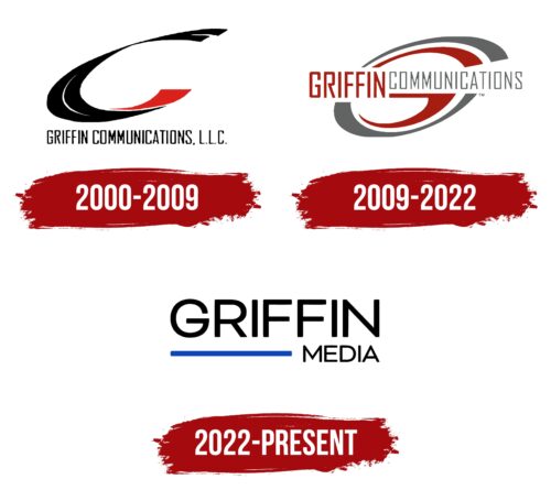
The name “Griffin Media,” presented on the logo, has been used since 2022. It indicates that John Toole “J.T.” Griffin created the brand and is solely owned by his family. The emblem has changed several times as the company underwent a series of major rebrandings. Before 2022, it was known as Griffin Communications, and its wordmark contained the corresponding inscription. Even earlier, it was called Griffin Television Inc. (from 1968), Griffin-Leake TV (from 1964), KATV Inc. (from 1963), and Oklahoma Television Corporation (from 1951), but logos from those times have been lost.
What is Griffin Media?
Griffin Media is a media company based in Oklahoma City. It specializes in creating and distributing content in various formats. It owns television and radio stations, as well as digital platforms. The media assets focus on local news, sports events, and music hits.
2000 – 2009
The large black arc splits in some places and represents the “C.” A curving red stripe added to the bottom edge turns it into a semblance of “G.” Thus, it is a monogram formed from the initial letters of the brand’s name. It symbolizes motion, dynamism, and energy as Griffin Communications strives for development and wants to stay abreast of all trends.
Stylized glyphs are an expression of individuality and uniqueness. Colors have also been chosen for a reason. Black is associated with stability and professionalism. It refers to the company’s long history, which started in 1951. Red is used as a visual accent to attract attention. At the bottom, there is an inscription “Griffin Communications, L.C.C..” This is the brand name the company received in 2000. It is designed in a rectangular geometric grotesque style. The font is straight and semi-bold, and all letters are uppercase.
2009 – 2022
Designers divided the “G” and “C,” placing one letter inside the other. Now the “G” is completely red and has a long horizontal stroke. It is located inside the gray “C,” in the center of attention. This is the main identifier of the brand. Combining two multicolored glyphs creates contrast and reflects the company’s variety of content and stations. The tilt to the right side signifies the energy and progress that characterize Griffin Communications as an innovative representative of the media industry.
The company name is in the middle and divides the monogram into two parts. It is still written in an uppercase sans-serif font, but now the words differ in size and color: the red “GRIFFIN” is almost twice as large as the following gray “COMMUNICATIONS.”
2022 – today
In 2022, the company was renamed Griffin Media, emphasizing its specialization in the media industry and striving to provide different types of content. The new name is typed in uppercase letters with softened corners to create an atmosphere of friendliness and reliability. This time, the inscription is divided into two lines. Such an arrangement ensures easy recognition of the logo. The second word is reduced and supplemented with a long horizontal blue stripe associated with trust, honesty, and constancy.
Font and Colors
A standard sans-serif font is associated with Griffin Media’s pursuit of a clear and understandable representation of its brand. For the same purpose, all letters are made uppercase. The soft shape speaks of the desire to inspire trust to expand the audience. A blue accent stands out against the background of a completely black inscription. This color symbolizes the quality and reliability of the content broadcasted by the company.
Griffin Media color codes
| Black | Hex color: | #000000 |
|---|---|---|
| RGB: | 0 0 0 | |
| CMYK: | 0 0 0 100 | |
| Pantone: | PMS Process Black C |
| Absolute Zero | Hex color: | #0f46bc |
|---|---|---|
| RGB: | 15 70 188 | |
| CMYK: | 92 63 0 26 | |
| Pantone: | PMS 2728 C |


