


![]() Grohe Logo PNG
Grohe Logo PNG
The Grohe logo is used to label the company’s sanitary fixtures and accessories. It symbolizes the wave of success, continuous forward movement, and development, because that is what an effective business is built on.
Grohe grew from the same family line as Hansgrohe. In 1901, Hans Grohe opened a small metalworking business in Schiltach, first making parts for Junghans alarm clocks, then shower heads, faucets, and sanitary fittings. His son Friedrich Grohe left the family firm and, in 1936, bought Berkenhoff & Paschedag in Hemer, shifting it fully toward bathroom fittings. In 1948, the company became Friedrich Grohe Armaturenfabrik.
Its technical base formed around thermostats and mixers. In 1956, Grohe bought Carl Nestler Armaturenfabrik, Germany’s first maker of thermostats for private bathrooms, and launched Skalatherm, an automatic mixing valve with a built-in thermostat. In 1962, it gained European rights to produce the American Moen single-lever mixer, bringing one-handed water control to Europe.
Grohe expanded abroad with offices in France (1961), Austria (1965), Italy (1967), and the United States (1975). In 1968, Friedrich Grohe sold a 51% stake to ITT, but his heirs bought it back after he died in 1983. That year, Grohe introduced the Ladylux kitchen faucet with a pull-out spray head in the U.S. In 1991, Friedrich Grohe AG became a publicly traded company and acquired several German fittings manufacturers.
In 1999, the Grohe and Rost families sold their stakes to BC Partners, and in 2000, Grohe returned to private ownership. Later, it passed to Texas Pacific Group and CSFB Private Equity. In 2010, the company was fined €54.8 million in a European sanitary-fittings cartel case. In 2014, Japan’s LIXIL acquired an 87.5% stake in Grohe for about €3.06 billion. Its main competitors remain Hansgrohe and Geberit.
Meaning and History
Brand recognition is high due to the company’s popularity among the target audience. Throughout, one logo was presented, which is used in several interpretations. The image looks minimalist yet modern and promising, clearly associated with the organization’s main activities.
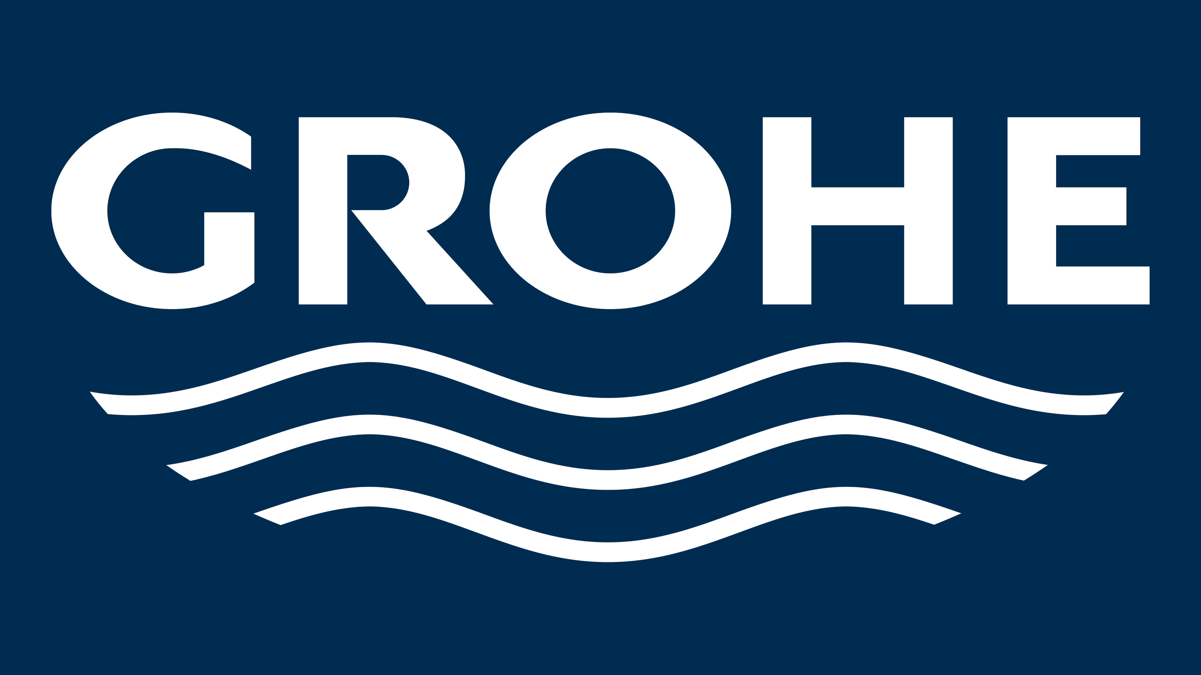
The Grohe logo consists of the company name and the emblem at the bottom. If we talk about the word “inscription,” it is set in a classic, solid sans-serif font with bold yet clear lines. Monumental letters look strict and powerful, thereby adding strength and confidence to the company in the eyes of potential buyers.
What is Grohe?
It is one of the world’s largest manufacturers of sanitary fittings, faucets, and accessories. Sales volumes are increasing every year due to work in most countries worldwide. High quality and significant market experience attract potential customers’ attention.
The emblem is minimalistic. It consists of three curved horizontal lines. The lower the line, the shorter it is. Thus, it looks like a wave and contrasts interestingly with the main element. They should be associated with buyers whose main specialization is the company’s, namely, plumbing.
Consequently, the light, intuitive emblem somewhat softens the brutality of the verbal inscription and is directly associated with water. Hence, it’s not surprising that a blue-and-white color palette is chosen. After all, as a rule, water is depicted precisely with the help of various shades of blue. In certain variations, the colors change. They have white letters on a blue background.
Font and Colors
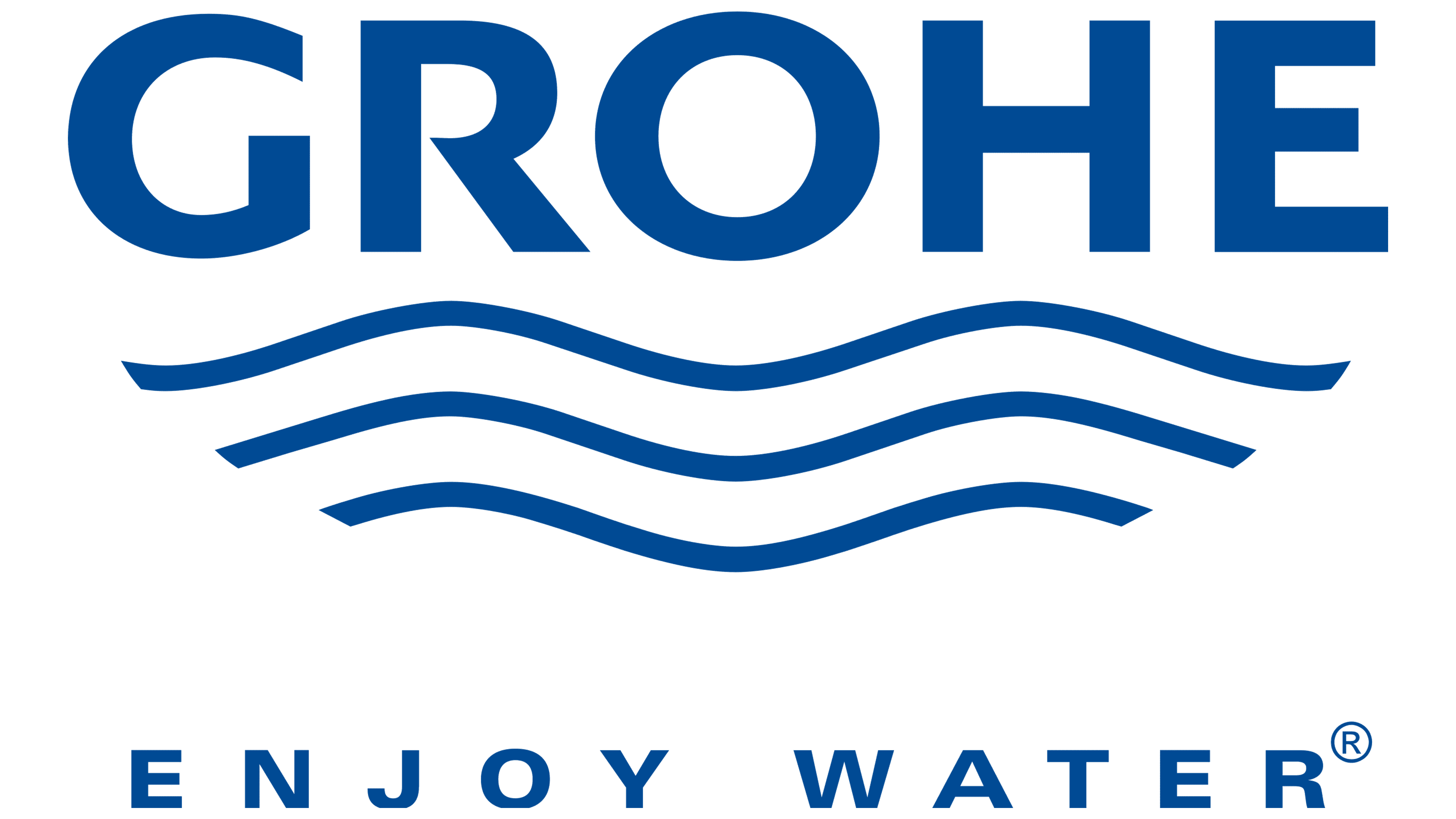
The word “inscription” is set in a modern, bold sans-serif typeface. Monumental and confident letters look powerful, highlighting the company logo from competitors. There is a significant amount of space between characters. Therefore, it can feel like each character is a separate element. The style of each letter is classical, except for “E,” where the middle horizontal line is slightly smaller than the top and bottom.
Like most sanitary ware brands, Grohe has chosen a blue-and-white color palette. They look harmonious and ideally fit the organization’s specifics. Many people associate dark blue with water, so a potential buyer unfamiliar with the brand’s activities will understand that it is engaged in plumbing.