Grosvenor Casino’s simple and stylish logo captures the essence of this online entertainment establishment, which provides access to dozens of different slot machines. The logo design is light and unobtrusive so as not to deter potential customers.
Grosvenor Casino: Brand overview
| Founded: | 1970 |
| Founder: | The Rank Group |
| Headquarters: | Maidenhead, UK |
Meaning and History
Among fans of gambling, brand recognition is at a high level. This is also possible thanks to the company logo, which had only minimal changes during the redesigns. All the time, there were only two of them. Therefore the target audience of Grosvenor Casino had time to get used to the new emblem of their favorite company.
What is Grosvenor Casino?
This major gambling resource has been offering customers online games of the highest quality for 15 years. This is evidenced by RTP indicators, which minimize the advantage of online casinos over their customers.
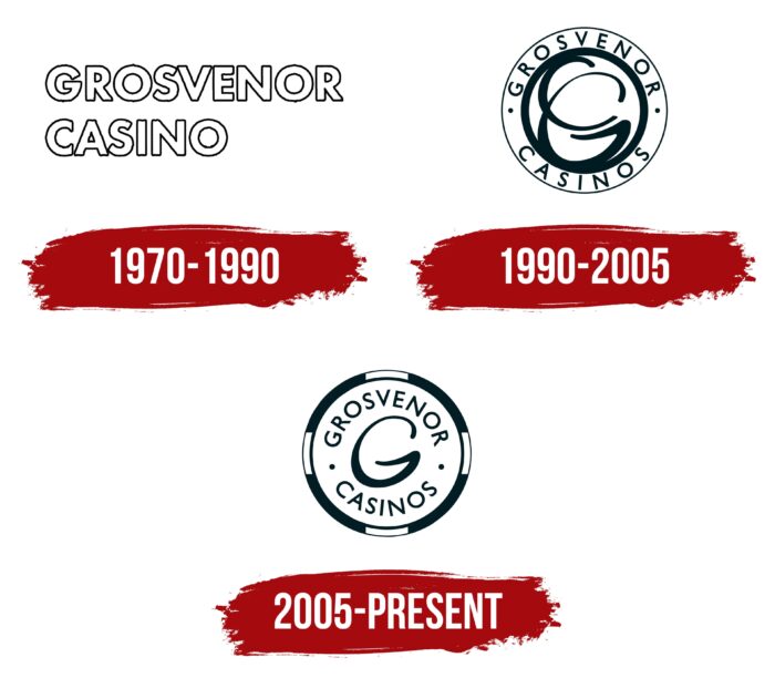
1970 – 1990
Almost immediately after the establishment of the casino, the first deposit was also presented. It was a verbal inscription made in two lines. The brand name used a classic bold sans-serif font with rounded corners in the letters. This format of the logo was discreet. Therefore, at this stage, the visual component was not the company’s main advantage.
1990 – 2005
The first redesign made the Grosvenor Casino logo more modern and confident. Now it was an emblem in the form of two white circles, one of which was inside the other. Each of them had a dark blue outline. At the top was the inscription “Grosvenor,” and at the bottom, “Casino.” They were done in a classic sans-serif font with thin lines in the letters. Two blue ones separated them. At the same time, the central part of the logo was occupied by stylized letters “G” and “C.” They were executed harmoniously and bewitchingly.
2005 – today
A new stage in the company’s activities is directly related to its transition to the online market segment. The latest redesign to date has made the logo more modern and confident. Now it was one white circle with a thick outline. Interestingly, this outline was divided into blocks of dark blue and white. The font used for the inscriptions remained unchanged, as did the arrangement of the words. At the same time, only the letter “G” remained in the central part, which is the initial in the word “Grosvenor.”
Font and Colors
After the first logo redesign, the company settled on a classic sans-serif typeface that remains unchanged today. If the main word inscriptions look familiar, then the stylized letter “G” definitely attracts attention.
The company settled on a white and blue color palette. Monotony made the logo more strict. But despite this, it cannot be said that he is not expressive. Many players notice a round emblem with pleasant inscriptions. Therefore the online casino has no problems attracting the target audience.
Grosvenor Casino color codes
| Dark Jungle Green | Hex color: | #03262c |
|---|---|---|
| RGB: | 3 38 44 | |
| CMYK: | 93 14 0 83 | |
| Pantone: | PMS 5463.C |

